Getting the transcript
Reading the captions from YouTube. A video nobody has opened here before takes 10 to 30 seconds; this page fills in on its own.
Getting the transcript
Reading the captions from YouTube. A video nobody has opened here before takes 10 to 30 seconds; this page fills in on its own.
Olly Rosewell · @OBRosewell
Words
5,636
Runtime
28:38
Speaking pace
197wpm
Reading time
23min
197 words per minute, between the 181 median and the 201 75th percentile of 349 measured videos. That distribution comes from the 349-video hook study.
Opening (first 30 seconds)
What's going on guys? This is Oliver, formerly from Response AI and a few other software tools that I've since exited. And in this video, I want to talk about the SaaS UI concept that you guys need to know, particularly in order to not build software that looks absolutely garbage, right? So, the gap between a vibe coded app and a product people pay for is never really the code because at the moment, as you guys know, you can now vibe code pretty good like um you know, well-functioning apps, but it's about uh interface decisions, about
99 words, the words spoken in the first 30 seconds at 197 words per minute.
Free, no signup. See how the first 30 seconds hold attention, with rewrites.
Sentence shape
| Measure | This transcript |
|---|---|
| Sentences | 399 |
| Average words per sentence | 14.1 |
| Longest sentence | 54 words |
| Questions asked | 92 |
| Sentences containing a number | 16 |
Most used terms
Filler phrases
299 in total: like 88 · right? 75 · um 59 · you know 29 · sort of 21 · kind of 10 · actually 8 · uh 5 · basically 2 · literally 2.
A literal whole-word count of the same phrase list the Prepublish browser extension uses, so a phrase inside another word is not counted and a phrase used in its ordinary sense still is. It is a count and not a judgement.
Run the check on the words above: where attention is likely to drop, with a rewrite for each weak line. The free check shows the scores and the one issue costing the most.
What this transcript is
Every word below is the caption track YouTube publishes for this video, pulled from the video itself and reproduced unchanged. It is not Prepublish's writing, not a summary, and not a re-transcription: it is the video's own published captions. English captions, generated automatically by YouTube, in the video’s original language. Source: the video on YouTube. A channel that would rather this page did not exist can ask for its removal through the contact page, and it is removed.
No Script X-ray for this video: YouTube shows a Most replayed graph only once a video has enough views.
What's going on guys? This is Oliver, formerly from Response AI and a few other software tools that I've since exited. And in this video, I want to talk about the SaaS UI concept that you guys need to know, particularly in order to not build software that looks absolutely garbage, right? So, the gap between a vibe coded app and a product people pay for is never really the code because at the moment, as you guys know, you can now vibe code pretty good like um you know, well-functioning apps, but it's about uh interface decisions, about design decisions, and you don't need taste.
You just need a sort of checklist to to run through this so the apps don't look terrible, right? Now, throughout this, I'm going to actually be running through um a big sort of checklist that I've um created. As you can see this absolutely dreadful um vibe coded landing page, right? Um but in that sort of like um explanation of how to actually run this and build better tools, um I'm going to be just switching to different things to show you examples, right?
So, bad UI, um you know, it it sort of came from like Salesforce and SAP, right? They were these really powerful tools that looked awful. And now a new software ships every hour, and around 88% of users abandon the app and don't pay after one poor experience, right? So, every vague icon, every design decision that doesn't work, it's um it's a thorn in their side, and they'll end up leaving, and people are even more picky nowadays, right?
Now, you've built the maze, and they've never seen it, okay? So, basically, that's why I always recommend using tools like Hotjar um or Posthog because you spend months in this app, and you know exactly where everything is, right? Users are not tourists sort of wandering your interface. They buy the stuff that you build so that they can create stuff or um you know, get a job done, right? Um just because you love the app, and you think it's really cool, does not mean people care about it.
All they care about is the result. So, hold their hand far more than it feels necessary, guide them down the right route, and we'll explain that more in a second, right? Now, the first thing is undoing what the AI gave you as a UI, okay? So, Cursor, Lovable, Bolt, etc. They'll build you something functional in an afternoon, and they will also apply the same defaults every single time. It's getting better. The stuff that they build on first glance is not as bad as it used to be, but people who look at software all day recognize those defaults instantly, and that's when you you you realize that things are vibe-coded slop.
And these are also the cheapest fixes in the whole deck, right? So, most take under an hour. Now, obviously, this is just a silly example, but this is my vibe-coded terrible landing page, right? So, you've got emojis as decorations, you've got glow shadows, you've got clashing gradients, right? Everything below, like everything here is intentionally bad, right? But, if we actually kind of um like deep dive it, even though it looks terrible, a big thing is that there's differing font sizes, right?
Um there's differing um what's called radiuses on the buttons, so some buttons are circular, some are square. You've got things that aren't um central. So, watch demo is not centered inside this button. You've obviously got different feature-sized boxes with different radiuses as well. So, one has a square radius, and one has that circular one. Um and on top of that, then you've just got clashing clashing like um images and clashing text, and obviously loads of emojis, right?
And this is a this is a joke, right? It's obviously vibe-coded stuff doesn't look as bad as this, but it still looks pretty bad. The next thing that's really important is killing emojis, right? So, I use Phosphor, and I use um something called um I forget the name of it now. Um uh Lucid, right? So, the fastest um sort of 30 minutes um and the most important, you know, like I suppose time you'll spend on the actual UI itself is the design and the packages that you use to build the app, right?
So, you can install Phosphor or you can install Lucide, right? Both are free and there's thousands of icons that look nice and they hold the line, right? So, their sizing and their shape and their color um they will mix in well with the rest of your app if um you don't like, you know, completely lose touch of the design and and sort of just start doing random stuff. The even though the icons are really small and like not a very big part, they're one of the most tasteful aspects of your app.
And inside this um tab here, icons versus emojis, you can see that you can swap emoji as icon, you know, decisions for a real icon set like Lucide, Phosphor, or Feather, right? They have the same meaning, but instead of a garbage icon, like an actual emoji for delete, you should obviously just use a simple icon. It reduces how much clashes, it reduces friction, and it just makes your app look way more grown-up and way more sort of um palatable for the user.
The next thing is that you should never let the AI choose your colors, right? So, it'll pick bright and it will pick clashing. So, every AI tool defaults to a saturated blue or purple. Then it adds a second bright accent that fights it, right? It reads as a template because it is one and it looks dreadful. So, you pick a restrained base and one accent, muted works, right? Stripe's palette is so boring, but it's one of the most trusted interfaces in software because with simplicity and with grayscale and with white space and with, you know, less detail and less color comes trust.
People trust simplicity. They do not trust all of these different things that are trying to get your attention, these glowing buttons, these purple gradients like a PowerPoint from when you're 10 years old. You then You then just let your data carry the color. So, a dashboard full of colored buttons looks cheap. The same dashboard with muted chrome and color reserved for charts and statuses looks expensive. So, you should only reserve color for things that are trying to show something.
So, as you can see here again, you've got two examples, right? You've got this thick and just really challenging text with a with a rocket emoji that says supercharge your workflow, blazing fast, smart targeting, whatever it may be. Like this looks great if you're 5 years old, okay? Whereas on the right, you've got that muted and minimal kind of um version of the landing page. And the or version of this sort of feature section, right?
Now, the whole point is that yes, to some, the one on the right looks boring. But we are not here to excite people with the design of our software. We are merely looking to guide them down the path to getting the result they want, right? So, on the left, you've just got this thing that screams that you don't know how to code, you don't know how to build software, and what they're about to buy is going to be terrible, right?
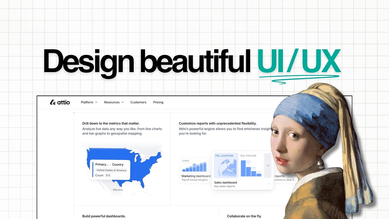
Whereas on the right, boring typically means that your product is going to speak for itself. And it doesn't mean boring, it just means muted and minimal. And obviously, um the right is a muted sort of Attio or Airtable style palette. It's near white, it's thin borders, there's no shadows. And Attio is probably my favorite website I've ever seen. You can obviously see here, it says welcome to Agented Revenue. Attio is the CRM that builds pipeline, etc., right?
So, ignore the kind of like um you know, like the animations and stuff cuz this is a very, very successful company. But see how it's pretty much mostly grayscale with colors only showing um important things like ICP score so here. So, that's in green, but it's very, very muted. There's a very, very thin sort of green border. All of the um radiuses of the buttons, etc., are the same. So, you haven't got square buttons versus circular buttons.
They're always this sort of square-ish, circular-ish button. You've got the logos in color, which makes it look really, really sort of enterprise grade. You've got a simple blue and sort of like a simple white that says send email. Things that aren't super important, but still a feature itself are in white. So, you've got things like save draft. And things that are a decision to make are less sort of like visible, like discard, right?
So, right now that shows you that with the email to Maya White, you are looking to send the email. You're looking far less to discard, and you're looking in a middle ground looking to save as a draft. So, that's why it leads you down the path of um completing the task, right? Again, you've got colors where it matters inside this landing page. And the only reason I'm showing you guys this is because um it's actually what the app looks like.
Atio looks exactly like this. You've got the simple colors um that aren't sort of clashing, and they're sort of like muted pastely colors for all these different things. You've got no additional colors, and you've only got um icons to say what it is. So, you see how it says here Lumio AI. Instead of saying company, Lumio AI, it's literally just showing you a little icon. The same goes with the date, September 30th. That's when the Lumio AI came into this pipeline.
You've got a dollar sign for the dollars, and you've got a a simple like Facebook style old school icon. Again, these things are design choices, but it makes the app look so much more beautiful than this kind of, you know, this really harsh looking thing where you're trying to do too much at too, you know, too much in in too little time. The next important thing is to never let the AI choose your layout either, right?
So, on the right side, you've got this really shoddy um kind of dashboard of different tools with this sort of really chunky background um sort of like shadow. The clearest tell of a generated app is repetition. So, AI will put the same four KPI cards on your dashboard, your analytics page, um and your billing page cuz it has no memory of what it already built typically, right? So, each page should answer one question.
If I'm on the teams page, I do not need any analytics. If I want that, I'll go to the analytics page or the dashboard, etc. Audit every page and ask what the one thing is that someone would go to that page for and delete anything that isn't that. The next thing is to fix the cards first. So, the biggest visible change for the least work. AI is worse at dense repeated components. So, a list of cards is where it dumps every button, chip, timestamp, etc.
All you guys need to do is compress this. Collapse the row of buttons into a triple dot menu, right? Turn check text chips into icons instead. Um do things like push the number that actually matters to the right and move everything else out of the way. It's the same information but a third of the noise and you match um what what is containing the data with what the person is looking for. So, again, you you aren't putting random stuff on a page.
Notice how on the right, this is a guests list. It doesn't say how many guests have come in in X period of time. It doesn't tell you how many total guests there have been over the last year. It is a list of guests because it is a tab called guests list, okay? So, again, if your form has four fields and the slide out panel is empty, a centered modal is probably the better choice. The same thing applies to all these things.
You have to figure out what the user is there for inside that tab and then design around that. A perfect example here about density and repetition is on the left, you've got everything always visible, right? Which is a problem. So, Sarah Chen, product designer, the product the pros uh or the project that she's running, Sarah Chen, is in progress, it's high priority, there's a bug that needs to be sorted out and it's on the front end, right?
Marcus Webb is it's already done, it was medium and it's back end, etc., right? Again, all of this is just too much color and too much stuff. And you see how it strikes the balance between what I told you just now, guys, which is that you should only use color when it symbolizes something or helps with an action. You should not use color everywhere for every action or every symbolism inside the app. Like yes, it's important that Sarah Chen's project and bug that she needs to fix is high priority, but we don't need that amongst four other buttons with different colors.
At face value on the right, you've got this collapsed thing that's quiet and obviously you've got a drop down like a like a three-tier dot menu if you want to press that. We know that Sarah Chen is in progress. It's high priority and in a middle ground I'd maybe add a tiny dot here to say in progress. Uh you know, it's like a blue icon or a yellow icon. And high priority could be um with a red dot or just something like that, right?
Maybe I wouldn't mix the two. The progress should just say in progress and priority should be colored. You see how this is much much different. Now AI decorates and your job is just to inform. So look at what every one of those fixes has in common, guys. Emojis, bright colors, repeated KPIs, overloaded cards, empty panels, like random colors, whatever it may be. Each one is the tool adding visual material where information should be.
So AI optimizes for a screen that looks finished, right? You need a screen that helps someone finish something. So ask of ask AI about every element. Does this help the user complete the job they came here for? Because if it's just decoration, then get rid of it. Now part two, the laws that don't change, right? So interface trends turn over every few years. You've got like skeuomorphic, flat, neomorphic, glass. You've got like these this kind of like new age is kind of like white space and lots of like tabled stuff like Atio.
And underneath the fashion sits a small set of principles. And if you get those principles right, your app looks competent and people will trust it, right? So when there's nothing left to remove, that's when things are perfect. So on the right is an example of my um of my old software, Caprine. And Caprine was basically just a table, and the table showed you um investors, and that's it. You could filter by investor stage, by how much they've invested, etc.
And it was as simple as that. The instinct with a front-end is to see how much you can fit on it, right? That instinct is wrong. The real question is how little you can get away with it whilst helping the user still complete the job. So, before you add anything else, try deleting stuff. And you write the rules down or you will break them, right? So, if a button says delete on one screen and remove on another, you have created friction.
Users will never report this, they'll just find your app annoying as hell. And you you'll never be able to see why people are you know, quitting when it's just like little things that just make it look so amateur. So, you write one page and you give it to AI. You write a markdown document about text sizes, button heights, spacing steps, the verb you use for actions, because in one verb it might say remove and in another verb that the verb that will use will be delete.
And it's like, well, why why is the AI changing things up? And it's because it sometimes forgets, guys. So, paste it into your AI tool and say, "These are the rules." Again, here with consistency and friction, you've got humans like to pattern match, right? So, naming the same action delete one place and remove another, it forces a reread over time, it looks awful, right? So, you've literally got remove, delete, and trash, right?
Consistently, it should just all be delete. And with random sizes um of font and things like that, with consistency, it just creates friction. So, look how awful this is on the right. You've got different fonts, some of them are in um some of them like are in capital letters and some of them aren't. Some of them are like muted in gray, it's all awful. And this is what apps look like, right? The consistent scale, which AI sometimes gets wrong, is again, "Welcome back" in bold.
So, that's just that's just a message. Here's what's happening today. Underneath you've got one capital letters title, and that's in recent activity. So, that's titling the actual section. Three tasks completed this week, updated two minutes ago. And a hierarchy tells the user where to look. So, size, weight, color, space, etc. Every screen is a sentence, and something has to be the subject, right? So, if everything is the same size and weight, the user has to read all of it to find the thing they want.
Basecamp, which is an amazing software, it does this with almost nothing, right? It's just bold titles for projects, muted secondary text, and that is the entire system. It's like reading a simple document. Airtable took spreadsheets, the most boring thing on earth, and made rows scannable with color-coded statuses. The practical version is that you pick the one element per screen that matters and turn the volume down on everything around it.
And you start with intent. So, most people open a blank page and start thinking about cards, icons, where the sidebar goes. That's starting at the end. You start here instead, right? What did the person arrive to do? So, an example is with CapForge, when they log in, it just says, "Here's the database, and here's how you can filter by the leads that you need." And it shows you how many contacts, and then it asks you to export them.
I like you like, you know, you've got a sidebar with stuff, but you've got the credits in the bottom left, so you know exactly how many leads are left that you can export. You've got the filters above with specific filters, and you've got a key, you've got like a legend that says what the specific filters do. And it's as simple as that. Now, obviously from that perspective, you notice when a second intent appears. So, someone who wants a holiday but doesn't know where is browsing, not searching.
That's what filters are for. So, functionality expands when intent expands, never because you had space to fill, okay? That is so important, guys. You only add stuff when you realize that the user needs to do more stuff. You do not think, "Oh, this could be cool for the user to do." and then add some random thing because you have now put words in their mouth. And you design for the ugly data, not the demo data, right?
So, your app looks great because you filled it with these this this tidy example data, short names, numbers. You need to put real data and real stuff in your app to see just how bad it looks. So, decide the rules now. You truncate long strings with an ellipsis after say 15 characters. Put icons on a solid circle so that they survive any background. Design the empty state deliberately deliberately. Have loading states.
Have error messages. All these things are things a new user's going to see and you're not seeing them because you're in this perfect bubble whilst designing the app. Now, next of course is onboarding, right? The moment after someone starts a trial is when they are least patient and most critical of your app, right? You have minutes, sometimes seconds as opposed to days to do this. You used to have days cuz people were more patient.
Do not force a tour. So, forced tutorials feel like a lecture. People click through them without reading just to get to the app itself. Progressive onboarding wins. One obvious action that gets a job done, then reveal the next when they finish it, right? Make the first step impossible to miss. On my own app, the primary card has a drop shadow. It's greener than everything else around it and it would say start here. Add a progress bar so they can see the finish line and when they finished it, you know, make it a game.
Say that, you know, well done. Here's some confetti and that kind of thing, right? And excuse me, it works. With Paper Schedule, one of my apps, when you connect your first account, so when you connect your X account or your or your you know, Facebook account or your Instagram account, confetti comes up and you get an email that says, "Well done. You connected your first account. Connect the next one." So, again, And celebrating simple things and celebrating the user doing the job. >> [snorts] >> Now, speed is also an aesthetic, right?
So, a 1-second delay costs 7% of conversions. It's [snorts] showing something immediately, right, is the fix, not always faster code. So, open LinkedIn and search a name, right? For a split second, you get gray skeleton bars, and nothing loaded faster, it just felt like it did. So, if it's blank, people are going to think, "Oh, this looks awful." A really interesting thing is that sometimes people on um iOS apps, like iPhone apps, they will use Apple's spinner, and show it immediately, instead of their own design spinner, because when it's Apple's spinner, the user thinks it's Apple, and it's the iPhone being slow, but it's actually your app.
And so, so do you see how these things, like it's all these different things that make your app feel faster, and you can add skeleton screens, and skeleton little buttons, and um and skeleton blurbs, and things like that, wherever you fetch data, and it's a progress indicator for anything over a second. It's something playful for genuinely long jobs, like, you know, um like a I don't know, like a um an animation of like uh a dog juggling, any of these things, like Posthog do it so well.
There's just like a hog like walking around, or like a like a badger, or a hedgehog, you know? Like like like a hedgehog walking around the screen when you're doing stuff. Like all these little things are funny, right? Users don't need speed, they need evidence that something is happening, because people are okay to wait 2 seconds for something, they're not okay to wait 2 seconds when it's blank. And you show them value in numbers.
So, the most underused retention feature in B2B is just showing people what they're achieving. So, an example here is the value tracker. So, B2B buyers, like business buyers, they must justify the subscription to a boss, or to themselves. If the app doesn't show what you're achieving for them, they'll guess that they're not achieving much. They don't guess higher. They don't think, "I reckon I'm doing loads of good stuff with this app." They'll always think, "I'm doing nothing." And it's a scoreboard, not just a tool.
So, your impact this month, you've saved 30 hours, you've automated 100 100 tasks, you've found 26 leads, and you've generated 18k in revenue. Again, it's it's showing what you've done and what you've won on on the dashboard instead of just leaving it to to guesswork. And this is very easy to do, guys. I said, you know, in in Paper Schedule, I say, all right, you've posted 25 times and saved 10 hours. Simple. I know that people always look at that.
And people always get confetti when they hit a certain milestone, etc. It's so simple to do it, but it's so effective. Now, some buttons should be hard to press, right? So, there's ethical friction and what's called the Zeigarnik effect. So, if a user clicks delete and then something vanishes, two bad things happen. They cannot undo the mistake, and they're not certain it worked because it happened too fast. So, they refresh to check, and it's gone.
For anything destructive or expensive or final, add a confirmation. Are you sure? You think that this is friction, but it's not the way you should be thinking, guys. You should be thinking about certainty for the user. You type the name to confirm for the truly serious one. So, like, you know, are you sure you want to delete this server? That was big, right? Yes, delete. Type the name of the server. Superbase lets you do it.
Instead of You can't delete like a database on Superbase without typing the name of the database. And it's tedious, but it's made to be tedious cuz it's the danger zone. And again, um show a clear completion state. You show confetti or you show a tick. On Paper Schedule, there's this spinner, and then it does like a tick or like a thumbs up. And it's like, that's the Zeigarnik effect. Unfinished actions nag at people.
So, it may have finished the task, but if people think, oh, what just happened? They're going to be bugged by it. An animation has to earn its place, right? I say, no animation inside the app unless you're doing confetti and stuff for like things that are completed. Everything else is your old like it's just like kind of cheesy scroll jacking elements flying in in the edges, parallax, you know, like like fading in and stuff.
The only thing that I fade in is skeleton loaders so people know that things are happening. Choose a load more button over an infinite scroll. If it gives the user control, it lets them actually reach your footer, which infinite scroll makes impossible. Like people are just going to scroll and scroll and scroll forever, and it looks really really bad, and it can make their computer slow, whatever it may be. And ultimately, the test is simple.
Does this motion tell the user something? If it doesn't, don't add it. An example here of the confirm and complete from the last slide. As you can see, you can just click delete and it disappears, right? The row's gone. No confirmation, no undo, no proof, no no no bin to check. Instead, confirm then complete. So, delete the Q3 launch plan. This removes the project and all of its tasks. This can't be undone. A little title that a subtitle that says what it does.
Then type delete to confirm. You delete the project, and then it says project deleted and gives them 5 seconds to undo it. Very very simple, guys. Now, the landing page is super important as well. It's where a vibe-coded product loses most of its customers. Now, this is one thing that I think I'm pretty good at, right? Is designing landing pages that have a clear-cut reason for you visiting, a clear-cut reason to buy, and a clear-cut sort of like um you know, thing that I'm selling, right?
There's a quality bar on SaaS landing pages that visitors readers trust mostly without noticing that they are, right? So, the jump from generic to professional is a known path with a couple of moves, right? Landing pages are about presentation, not complexity. So, getting out of template territory, right? You kill the alternating layout, right? Typically, it's just text on the left, image on the right, repeating down the page, and it is just a signature of vibe-coded slop.
Instead, stack the hero and then let it breathe. So, delete every stock photo, replace it with a screenshot of your actual product. You make sure that all the call to action buttons say the same thing. Never get started or try a demo or get the demo or get started or you or try a free trial. Should all be the same thing. Same labels mean the same places. And that is the mental model you want. You want simplicity, guys, right?
I think one of my favorite landing pages is my own from one of my previous startups, Paper Schedule. Now, genuinely, you know, it says, "Your AI GTM distribution agent from content to qualified pipeline." You've then obviously got the actual subtitle in softer font that says, "Paper write, schedule content, find you leads." Says, "Start for free or book a demo, right?" Then you've got this really tasteful sort of muted um animation to actually signify that this is the main section you should pay attention to because it's the three big features, right?
I've got no silly like um you know, like big designs or videos, etc. It's just three sections that say what we're going to be achieving. Then underneath you've got some more animated stuff that shows each thing you're going to achieve in motion. So, the content agent, then underneath you've got the paper called email agent working, so all of the leads are filling in. Then all of the enrichments happening, and then the cold email sequences are being written.
So, this is animated. Then you've obviously got the um you know, the the reviews of the app itself. And then below, you have got some nice muted um kind of like cute designs, not muted, sorry, like um watercolor designs of the app itself. And again, you can just go through this in step one to three. And it's how you're onboarded. So, you get onboarded, we map your entire pipeline, we give you daily content, and then we get you leads.
And it's simple cuz it's in three steps. You don't need 20 steps. And finally, one more thing that just says, "Here's what it does." And then the pricing. There's one pricing, and then FAQs, and then a demo thing at the bottom. See how that's simple enough? People who want this are going to know what it is. And then from there, you're just in that process of going, "Okay, well, what do I need to do, and how do I sign up?" Now, where it starts to look expensive is when you create you know, you curate the visual then you add some depth to it.
So, stop showing the whole dashboard. You zoom into the one part that proves the point of that section. Instead, a full screenshot makes the reader hunt for what they want to do on the landing page, right? A cropped one tells them exactly what to notice. You swap a row of four identical cards for a Bento grid. So, different content gets different amount of room. And you add the product designer touch. So, a little badge, a row of customer logos, a mega menu on the nav bar.
A mega menu quietly tells a visitor the product has depth worth exploring, right? The difference between good and great is the copy shifts from what it does to how it helps. So, instead of collect and analyze your data um you know quickly is descriptive and fine. Turn your data into decisions is the same feature promising an outcome. And that rewrite is the biggest single jump on the page. Then the motion gets precise.
Whereas a blur as one panel transitions to the next, a menu that stays open and slides sideways instead of closing, things like that. None of this needs custom illustration or 3D or you to pay a freelance to design stuff. It's all the same components you already have. You already designed your app. You already know what it does, etc. Now, how to get all this without designing anything? You just screenshot the apps that you like and the websites you like.
You go to Dribbble or Mobbin. Keep a folder and then every time you're going to build an app, just upload to Cursor or Luvvit all the screenshots and say this is exactly what I want. Copy this design. It is as simple as that. If you guys want the full playbook, go to roswell.dev. It's all there. UI prompts I build um to make cute looking software. My design rules, the complete idea to exit book is there. Any problems at all, guys, give me a shout and I'll see you in the next video next week.
The words are the caption track's own and nothing is reworded or re-transcribed. Paragraph breaks are placed between sentences so the text reads as prose.
Free tools for your own script: paste a draft and see where it stands before you record it.
Paste your draft and see where viewers are likely to drop off, with a rewrite for each weak line.
Paste the first 30 seconds of your own draft for a hook score and rewrites.
Check your draft against YouTube's advertiser-friendly guidelines before you record it.
Read this channel's public videos and transcripts, and download a writing brief for it.