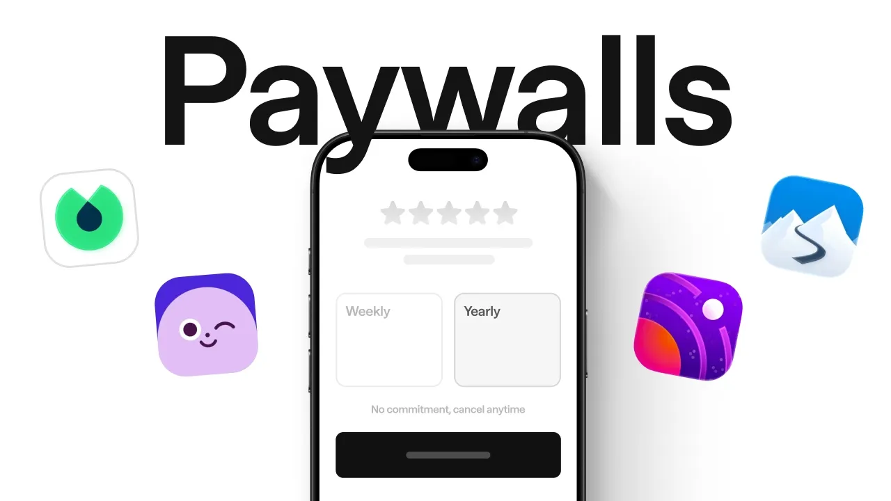
We Studied 2,995 Paywalls. Here’s What Actually Converts. transcript
Mobbin · @mobbindesign
Words
2,143
Runtime
12:31
Speaking pace
171wpm
Reading time
9min
171 words per minute, between the 160 25th percentile and the 181 median of 349 measured videos. That distribution comes from the 349-video hook study.
Opening (first 30 seconds)
After studying nearly 3,000 paywalls, hundreds of subscription flows on Moby, and talking to someone who's designed over 4,700 paywalls, we found this. >> [music] >> Sometimes, an ugly paywall could outperform a beautiful one. >> No matter what I did, the ugly paywall with a ton of text completely over performed anything that I would do. >> More friction could increase conversions. >> Multi-page paywalls almost always do better than single-page paywalls. >> Every paywall today kind of looks the same. So, I wanted to
86 words, the words spoken in the first 30 seconds at 171 words per minute.
Sentence shape
| Measure | This transcript |
|---|---|
| Sentences | 144 |
| Average words per sentence | 14.9 |
| Longest sentence | 49 words |
| Questions asked | 8 |
| Sentences containing a number | 9 |
Most used terms
- paywall34
- music21
- paywalls15
- trial14
- users11
- free8
- offer8
- product8
- user8
- app7
- different7
- people7
Filler phrases
26 in total: like 14 · kind of 7 · you know 2 · actually 1 · literally 1 · uh 1.
A literal whole-word count of the same phrase list the Prepublish browser extension uses, so a phrase inside another word is not counted and a phrase used in its ordinary sense still is. It is a count and not a judgement.
What this transcript is
Every word below is the caption track YouTube publishes for this video, pulled from the video itself and reproduced unchanged. It is not Prepublish's writing, not a summary, and not a re-transcription: it is the video's own published captions. English captions, generated automatically by YouTube, in the video’s original language. Source: the video on YouTube. A channel that would rather this page did not exist can ask for its removal through the contact page, and it is removed.
Transcript
After studying nearly 3,000 paywalls, hundreds of subscription flows on Moby, and talking to someone who's designed over 4,700 paywalls, we found this. >> [music] >> Sometimes, an ugly paywall could outperform a beautiful one. >> No matter what I did, the ugly paywall with a ton of text completely over performed anything that I would do. >> More friction could increase conversions. >> Multi-page paywalls almost always do better than single-page paywalls. >> Every paywall today kind of looks the same.
So, I wanted to know what separates a high-performing paywall from an average one. I used to think the decision happens on a paywall, but actually, users sometimes decide to pay before they even see the paywall. >> All the different touchpoints are extremely important. >> The paywall can appear after onboarding, when you unlock a premium feature, inside settings, [music] or even as a win-back offer before you leave. >> Those paywalls speak more to the user because they're more personalized.
You're constantly trying to get the user to either pay or stay as a subscribing member, and so you have to think about the entire life cycle of the customer. And yes, product is important for being able to solve a problem, but life cycle monetization and the paywalls, that's the only part of the app that makes money. >> A paywall isn't just a screen. It's a flow. Before asking for money, Opal spends time selling the outcome, getting 8 years of your life back.
By the time you reach the paywall, it doesn't feel like [music] an interruption. By showing users how many years of their life they could save, trial sign-ups went up from 7% to 17%. Jonathan prefers multi-page paywalls. >> Multi-page paywalls almost always do better than single-page paywalls. And so, in this paywall, you're at the end of the customer journey and onboarding, and you've just showed the customer that hey, your plan is ready.
This is what you can expect. You're speaking to them from an emotional perspective. You're telling them they're going to start feeling like themselves in 4 weeks or you're going to tell them something that is in line with their actual ideal outcome. Does the paywall already feel part of the experience? Like if it's an onboarding, is it a natural segue to kind of finish the onboarding? >> A Head takes a similar approach.
Information unfolds gradually. It gives users time to process the decision instead of forcing them to absorb everything at once. I think when a paywall works, it doesn't feel like you've hit a wall. It feels like the product is asking you to take the natural next step. Even if you have a well-designed paywall, [music] if it appears at the wrong moment, it's still a bad paywall. One example is the one-time offer. If you close it, it's gone.
Paired with animation and haptic feedback, this helps to pull the attention of the user the moment that you're considering an upgrade. Even when the timing is right, people can still hesitate. Will I forget to cancel? Am I making the right decision? And that's why some of the best-performing paywalls focus on reducing risk. Blinkist had a problem. Their users complained about free trials because they felt tricked into being charged.
So, they redesigned the paywall screen to show a step-by-step timeline. The result was more trial sign-ups, fewer complaints. Push notification opt-ins also went up, which makes sense because they remind you before your trial ends. >> [music] >> Tipstop emphasized the free trial, added a discount badge, and made the offer easier to understand. The offer didn't change. The way it was presented [music] did. Direct conversions almost tripled.
And then there's Slopes. Instead of redesigning the paywall, they asked a different question. What if we got rid of the paywall altogether? They took inspiration from Apple's redeem free trial approach and built what they call a pay ramp. Users see a single action, redeem your free week. No traditional paywall standing in the way. This alone increased trial starts by 25%. Which brings us to one of Jonathan's favorite paywall tweaks. >> This no commitment cancel anytime subtitle always seems to do well.
Adding it to the paywall will bump things up incrementally. And then also having some kind of call to action for what the user is doing instead of just continue is hit or miss, but I do like to experiment with that as well. Another thing too is like having this right chevron here on the button. I can't make a judgement yet as to whether like this in itself does the best because I have not done a test yet where everything is the same except for this right chevron, but in most of the paywalls that end up winning, they have this right chevron.
So, I've also started to include it on the button along with this subtitle here. >> Jonathan takes this idea one step further. >> So, if they try to hit cancel over here, I like to show the users an exit intent sheet. If they're not ready to commit for a year, you can still subscribe to the monthly plan. >> And when we talked about aggressive last minute discounts? >> I wouldn't really do this unless it's maybe Cyber Monday Black Friday.
I'm really curious to see how Apple is going to approach that this year for all these different sales, but to make sure that I'm compliant and safe, I'd recommend instead to have an offer with a larger trial. >> Giving users a longer trial could help you achieve the same goal while preserving trust. So, if reducing risk helps with conversions, we would expect that removing friction will do the same. But that's not the case.
To start your free trial on Outsider, >> [music] >> you'll need to enter your credit card details. Sign-ups dropped by more than half, but the conversion rates increased by five times, more than double the paying customers. The extra friction filtered out people who were never serious in the first place. Moonly discovered something similar. They introduced a free trial, but only on the annual plan. Sometimes what changes isn't the offer, it's how the offer is framed.
One of the most common techniques is social proof with real user reviews and a five-star rating. >> These social accolades are really nice to kind of show credibility and authority. >> The second common technique is value framing. >> [music] >> You're framing the value in such a way that it matches what the users care about. All these screens are selling different futures. [music] And then there's price anchoring. Tide breaks down the price into smaller weekly amounts.
Ahead compares its subscription to things people already spend money on, like coffee or therapy. Next up, pricing and packaging. Headspace [music] tested 7-day, 14-day, and 30-day free trials. The winning variant was this, 14-day trial for [music] the annual plan. Even though the annual plan costs more, the longer trial made the whole decision feel less risky. If you're wondering what the best pricing structure is, [music] it depends on what you're optimizing for. >> Ideally, you want to default to a yearly product because we see that that has the highest LTV, but a yearly product may not be the best for your business.
If you need to, you have that yearly product with [music] a weekly or with a monthly product. You only want to show two to decrease cognitive load on the user. So, if you do want to support other pricing options, you always hide it behind a view all plans button that opens up a sheet with all the different pricing. You want to keep the base paywall simple, get a bunch of users in there to see how your base stats perform before you go crazy on optimizing all your different placements. >> Jonathan is also a big believer in table-based [music] paywalls. >> I am a huge fan of tables.
They're a little hard to build in Superwall. I think that's maybe why, like in RevenueCat and Superwall, I'm not really seeing a lot of tables. These also do a good job of showcasing what you're missing out on if you don't subscribe. This also works pretty well. A video paywall showing you the app in action and simple bullet list, simple social proof here of people already using your app. >> Video could communicate value faster than static screenshots or bullet points.
Now, one thing we kept coming back to was polish. >> I think animations work really well. There's an app that I really like right now that's going viral. It's called Focus Town, and they've done an amazing job of branding and creating a Animal Crossing-esque experience, and that's the level of polish that we're going to be seeing from the most successful apps moving forward. You know, the bar has just been raised because now that anyone can ship an app, the ones that really put in the time to polish it with animations, with custom character designs, with world building are going to be the most successful moving forward. >> When two products are competing for the same user, polish could be the reason why someone chooses your product over the others.
[music] If you're building with AI, that's exactly what Mobbin MCP is for. It gives tools like Claude, ChatGPT, and Cursor access to Mobbin's library. So, instead of making things up, [music] your AI can reference patterns that already exist in the real world, compare how apps design their paywalls, and pull examples directly into your workflow. Think of it as grounding your AI's output in what's already been shipped.
Not every pattern is worth copying. Some of the highest converting paywalls are the ones Jonathan is the most skeptical of. The same tactics you'll find in drop shipping stores and e-commerce websites. >> So, one paywall that works extremely well that I really have a hard time accepting is the spin the wheel paywall. This is a predetermined spin the wheel Lottie file that may land on some kind of discounted percentage.
You know, the user gets to claim it and then cuz they've just won something, the idea is that they'll uh be more likely to then subscribe at that price point. If you're optimizing for a longer-term business, that may not be a good paywall for you. But, if you're optimizing for a weekly price and you want to maximize revenue, unfortunately, it works. The issue is that everyone is also starting to use it or I'm seeing it used a lot more. >> When every app uses fake urgency tactics, users eventually stop believing it. >> I think more and more users are getting comfortable closing paywalls because they know they're going to get some kind of offer afterwards. >> And in early 2026, Apple also started rejecting paywall patterns that relied on free trial toggles because some of these were considered confusing or misleading. >> Just remember that this is a long-term game. >> Jonathan once worked with an AI girlfriend app. >> They had probably the ugliest paywall I've ever seen and it was really compact elements, very aggressive squeeze page kind of paywall.
So, that ended up over-performing pretty much any paywall that I tried to do. >> Which means that there is literally no universal best paywall, only better experiments. >> One thing that I learned from Jake and Nick at Superwall was that design tests move the needle the most. We ended up running radically [music] different designs until you find something that blows everything out of the water. You could have a video paywall, you could have bullet list paywall, a trial timeline paywall, a long-form [music] paywall. >> Test every copy, the pricing, the flow until something clearly wins.
Getting people to subscribe is one thing. Building something that people continues to pay for [music] is much harder. >> The metrics that I wish more founders really care the most about is retention and LTV. I think if retention and LTV are good, you're building a good product and you want to build good products so that the ecosystem is flourishing in itself. So, >> maybe the question isn't how do I get people to [music] pay?
It's more of how could I create something worth paying for? Fun fact, >> [music] >> it takes less than five screens to subscribe to ClassPass, but 17 screens to cancel. Let us know if you'd like us to dive into cancellation flows or anything else in the comments below. Next, watch our breakdown on onboarding flows, dashboard designs, and the psychology behind streaks. I'll see you there.
The words are the caption track's own and nothing is reworded or re-transcribed. Paragraph breaks are placed between sentences so the text reads as prose.
Use this transcript
Three free tools that work on the material around a video like this one. No signup, no login.
Hook Analyzer
Paste the first 30 seconds of your own draft for a hook score and rewrites.
Policy Pre-Flight
Check your draft against YouTube's advertiser-friendly guidelines before you record it.
Channel Skill Generator
Read this channel's public videos and transcripts, and download a writing brief for it.