Getting the transcript
Reading the captions from YouTube. A video nobody has opened here before takes 10 to 30 seconds; this page fills in on its own.
Getting the transcript
Reading the captions from YouTube. A video nobody has opened here before takes 10 to 30 seconds; this page fills in on its own.
Kole Jain · @KoleJain
Where viewers went back to watch this video again, from YouTube's public Most replayed graph, lined up with what was said at that moment.
Most replayed moment #1
7:252.5x the video's typical replay level
common when you have a primary and secondary CTA side by side. And a good guideline for padding on these is to double the height for the width. And these can be done with or without icons, too. A good rule of design is when a user
Said at 7:17
Most replayed moment #2
3:282.4x the video's typical replay level
picking a font, I can almost unilaterally say you'll never need more than one for any design. So, find a nice sans serif font like the ones on screen and stick to it. Over the last seven years of designing, I've rarely used [music] any fonts other than what's on
Said at 3:23
Most replayed moment #3
7:022.1x the video's typical replay level
>> Now, to create strong designs, you'll need icons. Most icons are generally too large, so the trick is to get the line height of your font, in this case 24 pixels, and make the icons the same size and then tighten up the text. Sidebar links like this are actually just buttons without a background until you
Said at 6:55
The graph counts replays. It does not show where viewers stopped watching.
Words
1,802
Runtime
9:23
Speaking pace
192wpm
Reading time
8min
192 words per minute, between the 181 median and the 201 75th percentile of 349 measured videos. That distribution comes from the 349-video hook study.
Opening (first 30 seconds)
If you want to get good at UI UX design, you got to start with the basics. So, let's begin. This one's easiest to explain with an example first. If I have three text and icon pairs, but I put a container around drinks and food, you know that they're related and dessert is not. Then, if I put a container around drinks, you know that it's selected and you can toggle over to food. If I gray this text out, you know that it's inactive and clicking it probably won't do anything. See how you
96 words, the words spoken in the first 30 seconds at 192 words per minute.
Free, no signup. See how the first 30 seconds hold attention, with rewrites.
Sentence shape
| Measure | This transcript |
|---|---|
| Sentences | 100 |
| Average words per sentence | 18.0 |
| Longest sentence | 39 words |
| Questions asked | 1 |
| Sentences containing a number | 7 |
Most used terms
Filler phrases
29 in total: like 20 · actually 5 · you know 3 · kind of 1.
A literal whole-word count of the same phrase list the Prepublish browser extension uses, so a phrase inside another word is not counted and a phrase used in its ordinary sense still is. It is a count and not a judgement.
What this transcript is
Every word below is the caption track YouTube publishes for this video, pulled from the video itself and reproduced unchanged. It is not Prepublish's writing, not a summary, and not a re-transcription: it is the video's own published captions. English captions, generated automatically by YouTube, in the video’s original language. Source: the video on YouTube. A channel that would rather this page did not exist can ask for its removal through the contact page, and it is removed.
If you want to get good at UI UX design, you got to start with the basics. So, let's begin. This one's easiest to explain with an example first. If I have three text and icon pairs, but I put a container around drinks and food, you know that they're related and dessert is not. Then, if I put a container around drinks, you know that it's selected and you can toggle over to food. If I gray this text out, you know that it's inactive and clicking it probably won't do anything.
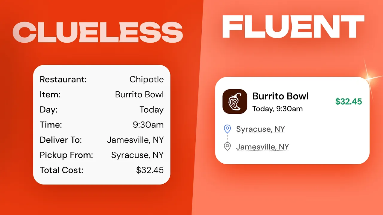
See how you just knew all of that? I didn't need to write instructions on how it worked because the UI was signifying how things worked. Good UI has many signifiers, like a button press state, highlights on active nav items, hover states, or even tooltips to tell the user what a UI affords or what it can do. Now, take a look at this card. It displays all of the information in a logical, repeatable format, but it looks like a spreadsheet, not a design.
So, let's give it some hierarchy, which is pretty intuitive. We have size, position, and color to use to our advantage. Starting from the top, an image always adds a great pop of color and makes scanning super easy, just like Uber. If in this case the item is the most important, we want that large and bold and at the top because otherwise it'll blend in with something like the time and date, which can be below and much smaller.
And it's this contrast, the difference between small and big or colorful and not, that actually creates the hierarchy. It's also why price should be at the top, right aligned, and blue. It's different than the rest, which draws the eye to it. The location should be smaller and below like this. But, instead of just from and to, we can use icons and align to demonstrate that it's moving from Jamesville to Syracuse without having to actually say that.
Now, with that said, it's not an exact science and you could definitely end up with a design that looks like this instead and it wouldn't be wrong. But, the same ideas apply. Most important things near the top, bigger and colorful is more important, and images are used whenever possible. And as you start to design more and more, you'll notice that similar patterns arise when you need labels or buttons, which we're going to talk about in a minute. >> [music] >> Now, some people have this misconception that all of your content needs to align to a 12-column grid and be exactly eight pixels apart.
But, these are just guidelines. For example, this design doesn't line up with any of the columns and that's not uncommon, especially for custom landing pages. But, for highly structured pages like galleries, blogs, or any repeating content, they can actually be useful for responsiveness by giving guidelines for responsive behavior on tablet [music] with eight columns and mobile with four. But, much more important than using excessive grids and layouts is white space, letting things breathe.
For example, in a simple section like this, the large text would have a font size and line height like this and the subtext would have a font size and line height like so. Buttons would be similar and optionally a top announcement bar like this. [music] Then, simply 32 pixels between every item, but you can also group elements that just go together like the announcement and text or the text and subtext, [music] which is just another form of visual hierarchy.
And this is where we see the four-point grid system actually come into play. Everything is a multiple, not because it inherently looks better, but because you can always split things in half, which creates consistency throughout a design. >> [music] >> Typography is really interesting because design is mostly just text. And for picking a font, I can almost unilaterally say you'll never need more than one for any design.
So, find a nice sans serif font like the ones on screen and stick to it. Over the last seven years of designing, I've rarely used [music] any fonts other than what's on screen and this shouldn't be where you're spending tons of time. I'm also not a big fan of calling any design skill a hack, but this one kind of is. This design looks okay right now, but our header text feels a little too loose. If you tighten up the letter spacing on this by about -2% to -3% and drop the line height to about 110% to 120%, it instantly makes any larger text look super pro real fast.
But, hierarchy with typography is a little bit more nuanced. And if we look at our previous example, text sizes can vary wildly. For landing pages and websites, you generally don't want more than six font sizes, which can have a really large range. For things like dashboards, that range shrinks dramatically [music] to where you don't normally have text sizes larger than 24 pixels because of the increase in information density.
But, honestly, one of the most important concepts of design is getting inspiration and doing research from a good source, like today's sponsor, Mobbin, who curates hundreds of thousands of mobile and web apps along with landing pages, too. So, you can always pull inspiration from real designs built by the top design teams in the world. [music] And if you're struggling with a specific section, just go and search for it and instantly pull up real-world examples with links to the live sites, too.
If you're interested, you can check out Mobbin using the first link down below to get 20% off. Now, back to the video. >> [music] >> Colors are difficult and everyone has their own taste, but I'm a big fan of starting with one primary color. Generally, this is your brand color. Then, you can lighten it for a good background or darken it for text colors. Both good ways to incorporate subtle color and make an otherwise drab design look much more interesting.
And with all of that, we're already halfway to a color ramp, which is what large companies use to build out chips, states, charts, and really anything else. But, I also think it's important as a beginner to let the color find you. Like an announcement bar to grab attention or a focus state on an input or the green new chip on a link. These are all semantic colors, which are colors that have meaning and provide signifiers to the user.
Blue for trust, red for danger or urgency, yellow for warning, and green for success. Make sure you use color for purpose, not just for decoration. >> [music] >> Now, designing in dark mode presents some pretty interesting challenges for us. First, this card is using a light border, which creates a bit too much contrast. So, we'll lower that down. In dark mode, we don't have shadows like light mode, so to create depth, we need to have a lighter card than the background.
So, I'll make that adjustment. This chip is also far too bright, so we can dim down the saturation and brightness and flip that for the text to create some hierarchy. There's also a ton of flexibility for deep purples, reds, or greens, not just navy blue or gray. >> [music] >> But, speaking of depth, shadows are a fantastic tool to use on light mode. This shadow, along with most, is too strong. So, reducing the opacity and dialing up the blur helps a lot.
The strength you'll need depends on the foreground and background, but cards require less while content that sits above other content like popovers will need stronger shadows. We can even use these techniques with inner and outer shadows to create effects like raised tactile buttons. Just remember, if the shadow is the first thing you notice on a design, you're not using it right. >> [music] >> Now, to create strong designs, you'll need icons.
Most icons are generally too large, so the trick is to get the line height of your font, in this case 24 pixels, and make the icons the same size and then tighten up the text. Sidebar links like this are actually just buttons without a background until you hover, which are often called ghost buttons. And if we isolate one and center it, we've got a perfect standalone button. These are super common when you have a primary and secondary CTA side by side.
And a good guideline for padding on these is to double the height for the width. And these can be done with or without icons, too. A good rule of design is when a user does anything, there should be a response. For example, every button needs at least four states: default, hovered, active or pressed, and disabled. Sometimes you'll need a loading state, too, with a spinner. Inputs are even more critical. You'll need a focus state when the user clicks in, error states with red borders and messages when something's wrong, and sometimes even warning states for optional issues.
And this applies everywhere. Loading spinners when data is fetching, success messages when an action completes, even micro animations on scroll or swipe. Every interaction needs a response. And that brings us wonderfully into micro interactions. Micro interactions are a form of feedback, but they step things up a notch. For example, this copy button has states and feedback when we hover and click, but we still don't know that we've copied anything.
Instead, if we have this chip slide up, that's a micro interaction that confirms our action. And these can range from highly practical to much more fun and playful. Finally, overlays are really important because if you screw them up, you're going to ruin the image and the text, too. In this case, we can't leave it as is, so we could add in a full-screen overlay, but it doesn't do the image justice. So, instead, add in a linear gradient that'll display the image then smoothly converge into a text-readable background.
Or, if we're going for extra fancy, we can add in a progressive blur on top of the gradient for an even more modern look. And that is more or less every UI UX concept all wrapped up in 10 minutes. If you want to check out Mobbin, it will be the first link down below and you can get the link to all of the Figma assets used in this video down there, too. Thank you so much for watching and I will see you in the next one.
The words are the caption track's own and nothing is reworded or re-transcribed. Paragraph breaks are placed between sentences so the text reads as prose.
Free tools for your own script. No signup, no login.
Paste your draft and see where viewers are likely to drop off, with a rewrite for each weak line.
Paste the first 30 seconds of your own draft for a hook score and rewrites.
Check your draft against YouTube's advertiser-friendly guidelines before you record it.
Read this channel's public videos and transcripts, and download a writing brief for it.