Getting the transcript
Reading the captions from YouTube. A video nobody has opened here before takes 10 to 30 seconds; this page fills in on its own.
Getting the transcript
Reading the captions from YouTube. A video nobody has opened here before takes 10 to 30 seconds; this page fills in on its own.
Wyatt Feaster · @wyattfeaster
Words
1,362
Runtime
9:23
Speaking pace
145wpm
Reading time
6min
145 words per minute, below the 160 25th percentile of 349 measured videos. That distribution comes from the 349-video hook study.
Opening (first 30 seconds)
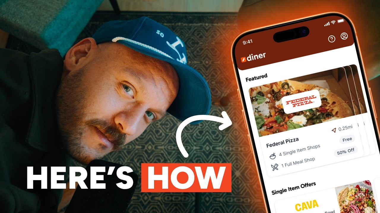
So many designers obsess over pretty UI, delightful animations, and micro interactions, yet they lack the skills to deliver something to their clients that actually drives results. Well, here's an app that I designed for a client called Diner. This app raised over $6 million in funding, onboarded 10,000 new users, and 90% of people that downloaded the app from the app store completed onboarding. Oh, and one very happy client. But to
73 words, the words spoken in the first 30 seconds at 145 words per minute.
Free, no signup. See how the first 30 seconds hold attention, with rewrites.
Sentence shape
| Measure | This transcript |
|---|---|
| Sentences | 78 |
| Average words per sentence | 17.5 |
| Longest sentence | 52 words |
| Questions asked | 9 |
| Sentences containing a number | 3 |
Most used terms
Filler phrases
19 in total: like 12 · kind of 4 · actually 3.
A literal whole-word count of the same phrase list the Prepublish browser extension uses, so a phrase inside another word is not counted and a phrase used in its ordinary sense still is. It is a count and not a judgement.
What this transcript is
Every word below is the caption track YouTube publishes for this video, pulled from the video itself and reproduced unchanged. It is not Prepublish's writing, not a summary, and not a re-transcription: it is the video's own published captions. English captions, generated automatically by YouTube, in the video’s original language. Source: the video on YouTube. A channel that would rather this page did not exist can ask for its removal through the contact page, and it is removed.
No Script X-ray for this video: YouTube shows a Most replayed graph only once a video has enough views.
So many designers obsess over pretty UI, delightful animations, and micro interactions, yet they lack the skills to deliver something to their clients that actually drives results. Well, here's an app that I designed for a client called Diner. This app raised over $6 million in funding, onboarded 10,000 new users, and 90% of people that downloaded the app from the app store completed onboarding. Oh, and one very happy client.
But to understand how we got here, we need to. And so in this video, I'm going to walk you through the entire process, start to finish, of everything that went in to designing out this app. And by the end of this video, we're going to cover the four phases that I go through with every single client to ensure exceptional results. Before beginning any project, we have to understand the why. I need to deeply understand the client's needs, where are they going as a business.
Who are their target users? What problems are they facing? What is the vision they have for their future? What things are working for them? What things are not? Without knowing this, the chances of success of this project are much, much, much lower. And sadly, this is often the most overlooked step in the entire design process. So, here's a little bit about the company. The company is called Diner, and they're a brand new company that's going 0 to one.
In a nutshell, this company's mission is to provide restaurants with data about food, vibes, and service to help them improve their businesses. and two, collect that data from diners anonymously by providing them discounts on their meals or comping them free menu items. So, here's what I was tasked with. I had to design their guest app from the ground up. This app had to accomplish a few key things. Number one, it had to leverage their existing brand identity that they just finished up.
Number two, it had to provide a low friction experience during onboarding. Number three, it had to make discovering dining experiences simple and fun. Number four, it had to help them grow. Five, it had to feel polished enough to earn users trust. And number six, it had to stay out of the way while people were actually dining. We didn't want to make it invasive. Next up, we had to align the core experience. We knew in general what we wanted it to feel like, but we really had to get into the details about what that customer would experience when they interacted with diner.
After we walked through all the different friction points, we eventually landed on a vision we felt good about together. User browses an app, books a date, goes to a restaurant, enjoys a meal, provides feedback to the AI, and then cashes out. Once we'd aligned on that vision, it was time to start architecting. As I was going through the experience, I was thinking about a number of different questions. How do we introduce new concepts early?
How do we get users introduced to the AI as soon as possible? How can we surface value props to them? How do we make sure people know exactly what to do next? I knew creating an outstanding onboarding experience was going to be critical because it's the user's first impression of our app. So, we ended up landing on the AI avatar guiding them through the entire experience. Then it was time for the fun part. I usually start my design process by gathering inspiration, looking through places like Pinterest, downloading apps, and asking the client what things they like, what apps they like, what visual design directions they like, so I get a good understanding of what kind of things to be looking for when gathering inspiration.
I knew the client wanted a minimal, clean, scalable aesthetic that let the restaurants and the food breathe. really tapped into their orange, red, yellow, maroon aesthetic and making sure that that use was very intentional. I like to download real apps in the app store, play with them, and see what's working for them and what principles we can take to then apply to this visual design direction that we will be presenting to the client.
For this one, one of the things that was really important was looking at inspiration of food apps and then apps that use a primary avatar to guide their user through the onboarding experience and make that first time experience feel really kind of magical and memorable. So, the client ended up picking this direction. It's a clean, minimal, exclusive aesthetic. And with that in mind, I got to work. Now, we can't actually cover every single part of the app that I designed out.
Otherwise, this video would be longer than the Lord of the Rings director's cut, but I do want to cover a few key areas of the experience. Like we touched on previously, we built out an AI avatar to help guide them through the entire experience through onboarding. It helped them enter personal information, showed them offers about what to expect, showed them how to browse the app, and it gave the users proper expectations of what to expect when interacting with the AI Tracy during their dining experience.
Once in the app, she helped users check in and confirm their day of booking. After their dine, she gave them a score telling them how good their feedback was. Organic discovery had to be easy. So, we introduced a label system that allowed people to quickly differentiate between a full meal or a single item offer. We also designed out a wallet experience that made it super easy for people to cash out via their bank account or Venmo.
One of the awesome things about the wallet is it helped the business to manage cash flow better. When we get to delivery, I like to do as much of the delivery process as prototypes as I can, especially for things like interactions, animations, and just seeing complex features like map views where you have to scroll through things and swipe and pinch to zoom. It really just helps me and the team get a good feeling of how a user will feel in the moment and like do interactions feel clunky or not because just doing that through exclusively Figma screens is tough to get a feeling for that.
Now I still deliver most of the stuff in Figma because it's a lot easier for developers to go in and kind of get a pulse of everything that's possibly needed. So combining Figma screens with prototypes really helps us to get great outcomes for the final product. So now I'll drop in and walk through a little bit of the final Figma file so you can get an idea of kind of the breadth of work that we worked on for this mobile app.
So without further ado, Heat. Heat. N. And at the end of this whole thing, none of this design and implementation and prototyping and all of this stuff really matters unless it's driving the results. It's solving users problems and ultimately helping the business move forward. And if you remember at the very beginning of the video, this app within the first 6 months got to 220 cities, onboarded 10,000 users, and helped this company raise $6 million in funding.
So, the results speak for themselves. This app did exactly what it was supposed to do, and at the end, me and the client were extremely happy with the outcome that we got. So, to wrap the whole thing up, if you're a founder or a team looking for help on your mobile app or your next design project, I'll go ahead and drop my link in the description where you can fill out some information and we can talk more. But, if you made it to the end of the video, I hope you really enjoyed it.
I hope you learned something in this process. Hit the like and subscribe button and we'll catch you
The words are the caption track's own and nothing is reworded or re-transcribed. Paragraph breaks are placed between sentences so the text reads as prose.
Free tools for your own script. No signup, no login.
Paste your draft and see where viewers are likely to drop off, with a rewrite for each weak line.
Paste the first 30 seconds of your own draft for a hook score and rewrites.
Check your draft against YouTube's advertiser-friendly guidelines before you record it.
Read this channel's public videos and transcripts, and download a writing brief for it.