Getting the transcript
Reading the captions from YouTube. A video nobody has opened here before takes 10 to 30 seconds; this page fills in on its own.
Getting the transcript
Reading the captions from YouTube. A video nobody has opened here before takes 10 to 30 seconds; this page fills in on its own.
Wyatt Feaster · @wyattfeaster
Words
1,237
Runtime
7:40
Speaking pace
161wpm
Reading time
5min
161 words per minute, between the 160 25th percentile and the 181 median of 349 measured videos. That distribution comes from the 349-video hook study.
Opening (first 30 seconds)
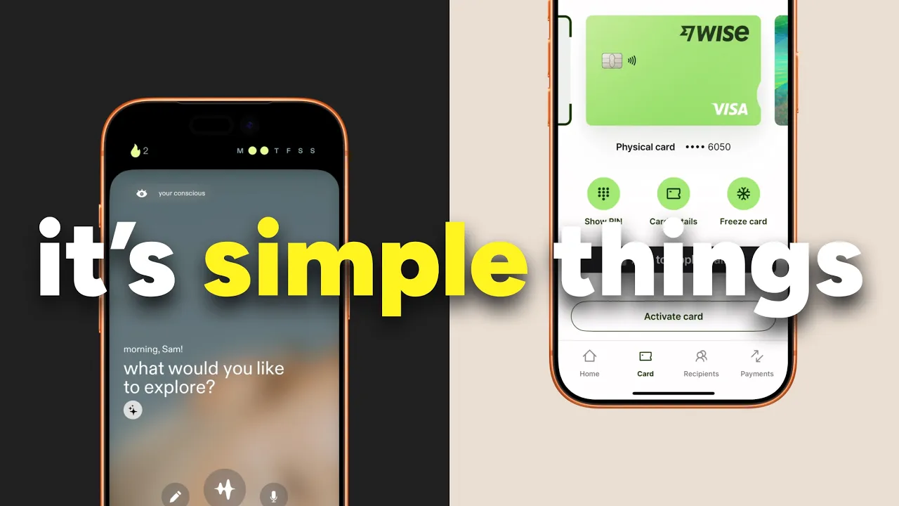
Do you ever look at an app and think this thing feels super expensive and premium like someone had spent thousands of hours on and tens of thousands of dollars on to design and build? Well, in this video, we are going to dive into the things that make an app feel premium and expensive. And the best part about this whole thing is that they're super easy things that you can take and go apply to your app today. So
81 words, the words spoken in the first 30 seconds at 161 words per minute.
Free, no signup. See how the first 30 seconds hold attention, with rewrites.
Sentence shape
| Measure | This transcript |
|---|---|
| Sentences | 82 |
| Average words per sentence | 15.1 |
| Longest sentence | 49 words |
| Questions asked | 3 |
| Sentences containing a number | 2 |
Most used terms
Filler phrases
12 in total: like 8 · actually 1 · kind of 1 · sort of 1 · uh 1.
A literal whole-word count of the same phrase list the Prepublish browser extension uses, so a phrase inside another word is not counted and a phrase used in its ordinary sense still is. It is a count and not a judgement.
What this transcript is
Every word below is the caption track YouTube publishes for this video, pulled from the video itself and reproduced unchanged. It is not Prepublish's writing, not a summary, and not a re-transcription: it is the video's own published captions. English captions, generated automatically by YouTube, in the video’s original language. Source: the video on YouTube. A channel that would rather this page did not exist can ask for its removal through the contact page, and it is removed.
No Script X-ray for this video: YouTube shows a Most replayed graph only once a video has enough views.
Do you ever look at an app and think this thing feels super expensive and premium like someone had spent thousands of hours on and tens of thousands of dollars on to design and build? Well, in this video, we are going to dive into the things that make an app feel premium and expensive. And the best part about this whole thing is that they're super easy things that you can take and go apply to your app today. So without further ado, let's get into the video.
They recommend and anticipate the user's needs. They remove friction for users by meeting them where they are. You can think about this when you go to a high-end hotel or party or wedding. How things are thought ahead for you. They bring the meal to you. They bring you a welcome drink. They do a turnown night service so that your bed is ready before you go to sleep. It's the little things that meet you in the moments that provide this sense of this premium expensive feeling.
And there's no difference in how the best apps do this. It's why we see recommendations, prefilling information, and delivery windows. They leverage transitional states with intentional pacing and timing. Now, I know that's a mouthful, but let me explain a little. Elevator music in the real world is a great example. When you're in a luxury hotel, they have peaceful music and luxurious smells. It makes that transitional period between entering the elevator and exiting the elevator a less awkward and a more delightful experience for the guest. and premium apps do the same.
Think about little things like how long should an animation actually take before moving on to the next screen or how do you elevate what is happening during that process. Everything is thought through and you feel that because it doesn't feel disjointed. One second right before we continue. If you're enjoying the video so far, hit that like and subscribe button, drop a comment. It really helps the channel grow and I appreciate everybody that is here from the last video.
Okay, let's get back into the video. Leverage moments of delight in big moments and in small moments. These can be things as simple as password entries. It can be as big as moments as completing an action. Excellent apps find moments across the user experience to give the user delight. You'll find things like micro animations or a 3D transition effect like Instagram has when you switch between stories. When you complete something on Straa, they have a printing animation to add some user delight.
These aren't things that necessarily need to be there, but they're things that create this expensive and just this luxurious feeling because when we start to feel something, we enjoy it more. Know when not to animate. the most expensive apps. Understand that there's a time and a place for animations, but there's also a time and a place to not use them. Apps that animate everything, it feels wrong and it slows the experience down.
And it often slows the experience down in critical moments. Could you imagine if there was an animation loading every single time you tried to enter some piece of credit card information? It would get really frustrating. Sometimes the most premium apps just get out of your way when you need them to. They don't do all the flashy stuff. Extreme consistency. So much so that it feels invisible. I'm talking icons, colors, spacing, fonts, interactions, everything that goes into what you would consider traditional UI.
But when it's executed at a high premium level, you don't notice. It's why when you go into apps with tons of font styles, tons of colors, all of the stuff is kind of a little bit off by one or two pixels, it feels wrong, but if you don't have a trained eye, you don't notice. It can be something as subtle as one icon is a filled icon and the other icon is a stroke icon. And it feels wrong, but you really don't know why that is.
And that's because of the attention to detail that these high-end apps have. Empty states that have intention. When an app executes empty states extremely well, they never deadend users. There's always some sort of way for them to exit their dead-end experience. You can think about this in a couple different ways. When a user goes to a place that they've completed all of their actions, they say there's nothing here, and then they give them an alternative route to go do within the app. or they use those opportunities to promote other areas of their app that they want to upsell.
They always give their users an alternative thing to do rather than just say, "Uh-oh, this is not the right place or you have nothing here." It's why when you land on a platform and you've never posted a single thing, they'll often say, "Create your first post or why invoicing apps say create your first invoice." It's to give you a stepping stone to the next part of the experience. The reward discovery. You can think about this like a little treasure hunt.
The apps that feel the most expensive and premium give users little nuggets here and there in places that are unexpected. Like when a user books a stay with Airbnb, after that's confirmed, the user gets a little postcard of where they're going. That little unexpected moment is only discovered by interacting and engaging and exploring through the app. That's what makes the experience feel special. It's what makes you remember the app.
Error states that feel prescriptive. When the premium apps execute this extremely well, they don't just tell their users there's a password problem or an error occurred, but rather they provide them with steps to solve their own problem and how to take action on it. Could you imagine if you were asking for directions and a person only said, "Nope, wrong way. That's not a very helpful person." So why do we so often see apps do this, but the premium ones know not to do this?
It's an expensive feeling with very minimal effort. And so that reaches the end of our video. That is what I feel makes apps feel expensive and premium. It's all of the little micro things that these apps do that elevate those apps to the next level. It's why sometimes you just can't explain why they feel expensive because a lot of the times it takes the trained eye and a trained designer and a team to really dive into the weeds and figure out those little moments of improving the experience that elevate it 10fold.
Hopefully, you found a few nuggets in here that you can take away and immediately go apply to your app today. There's some really simple ones, there's some right in the middle, and then there's some that take a little bit longer to implement. If you made it to the end of the video, I appreciate you so much for being here. Hit the like and subscribe button, and we'll see you next time. And as always, if you need help implementing some of these things, fill out an information form on my website and we can chat further.
Peace.
The words are the caption track's own and nothing is reworded or re-transcribed. Paragraph breaks are placed between sentences so the text reads as prose.
Free tools for your own script. No signup, no login.
Paste your draft and see where viewers are likely to drop off, with a rewrite for each weak line.
Paste the first 30 seconds of your own draft for a hook score and rewrites.
Check your draft against YouTube's advertiser-friendly guidelines before you record it.
Read this channel's public videos and transcripts, and download a writing brief for it.