Getting the transcript
Reading the captions from YouTube. A video nobody has opened here before takes 10 to 30 seconds; this page fills in on its own.
Reading the captions from YouTube. A video nobody has opened here before takes 10 to 30 seconds; this page fills in on its own.
PJ FinanceShow · @pjfinanceshow
Words
4,119
Runtime
30:30
Speaking pace
135wpm
Reading time
17min
135 words per minute, below the 160 25th percentile of 349 measured videos. That distribution comes from the 349-video hook study.
Opening (first 30 seconds)
Uh >> hi everyone. Our presentation explains how we used a shared research project to structure financial sector analysis. The objective was not to ask for a stock pick immediately. But we built a top- down process that starts with the economy, narrows to financials and its industries and then tests company level evidence. Part one explains the research design and part two shows how the research led
68 words, the words spoken in the first 30 seconds at 135 words per minute.
Free, no signup. See how the first 30 seconds hold attention, with rewrites.
Sentence shape
| Measure | This transcript |
|---|---|
| Sentences | 284 |
| Average words per sentence | 14.5 |
| Longest sentence | 183 words |
| Questions asked | 9 |
| Sentences containing a number | 51 |
Most used terms
What this transcript is
Every word below is the caption track YouTube publishes for this video, pulled from the video itself and reproduced unchanged. It is not Prepublish's writing, not a summary, and not a re-transcription: it is the video's own published captions. English captions, generated automatically by YouTube, in the video’s original language. Source: the video on YouTube. A channel that would rather this page did not exist can ask for its removal through the contact page, and it is removed.
Uh >> hi everyone. Our presentation explains how we used a shared research project to structure financial sector analysis. The objective was not to ask for a stock pick immediately. But we built a top- down process that starts with the economy, narrows to financials and its industries and then tests company level evidence. Part one explains the research design and part two shows how the research led to two focused two focused peer comparisons.
We begin with the shared workspace project goal and research prompts. We then explain chart analysis, the red team challenge processes and the refinement from version one to version two. In part two, we move from the financial sector into the selected industries and companies. BNY is compared with State Street. Chub is compared with Travelers. The final discussion separates operating evidence, valuation screens, and the work still needs needed for a fully underwritten investment decision.
The shared project gave our group a place to organize chats, reference files, and research instructions are all around one assignment. Its role in this presentation is collaboration and continuity. Team members can review contributions and build on the same research context. The important distinction is that a shared workspace organizes the work. It does not validate the conclusions though. We still need to inspect the sources, check calculations, and challenge assumptions before treating an answer as an investment evidence.
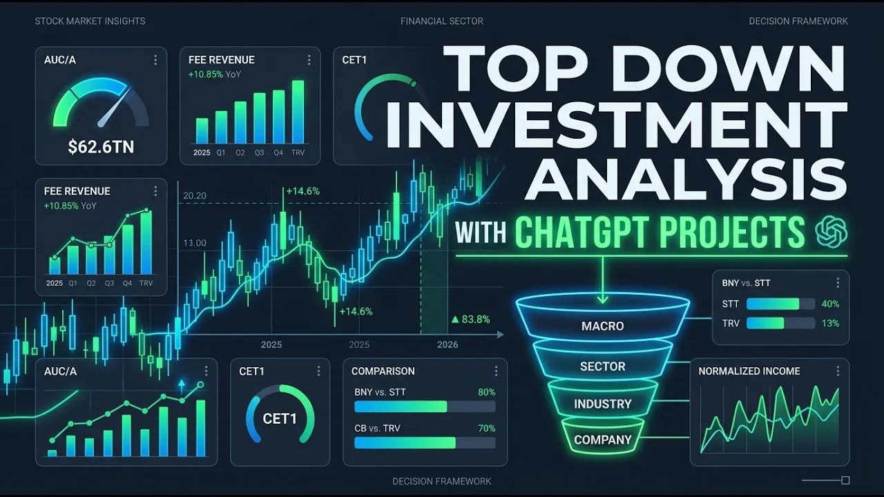
Read the framework from the top of the pyramid to the bottom. Macro sector, industry, then company, ETF, or asset recommendation. Each stage narrows the question and identifies which evidence is needed next. Macro conditions describe the environment. Sector work tests the breadth of the financials thesis. Industry work in identifies the business models worth studying. Company work checks whether the selected businesses and the price support and investment case.
A positive result at one level does not automatically pass the next level. These are two enlarged crops of the project's actual source list. They show 10 reusable text prompts, five macro frameworks, plus sector, industry, company, SEC, chart, and red team. The files define research context, permitted sources, analytical questions, and evidence checks. They are instructions rather than economic data sets. A file's presence does not prove model fine-tuning, a working data connector, or successful execution of the framework.
The five numbered macro prompts each as a different part of the economic question. Number one, macro Fred focuses on macro and financial signals. Number two, macrobea organizes output, income, spending, and price evidence. Number three, macro BLS organizes labor, prices, compensation, and productivity. Number four, macro treasury data focuses on government funding, debt, auctions, and cash management. Number five, macro World Bank provides global and development context.
The next slide shows a combined dashboard layout followed by one image of each numbered framework. [clears throat] This master image illustrates how the five frameworks can be placed along one another. Read each column for its question strongest signal contradictions and monitoring priorities. Then look at the synthesis panel at the bottom. Use the image to explain the dashboard uh architecture not to announce a newly verified macro regime.
Its printed information cuts off cut off is November 10th, 2024. While the other dashboard images display different dates and periods, they do not establish a synchronized evidence set of the September 2026 investment discussion. The FRED image uses five sections: economic analysis, market implications, top signals, data quality checks, and monitoring plans. It determines it demonstrates how a dashboard can connect individual observations to an interpretation while keeping confliction uh conflicting evidence visible.
Explain. Explain the layout. Rather than reading over every number, a source identifier helps trace a series, but neither an identif identifier nor a chart establishes the value, date, or interpretation has been that has been checked. This illustration is labeled as of January 31st, 2025. It is not the September 2026 evidence underlying in part two. The BEA dashboard illustrates the emphasis on output and demand uh composition, PCE, inflation, household income and saving, investment and profits.
Analytical question is not simply whether GDP increases but uh which components supported it and whether the private demand was durable. The image is labeled Q1 2025 second estimate released May 2029 2025. Treat it as a sub a supplied historical visual rather than a fresh economic assessment. The numerical the numerical scenarios and completeness labels shown inside the picture have not been adopted as a verified forecast or implement imple implement implication results.
The BLS image separates employment, labor utilization, prices, job turnover, compensation, and productivity. And separation matters because payroll growth alone cannot answer every labor market or inflation question. Use the accessibility um and counter counter evidence panels to explain the intended discipline. Establish uh which dimension can be evaluated. preserve contradictions and identify the next useful steps uh next useful observations.
The images a uh images April 28, 2025 cutoff and mixed references uh reference periods are historical not a current uh labor market reading or for this presentation. The treasury dashboard is a a financing framework rather than simply a yield chart. It sections covers it section covers debt composition, maturities, auctions, interest costs, cash management and financing oper financing operations. The intended insight is to distinguish related but different questions.
A higher market yield is not the same as the average cost on outstanding debt. And the treasury co the treasury cash balance is not a directed a direct measurement of bank reserves or asset turnover. The supplied image cuts off cutoff is November 8, 2024. So its values should not be presented as current as September 2026 conditions. The World Bank dashboard adds global development and country context. It illustrates why growth, poverty, trade, debt and human capital conditions can differ across regions even when the global headline is stable.
It displays operate uh it displays observations. It displays observations are mainly from 2022 to 2023. Use it as an example of framework uh of the framework's broader perspective, not as evidence that every country is experiencing the same current conditions. Comparisons require consistent definitions, periods, and coverage. A global aggregate can conceal large country level differences. Okay, so that covers the macro side.
The next five prompts take us from the economy down to individual companies. And the first is the sector prompt. The question asked is simple. What does the broader environment mean for financials as a whole? The key words are as a whole. We didn't want one bank or one insurer to stand in for the entire sector. So the problem maps the industries inside financials, who the major players are, and how concentrated the sector is.
It also keeps two things separate. how the businesses are actually doing and what the market already expects. A good operating trend doesn't mean the stocks are attractively priced. Uh for our project, this prompt's job is to tell us which areas deserve deeper research. Um as we move to the industrial um industry, once we know which areas look interesting interesting, the industry prompt goes down one level. The question here is where within financial should we look?
Uh this is about the e econ economics of specific business models. Um how do firms compete? What do pricing and costs look like? How much capital does the business need? And how does that trend actually turn into earnings or cash flow? And the most important idea on this slide is the last line. An uh an attractive industry is not automatically an attractive investment. An an industry can have strong durable demand and it stocks can still be expensive.
So this problem narrows our research list and it doesn't make the pick for us. Okay, moving on to company SEC. The company prompt is where we test the thesis against what companies actually report. Uh it's a filings first approach. We start with the 10K, the 10 Q's, the 10, the AKs, and the filing exhibits. From there, we look at the company's key metrics, earnings quality, liquidity, and capital structure. And we also check management's claim against the numbers and look for contradictions.
Um, one rule we restrict about is anything that comes from an SEC filing, uh, is labeled as a reported fact. Uh, market prices and valuation assumptions are labeled then separately. Then one honest limitation, um, is that this prompt, this is a text prompt, not a live connection to the SEC database, and we're not claiming a complete filing review for every company. Okay. So, next for the chart. The chart prompt gives us a consistent way to read any chart we're handed. uh first identify what we're looking at the security and the time frame right so then the technicals trend momentum support resistance and volume then context like sentiment or catalyst and finally it checks for distortions is the scale misleading was the time window cherry picked is data missing inside our industry work we use it to narrowly uh we use it narrowly only for technical and reliab reliability checks a charge can support or challenge the fundamental story it can provide it can't provide why a business is doing well and on its own it doesn't justify a price target or a trade so red team is the prompt that sits across all the others um at every stage it challenges three things the information we receive the prompts we build and the conclusions we form uh uses four lenses logic does the conclusion actually follow the evidence uh evidence does the source support the exact claim incl including the time period and the size assumptions was hidden dependencies uh could hidden hidden dependencies challenge the results and al and alternative explanations.
What else could credibly explain the same evidence? The goal isn't to discourage isn't to disagree with everything. We keep what holds up uh correct what's overstated and identify what would change our view. Um and just to be transparent, red team ran on the same AI model as the original research. So his structure is self-checked, not an independent audit. And then for V1 to V2, refining our research prompts. The last slide shows how we use the red team to improve the prompts themselves.
Um, if you read left to right, version one sets the prompts purpose, scope, source rules, and output. Uh, red team then pressure tests it and looks for unclear instructions or gaps that could let the model give a confident answer without support. The team reviews those suggestions and decides which one to adopt. We didn't um accept changes automatically. The approved changes become version two which is the prompt we actually used.
Um so that's how we built the framework. We will now uh move to um next part which is our investment recommendation. So we now move from our project design to the investment research application. So the following slides will show us how the sector evidence uh was eventually narrowed into industry priorities. Um and then we took two different groups of company comparisons. The recommendation is framed by the evidence actually available.
Um the aim is to show why our four finalists uh deserve comparative diligence while preserving the distinction between a promising business and a fully underwritten purchase. The map orients the audience to the range of activities within financials, banking, consumer finance, payments, asset management, and capital markets. Um, as well as insurance and market infrastructure for servicing. Uh, sorry, could you go back a slide?
Uh, the image is an illustrated business model map. So, it's it's not strictly a onetoone classification, but the companies can span over different activities. Um, and the example names do not imply these recommendations yet, but our subsequent focus does narrow. Um we start to look at custody and investment servicing with BNY and State Street as well as um underwriting represented by CHUB and Travelers. Uh next slide.
Yeah. So the sector focus the sector report records uh mixed macro settings. So during quarter 2 of 2026, our real GDP grew uh 1.5% annualized. Um July's real consumption increased less than about.1% month overmonth and August CPI increased 3.4% year-over-year. Um these are different reference points and periods from our supplied report within the macro framework. Um the analytical implication um is that the business model uh is that there's a business model differentiation.
So rates can affect yields, funding, demand and valuation in a lot of different ways. uh we therefore kind of focus going forward on the recurring earnings um as well as usable capital rather than assuming that a single macro directional um would benefit all financials. So the refined sector report replaced isolated examples um with a match panel of the 10 largest uh XLF holdings. XLF being the ETF that tracks financials.
Um they represented about 57.2% of the fund's weight. Um and their summed report net income increased uh 49.29% for the June ended 2026 quarter versus the comparable last year's 2025 quarter. So growth remained uh 32.23% and after removing Birkshshire and JP Morgan from both of those periods. Um but the two accounted for about 63.28% of the panel's overall dollar increase. Um the direction survives the concentration test. uh its magnitude is sensitive to the largest contributors.
Um so this further supports our research. It's not a proof of sectorwide recurring uh profit acceleration yet. So the supplied sector um must must show that XLF uh lags spy across those measured windows. So, it source table reported over a 30-day trading period um that price returns for XLF were negative 3.37% while the S&P SPY uh sits at.89%. So, year-to- date returns uh comparatively are about 1.99% 2% uh for the financials and spy is 11.7% as well as the 12-month returns that show XLF um returning about 3.2% 2% while the S&P sits close to 15%.
This divergence from stronger reported earnings does raise a question about our expectations and valuations. Um the charts horizon though um or are separable comparisons. So there's really not one continuous return path. Um price weakness alone does not establish those fund outflows. Um but it does cause an intrinsic value discount. So the red team review uh strengthened our evidence um while narrowing the interpretation.
Uh the expanded match panel supports large cap reported earnings resilience more credibly than a few selected examples. So what does it not prove um [clears throat] is equally important is that sectorwide recurring profit acceleration um is a universal benefit from overall higher rates within their net interest income or the cheapness based on a lower multiple. Um the revised research direction uh is a test of durability through the their business model um using different fees underwriting quality funding capital and valuation.
Um this is an analytical refinement. So it's separate um as we go from version one to version two in our prompt process. So the industry work place uh several le capital markets and disciplined PNC um underwriting first servicing offers a test of reoccurring fees um mandate conversion and delivery cost um insurance requires uh a test of underwriting profitability after uh catastrophe and reserve effects. So the selected banks remained a separate um JP Morgan to PNC workstream.
Um payments remained uh the first candidate for promotion but cash conversion capital returns and the valuation needed more evidence overall. Um this is a research priority decision. Um and it's not a portfolio allocation or an expected return ranking. So the refined issuer diligence report screens eight US listed equities across four peer work streams. Um the team's four finalists are Bank of New York Melon BNY uh State Street uh asset management for the investment servicing side as well as Chub and Travelers um within the underwriting side.
Um the presentation's eight security uh intermediate step describes the attached issuer report not the team's broader 12 company exercise. So we started out with 12 companies and narrowed down putting them into you know exceptional quality intermediate and then okay but not good enough for our thesis. So the other report pairs um JP Morgan, PNC, Visa, Mastercard but our two finalists in each selected lane are the genuine uh alternatives.
So the first name introduced is not automatically the preferred security though which we will get into next. Before comparing names we defined what would change our view for servicing. Recurring fees must support full delivery costs. Mandates must convert into earned revenue and funding and capital must remain adequate. For insurers pricing must cover loss costs and the underwriting result must survive reasonable catastrophe and reserve normalization.
Valuation remains a separate test for both groups. This slide sets the standards we apply to the company evidence rather than adding different standards after seeing which company looks best. BNY's report shows Q26 fee revenue of 4.036 billion up 10.85% against expenses of 3.439 billion up 727%. that supports a reported fee versus cost improvement. Net interest income of 1.446 billion in share count reduction also contributed to the earning stories.
This 62.6 trillion of assets under custody or administration belongs to clients. It is not BNY's own capital. Report C1 was 11%. The investment question is whether recurring fee economics and usable capital justify the valuation relative to State Street, not whether the latest quarter was strong. State Street's Q2 fee revenue was up 3.188 billion, up 17.25%. GAAP expenses were 2.659 billion, up 5.1%, and net interest income was 860 million.
Those figures support operating improvement, but the expense comparison requires a base effect adjustment. The supplied reports expensely adjustment reduces the prior year base to 2.412 billion. Against that base, expenses grew 10.2% not 5.1%. The next question is whether mandate wins become recurring earned revenue after full implementation and servicing costs. A pipeline is not recognized revenue. Compare BNY and State Street within the servicing peer group.
Both report fee growth, but State Street's apparent expense advantage must be read within its prior year notable items. Client assets, net interest income, and regulatory capital describe different dimensions of the business. The 15.7 multiple and 12.5 multiple PE figures here mechanically annualize one quarter of earnings per share. They are not fiscal AI forward PE or demonstrated sustainable earnings multiples. A lower screen deserves investigation, but the same cost mandate conversion and capital standards must be applied to both companies before choosing a winner.
On the other hand, Chub's report shows a Q2 property and casualty combined ratio of 83.8%, a current year X catastrophe ratio of 82.2%, 2% and core operating income of 2.842 billion. The evidence supports profitable underwriting while core income remains a company defined non-GAAP measure. Lower catastrophe losses and favorable prior year reserve development contributed to the result. Chub also combines global property and casualty reinsurance and life activities.
So the PNC ratio is not a profitability measure for the entire group. The next test is whether pricing reserves and capital sustain the economics across periods and business lines. Travelers reported Q2 net income of 2.208 billion and a combined ratio of 83.6% compared with the 90.3% a year earlier. The stronger reported profitability is a distinct finding from the underlying margin acceleration for the first half. removing catastrophe contributions and reversing favorable reserve development gives 84.7 in both 25 and 26.
The calculation is 86.1 - 6.0 + 4.6 for 2026 and 96.3 - 14.8 + 3.2 for 2025. The core question is how much of the earnings improvement remains after catastrophe reserve and capital effects are normalized? Compare Chub and Travelers as underwriting peers while retaining differences in business mix and measurement. Their Q2 headline combined ratios are close, but the underlying row juxtaposes Chub's current year end current year XCAT measure with Traveler's first half underlying measures.
The income row also compares CHUB core operating income with Traveler's GAP net income. These rows organize the next research questions. They are not interchangeable measures from which to select a numerical winner. Align periods, catastrophe definitions, reserve development, investment accounting, and capital before making that judgment. Within servicing, BNI displayed price to book ratios 2.4 times versus State Streets two times.
Its PE is also higher at 17.2 times versus 16.2 times. For the underwriters, Traveler's PE is lower than Chubs, 10.2 versus 12.1 times, but its PB is higher, 2.4 versus 1.7. These are vendor displayed comparisons, not a new valuation model. Within servicing, BNY has the higher displayed PB and PE than State Street. Within underwriting, Travelers has a lower displayed PE than Chub, but a higher PB. The valuation lenses, therefore, do not produce one automatic winner.
Do not rank the four firms by share price or earnings per share level. Also, do not substitute these pricetobook values for the earlier price to tangible book calculations. Check that price dates, earnings periods, and book definitions align before drawing a purchase conclusion. In servicing, state streets forward PE is 11.9 versus BNY is 15.7 times. PEG is.5 versus 1. This is not proof of undervaluation. For underwriters, travelers also shows a lower forward PE 10.9 versus chubs 12.3 times and PEG4 versus one.
Verify forecast bases. Keep the two peer companies separate. Comparison separate. State Street's lower forward multiple and PEG make it a valuation challenger to BNY. Travelers has lower displayed forward PE and PEG than than CHUB. Neither observation proves that expected growth will occur or that the market has mispriced risk. The screenshot does not identify the forward earnings horizon, estimate contributors, PEG growth window or accounting adjustments.
In the insurer pair, forward PE exceeds displayed PE for both names that could reflect different expected earnings or measurements bases and is not itself proof of an of an earnings decline. In servicing, BNY's $153.79 price exceeds its displayed 138.98 high. Verify the data. State Street is 5.9% below its high. For underwriters, travelers is 5.4% below its displayed high versus chub 6%. Range position alone does not establish value.
The distance calculations used divided by displayed high. State Street is 5.9% below its high. The BNY row is internally inconsistent for a common date range. The 153.79 price exceeds the 100 138.98 price displayed 52- week high. Withhold a BNY range or breakout conclusion until dates and adjustments are reconciled. With an underwriting, Travelers is 5.4% below its displayed high and chub is 6% below. Their positioning is similar on this narrow measure, but being near a high is not evidence of intrinsic value, future return, or an entry opportunity.
In servicing, BNY shows higher ROE 13.4% versus State Streets 12.4% and ROA 1.2% versus.9% in the snapshot. For underwriters, travelers ROE is 26.5% versus CHS 14.4%. test whether the gap survives reserve and cata cat catastrophe normalization within the servicing pair. BNY shows higher displayed ROE and ROA than State Street with an underwriting. Travelers displayed ROE is substantially higher than CHS. These are separate peer observations, not a ranking of underwriting against custody ex economics.
The larger insurer return gap needs a per a persistence test. The existing reports identify catastrophe and reserve effects and differences in equity and business mix can also matter. Verify comparable periods and denominators before treating the gap as a structural advantage. Accounting return ratios are not shareholder total returns. The four gates distinguish a promising operating story from a completed investment case.
Identity and dated prices are documented in the reports. Normalized earnings, capital and funding, and explicit downside remain only partially developed. The industry reports model work was not equally complete for every peer, and the later company reports retain important gaps. A stress calculated from the observed price is a sensitivity, not an independent fair value. The new vendor comps add context, but don't automatically close the unresolved gates.
Our recommendation is to advance the two strongest supported comparison work streams. BNY versus State Street and servicing le capital markets and chub versus travelers and discipline PNC underwriting. The decision hinges on recurring capital supported earnings at a defensible price. The comps reveal valuation and profitability differences inside each pair, but unresolved measurement normalization and capital questions prevent a fully underwritten purchase conclusion.
Research priority is not capital allocation and no portfolio weights or transaction instructions are being proposed. Thank you for listening. We welcome questions on the research structure, the evidence behind the two-pier comparisons, and the additional tests needed before choosing a security. For valuation questions, return to the peer or fiscal.ai slides, and distinguish displayed ratios from normalized earning power.
For process questions, return to red team and explain which conclusions survived, which were narrowed, and what evidence would change the view. Thank you.
The words are the caption track's own and nothing is reworded or re-transcribed. Paragraph breaks are placed between sentences so the text reads as prose.
Free tools for your own script. No signup, no login.
Paste your draft and see where viewers are likely to drop off, with a rewrite for each weak line.
Paste the first 30 seconds of your own draft for a hook score and rewrites.
Check your draft against YouTube's advertiser-friendly guidelines before you record it.
Read this channel's public videos and transcripts, and download a writing brief for it.
Filler phrases
120 in total: uh 55 · um 55 · actually 6 · like 2 · kind of 1 · you know 1.
A literal whole-word count of the same phrase list the Prepublish browser extension uses, so a phrase inside another word is not counted and a phrase used in its ordinary sense still is. It is a count and not a judgement.