Getting the transcript
Reading the captions from YouTube. A video nobody has opened here before takes 10 to 30 seconds; this page fills in on its own.
Getting the transcript
Reading the captions from YouTube. A video nobody has opened here before takes 10 to 30 seconds; this page fills in on its own.
Wyatt Feaster · @wyattfeaster
Words
2,243
Runtime
13:13
Speaking pace
170wpm
Reading time
9min
170 words per minute, between the 160 25th percentile and the 181 median of 349 measured videos. That distribution comes from the 349-video hook study.
Opening (first 30 seconds)
The design of your product can make or break your experience. It determines whether or not people come back to your product, whether or not they share it with their friends and their family, and whether or not they trust it enough to put in their credit card and convert. Listen, I get it. You got AI. You can build with it. You can ship with it. You can design with it. But the problem with most of that is stuff shipped with AI has
85 words, the words spoken in the first 30 seconds at 170 words per minute.
Free, no signup. See how the first 30 seconds hold attention, with rewrites.
Sentence shape
| Measure | This transcript |
|---|---|
| Sentences | 143 |
| Average words per sentence | 15.7 |
| Longest sentence | 60 words |
| Questions asked | 10 |
| Sentences containing a number | 8 |
Most used terms
Filler phrases
52 in total: like 19 · um 11 · kind of 7 · right? 7 · actually 3 · uh 3 · sort of 1 · you know 1.
A literal whole-word count of the same phrase list the Prepublish browser extension uses, so a phrase inside another word is not counted and a phrase used in its ordinary sense still is. It is a count and not a judgement.
What this transcript is
Every word below is the caption track YouTube publishes for this video, pulled from the video itself and reproduced unchanged. It is not Prepublish's writing, not a summary, and not a re-transcription: it is the video's own published captions. English captions, generated automatically by YouTube, in the video’s original language. Source: the video on YouTube. A channel that would rather this page did not exist can ask for its removal through the contact page, and it is removed.
No Script X-ray for this video: YouTube shows a Most replayed graph only once a video has enough views.
The design of your product can make or break your experience. It determines whether or not people come back to your product, whether or not they share it with their friends and their family, and whether or not they trust it enough to put in their credit card and convert. Listen, I get it. You got AI. You can build with it. You can ship with it. You can design with it. But the problem with most of that is stuff shipped with AI has absolute garbage experiences.
So in today's video, I'm going to walk you through the list of five things that I put together that should be able to help you get better design outcomes when you are creating and shipping with AI. And if you stick around to the end, I will walk you through a live working session where I will build out a design using AI that looks really, really good and doesn't look like you just prompted one time and clawed and got absolute garbage results that you don't want to ship and that people can sniff out immediately.
So, without further ado, let's get into it. Starting us off here at number one, it is know where the hell you want to take this thing. In order to get really good outcomes with AI, you need to make sure that you are giving it enough context to where it knows the long-term vision of where you're going with this product and design. It needs to know the target user you're going after, the general premise of this designer product that you're working on.
Hell, even create a PRD document like you would normally give to a designer or an engineer to make sure they understand the full blueprint of what you're trying to get out of them. Think about treating them like an intern. You have to give them all of the context and information about where you're going long term so they can digest that, understand it, and then be able to take that first step moving towards the right direction.
Number two here on our list is to go slow. Do not try to oneshot the whole thing. You hear that about development and the coding side of things, but the same holds true for design. I think on the design end, everybody tries to think you can just say build me a landing page to do this or build me a mobile app flow for this and think it's going to get a really good job of doing it right out the gate. It does not. When you are creating the designs, tell it to go screen by screen, one thing at a time.
If I'm doing an onboarding experience, I'm going to say start with the homepage. Then we want to move into enter a phone number. Now we want into move into creating the personal information page. Then we want to collect the email and we want to go sequentially one thing at a time so it understands the direction that we are going. When we get a foundational piece in place then it is very easy for it to take the next step and create a higher quality design.
The deeper you get into it oftent times the better the quality gets. So, make sure you take it slow, meticulous, and be very prescriptive about what you want it to do next. If you don't give it enough guidance and you don't make it go slow enough, it's going to go wild and lose its Just like the first time a middle school boy opens up that National Geographic magazine. Okay, number three here is tell it what you don't want it to do.
Just like mom when she'd tell you all the things you can't do to have fun as a kid, you got to do the same thing here. So, make sure you tell it don't wander off on the fonts. Don't pick new colors. Don't pick new styles. Don't pick weird interactions. Don't add drop shadows. We don't need all of these extra features that it might add. Be very prescriptive on the stuff you don't want it. Don't introduce these things.
Sometimes telling it what you shouldn't do is actually more helpful than telling it what it should do. All right, number four. This is probably one of the controversial ones, or I don't know if controversial is the right word, but this is probably the one that isn't talked about enough. Give it limited references. You hear a lot about give it all the context, all the references, all the images, all the design styles, but what I found by getting deeper and deeper into this is the less visual context references that you can provide it, the better output that you're going to get.
For example, if I want to create a welcome screen on a mobile app or if I want to create a transitional screen to scan somebody's payment information, I want to give it one screenshot of a design that I like. tell it what I want to create, what information I want on that page, and then I want it to generate it. It has already the business context, but that's all I want to do. If I give it two, three, four, five different styles of design that are kind of all in the same ballpark, it does a terrible job.
It's like giving an intern to say, "Here's 10 design styles that I like all in the general reference. Now create me a design that looks very similar and has the same sort of feeling. It's not going to work. Limited context when doing onetoone design for specific screens and high quality output makes all of the difference in whether you are going to get AI slop or not. The last one on the list here is to make sure you go through revisions, right?
So quality check the AI's output. Make sure that things flow properly, that the hierarchy makes sense. AI tends to do a bad job at hierarchy, going through the whole page and making sure that the right things take visual priority. If you're a user, you're coming there to understand the product. What things are offered to you? Are you able to find those pieces of information really quickly and easily? If not, make some revisions to it.
Tell the AI to tweak that. One of the things that AI likes to do is to give priority to things that don't make sense to have priority. It likes to add additional little features here and there that aren't relevant to your business. It likes to feature bloat things. It likes to infer and guess. And so doing that last line of defense of quality control makes a huge difference on that final output. One of the biggest things you can do that separates garbage from high quality output is to make sure the sizing and the spacing and the color consistencies all match up.
It likes to do tons and tons of variety. So, make sure there's consistency to those things. And that all comes down to revising that final output before you send it out. So, with those quick five things in mind, let's get into the demo. I'll show you. I'll walk you through it. And then hopefully by the end of it, you'll be able to produce better outcomes for yourself. Okay, we're going to go ahead and live demo this together here.
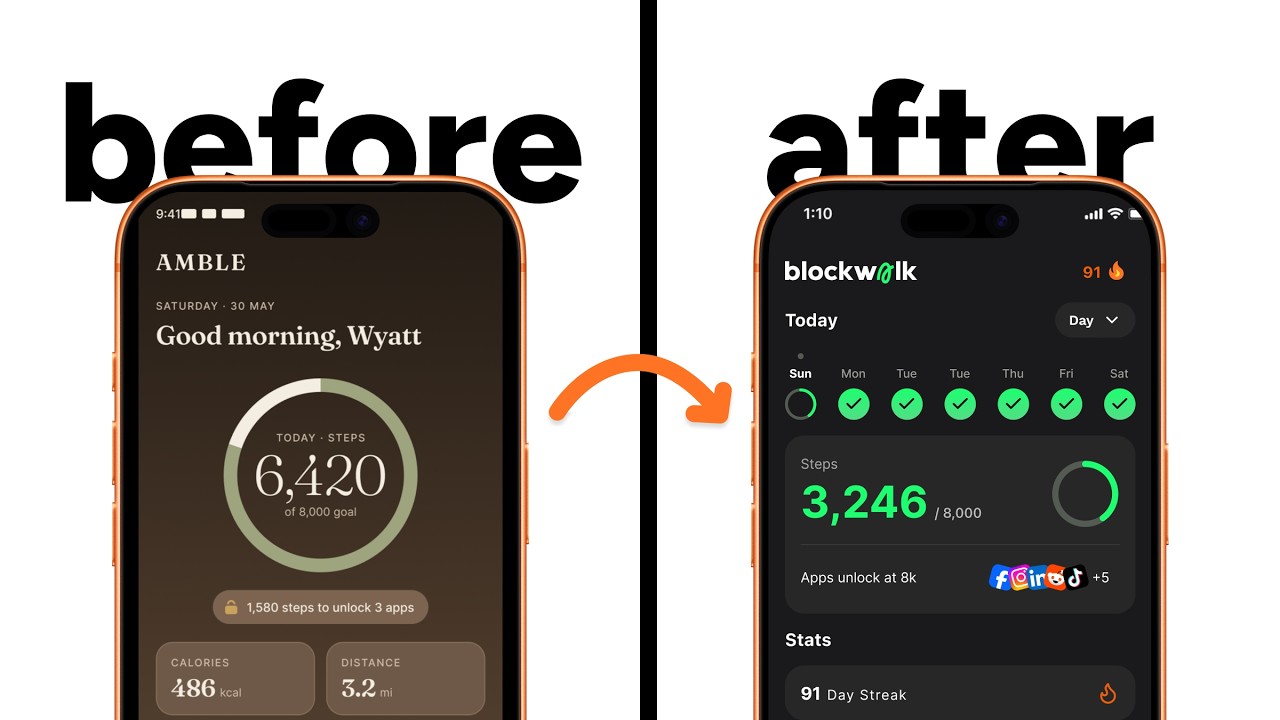
So, what I'm going to do is I'm going to work on my own product, BlockWalk here. And this is a product that allows you to block your distracting apps until you hit your daily step goal. In this situation, we want to add a screen into our mobile app that allows us to have a milestone for when somebody hits 30 days of consecutive blocking of their apps and hitting their step goal. So, a milestone of you have hit your step goal for 30 days straight.
We want to be able to add that milestone into it. um and we want AI to build that for us because that could take a lot of iterations for us to do. So in this example, we're going to do that. So let's just do an example of what happens if we just prompt it and we tell it to build it for us without any context. What happens with the AI slop? So I'm going to write in what for it to do and then we're going to check back.
Okay, so we create a quick prompt where we said, "Create me a 30-day milestone screen for when user has 30 days of consecutive hitting their step." Create it in this Figma file. Make sure to use auto layout. I have attached some references that I like. So, I'm going to actually hit share, copy link, and we're going to have it created live in this cinema file. So, I'm going to hit You can see the references here. We just kind of did one like this, one like this, one like this.
All just kind of having badging, right? So now we're going to create and we'll check that one step. This is kind of like what we do if we have too many references. So it's taking a little bit of time, but we can see that it's live creating on this other screen here. It's live creating the design based on the parameters we gave it and the references that we have. And it's also creating it um based on some of the light styles that we already have, which are some greens and some creams and some white colors within our color product.
So, it looks like it's finished up, but in all honesty, it's not the greatest thing, right? Like it looks AI generated. There's some weird things here that are going on, and we can get a lot better results with this, right? Some simple, easy design fixes we can do is just remove these weird white backgrounds and just have everything the same color or we just make everything be um green, right? But we have those as the baseline, right?
So, we can do some things. It cuts off some weird angles. It does some weird Uh we don't want it to code content. It's a little bit better with a little bit of revising. And now let's see if we give it less reference images how we can get a better outcome. Okay. So, what we're going to do is we're actually going to go into cursor and we're going to change this here to from auto. We're going to turn this off and we're going to go with the really expensive one.
This does take a lot of credits, but we go to Opus4.8 because it makes a significant difference. Okay. Now, we created a new prompt. Create me a new version. Make the design vibe like this reference image. Create some kind of badge illustration for the 30-day milestone. Make sure to use auto layout and dark mode created in the same Figma file. And so we're going to use this single milestone. From there, we're going to have it generate it with Opus 4.8.
We're going to have it create in the actual file and then we'll check back in when that's done. This one will take a little bit longer. Okay, so we're back. The first report that we got is this night and day difference, right? Because of the reference image we used, it's a lot better. And the polish level is significantly better. It already kind of knows that we need to add a CTA to the bottom to make it feel like that extra level of polish.
So, we're going to tell it to do that. We'll check back in and then it's pretty good to go. Okay, we've reached our final outcome and we've got it's got to this. So, with a little revisions and some updates to the model, tweaking a couple things, we've got to our final outcome. And you can see the significant difference when you just give one reference image versus multiple and the quality of inference and output that it does.
Um, I've tried it with other models as well and it still produces better outcomes when you only use one reference image that you like. Um, the highest quality one obviously is the Opus 4.8, but other ones still do pretty good outcomes. Um, but yeah, that's kind of the walkthrough how I've been able to get it to um, you know, create significantly betterly polished designs and output. and then um move forward with it. So uh obviously this is the UI piece at the end here, but if you are a founder and you still feel like you need some guidance on the experience, how to prompt um to build out a mobile app MVP to do anything of the sort, um feel free to reach out to me.
I'll drop my link in the description uh for my design services. But um otherwise, I appreciate everybody that made it to the end of the video. Hope you found some value in this and we will see you next week. Peace.
The words are the caption track's own and nothing is reworded or re-transcribed. Paragraph breaks are placed between sentences so the text reads as prose.
Free tools for your own script. No signup, no login.
Paste your draft and see where viewers are likely to drop off, with a rewrite for each weak line.
Paste the first 30 seconds of your own draft for a hook score and rewrites.
Check your draft against YouTube's advertiser-friendly guidelines before you record it.
Read this channel's public videos and transcripts, and download a writing brief for it.