Getting the transcript
Reading the captions from YouTube. A video nobody has opened here before takes 10 to 30 seconds; this page fills in on its own.
Getting the transcript
Reading the captions from YouTube. A video nobody has opened here before takes 10 to 30 seconds; this page fills in on its own.
Waqas Qazi · @theqazman
Words
10,494
Runtime
50:27
Speaking pace
208wpm
Reading time
44min
208 words per minute, above the 201 75th percentile of 349 measured videos. That distribution comes from the 349-video hook study.
Opening (first 30 seconds)
15 years of color grading experience and this is what I learned. There's only finite amount of looks that your clients are going to ask you to create. If you're working on a commercial for a product, they're going to want a crisp, clean look. If you're working on a documentary, they want a natural look. If you're working on a music video, they want you to push the envelope. If you're working on a narrative, depending on the genre, it's either a sci-fi look or a summer blockbuster look or a no country for old men natural films look. The problem is when
104 words, the words spoken in the first 30 seconds at 208 words per minute.
Free, no signup. See how the first 30 seconds hold attention, with rewrites.
Sentence shape
| Measure | This transcript |
|---|---|
| Sentences | 964 |
| Average words per sentence | 10.9 |
| Longest sentence | 104 words |
| Questions asked | 115 |
| Sentences containing a number | 57 |
Most used terms
Filler phrases
539 in total: like 314 · right? 43 · uh 43 · I mean 35 · you know 31 · actually 20 · kind of 18 · um 17 · basically 11 · literally 4 · sort of 3.
A literal whole-word count of the same phrase list the Prepublish browser extension uses, so a phrase inside another word is not counted and a phrase used in its ordinary sense still is. It is a count and not a judgement.
What this transcript is
Every word below is the caption track YouTube publishes for this video, pulled from the video itself and reproduced unchanged. It is not Prepublish's writing, not a summary, and not a re-transcription: it is the video's own published captions. English captions, generated automatically by YouTube, in the video’s original language. Source: the video on YouTube. A channel that would rather this page did not exist can ask for its removal through the contact page, and it is removed.
No Script X-ray for this video: YouTube shows a Most replayed graph only once a video has enough views.
15 years of color grading experience and this is what I learned. There's only finite amount of looks that your clients are going to ask you to create. If you're working on a commercial for a product, they're going to want a crisp, clean look. If you're working on a documentary, they want a natural look. If you're working on a music video, they want you to push the envelope. If you're working on a narrative, depending on the genre, it's either a sci-fi look or a summer blockbuster look or a no country for old men natural films look.
The problem is when you're working inside Resolve, it's a blank canvas when you first fire it up. So, you really know what you're doing and you have to build these looks from scratch. A bigger bigger problem is that regardless of the type of project you're working on and how big or small it is, unless you're company 3, you're just not going to get the budget or the time to build something like that from scratch. So, what do we do?
We need something that can get us there quickly and with uncompromisable results. We also need this solution to give us full autonomy so we can make that look ours. We also want it to be easy for people that are just getting into this world to get professional results. At the same time, we want it advanced enough so the power user can really put it through its paces. Well, I'm happy to tell you the solution does exist and it's called Rapid Grade.
It's easy to use, but it's built on complex and very sophisticated infrastructure to make sure that everything that you work on using Rapid Grade ends up looking like a Hollywood movie. Talk is cheap, so let me put it to action. For those that don't know me, my name is Kazzy. I work with brands like Adidas, Amazon Prime, Universal Studios, and I make no just straightforward [music] color grading tutorials so you can work with your dream clients.
All right, so inside Resolve, um, we have a super super simple setup. All right, four nodes. We got our input device transform. We're taking Alexa footage, converting it to Da Vinci White gamut, which is our working color space. That's what I prefer. And then on the um output, we're just taking the Da Vinci wide gamut and exporting to REC 79 gamma 2.4. Okay, so that is a pretty simple straightforward setup. And just look at what kind of dream is this like where you can work off of four nodes and by the time we're done with this look, it's going to be completely transformed and it will boggle your freaking brain and we didn't need to go 30 nodes node tree, which my actual node tree is pretty intense.
So, if I were to take you here and drop one of these, I can just drop this and you can see I mean it's not super intense as some people's not tree and usually people have like pre-clip and post you know group clip and all that going on and you can do that but this is a very distilled version of best bang for your buck. But then right now we're working with this. So this is really really crazy. And when something is super simplified, it doesn't always mean that it's watered down.
Because anytime you listen to Warren Buffett, one of the most successful investors of all time, when you listen to him, he makes everything sound so simple that you're like, "Dude, you have no idea. Let me talk to somebody who can really crunch numbers and talk nerdy." And that's the difference. People that talk nerdy, they're usually overcompensating for something else. uh people that know how to simplify things are the ones that have that higher level understanding.
Okay. So what I'm going to do is this uh this is just our balance node. This is uh what the shot was like before touching anything straight REC 79 conversion. I just went and did this. Um all I'm doing is just one move our HDR pallet global offset. Just look at this. Just a tiny nudge brought the exposure down just a touch. All happening on the global scale. Why? because we want to make broad changes right now. We just don't want to get granular.
Don't ever get granular when it comes to balance. Okay? Balance means something is tipped off, right? It's either too magenta, it's too green, it's too red, or it's too blue, and you just go there. Or to cyan, and you just go there, and you just like turn the entire wheel, right? To kind of just like get it in that center point. Our entire goal right now is anytime you're balancing your shot, just have your vectors scope on and just make sure that you just move everything closer to that crosshair.
Okay? Not unrealistically when it makes sense. Sometimes if everything is lit with blue lights, you can't do that cuz you're going to strip all that juice, that color out of your image. So, now that we have this, I go right here in this node. I go to my effects, open effects right here. I open that up and I just go here and type in rapid grade. Obviously, you guys are not going to see that because you guys don't have it.
You can download the trial version. If you want to give it a shot, go on the website. Link is going to be in the description. Scroll all the way down. Okay. So, right under the different plans that we have, you're going to find a link to download the demo. So, go ahead, play with it. I think it's a 7-day or 3-day trial. So, now full access, it's just going to have watermarks, but you really get to experience the entire thing that I'm going to take you through.
So the way I want to do this is how I built it instead of like top to bottom. I mean it is sort of built that way but still I don't want to give you a linear explanation of this. I want to give you like the real hands-on realworld scenario of this and then you it will really make sense to like what makes this different than the tools that we have inside resolve the other free tools that are available or the paid tools that are available.
What makes this stand out among the rest? And that's the entire idea. Okay. So, first of all, when you dump this on, it is going to be set to Da Vinci white gamut because I'm assuming that that's your working color space. You can just go ahead and change that. You can work in ASUS, you can work in AR, like you know, you got, you know, you pick your poison, whatever you want to go with. Okay. Right underneath that, we have oneclick look.
So, this is our pride and joy. This is our main like heavy hitter that's working for this tool where you're not getting generic custom LUTs that somebody learned to make over the weekend. This is somebody with 15 years of experience working with multi-billion dollar brands. I've been in every single situation. And what makes me so proud of this setup right here is that I'm just giving you all the looks. You know, in the beginning of the video what I talked about, there's only x amount of looks people are going to ask for.
I gave you all of those. So, under the essentials pack, this is basically endgame. Okay, this is genuinely basically endgame. You just go there and you start selecting going through these and they're named not cleverly. They're named very like as it sounds and I like to do that. So, I don't want to be too cute too clever because then it's a problem for a lot of people. My content is not just being purchased by people in the United States, you know, it's purchased from people all over the world.
So I just want to take out the something getting lost in translation. So when you click on look and you go through all these I mean think about what you're looking for. Click on that and it'll give you that and we'll go through it later. Okay but that's the entire idea. Okay so the oneclick look system and especially essentials pack which the product comes with. That's it. You're done. You have every single look that's not 90% there.
It's 110% there. If you want to then spice it up on top of it, make it yours, you can. But this is the real artillery that it comes with. Okay, let's go down. Then we have our film look because anytime somebody is building a cinematic look, cinematic equals filmic, right? Like try to make it look like film. And then what makes something look like film? When you guys go here under LUTs and under film looks and when you drop one of these Kodak 2383 or Fujifilm 3513, what is happening?
It's basically just going under these curves and making a lot of manipulations in your curves and then that's what's giving you that specific look. So we start with that. We start with our curves and we have bunch of different flavors. Okay. So if you go under presets you have three different flavors of 2383 because when you use Resolves 2383 it's very much on the nose. It's very very aggressive. Well here we have three different flavors.
We have three different flavors of 3513 and then we have something very unique. So when you watch movies like The Wolf of Wall Street or Knives Out and stuff like that that really stands out, really pops, they usually have concoctions, right? Like obviously they're using a film negative emulation, right? To give it a certain look, like as something was shot on a film negative, a specific film negative. And three of the most popular ones that again are used on movies like The Wolf of Wall Street or Knives Out or 5207, 527, 5219.
And then we're concocting that with the 2383. All right. Everybody is like beloved. If you want a Joker look 5219 2383. Okay, that's a very similar concoction and then you can just take it from there and make it yours. So all these are already present here. And the this is the theme of this entire tool which is every major thing is going to be preconfigured. You're either going to have a preset created by me or you're going to have all these different tools preconfigured.
And the idea is that I don't want to give you a blank canvas because we already talked about the frustration is like if you're straight in Resolve and you're trying to create a look, it is a blank canvas. And that's just not what's happening in 2026. You want to start off from a good launching off point. So here I'm preconfiguring every single tool in here to its optimal settings. Now if you want to take that and move it around and get whatever specific thing you're looking for, do it.
But why don't I use my experience to tell you what I personally think in my humble opinion, somebody who's created this tool, have so much experience to be like this is the sweet spot. This is where I would park it. I'm giving you all the training tools. This is for amateurs and for advanced users. It's just like, hey, this is the taste making and everything that took place over the course of 15 years. And I'm saying park it right here.
And now if you want to play with it and take it somewhere from there, totally up to you. go do it. Right? So, curves is our main thing. Then our highlight tone. Um, before I just like hover over and tell you these things, why don't we just start cooking something up? We Let's just start making something up because that's a lot more fun to like really see what's happening. So, the first thing that we want to always do is go all the way down to charts and turn on two types of charts, okay?
Color chart and exposure ramp. Amazing. Because right now it's telling us nothing is happening. The entire image is untouched. And then once we start building our look on top of it, we'll know what we're doing to the highlights. We'll know what we're doing to our shadows. We'll know what we're doing to our mid tones. Are we cutting a lot of dynamic range by having a very strong contrast? Are we like just crushing our blacks?
Do we have to let that breathe a little bit more? Are we contaminating our like undertones too much with like lots of gunky green or something like that? This is where like the detective work happens and really you can hone in and create a look that is just one of one. Same thing here. What are we doing to all these colors? Are we intensifying certain colors to make them nuclear and now they're going to just like look awful on random screens?
Okay, dial it back. Are we adding enough film density in certain colors because maybe they're just too poppy and too bright and we have to like tone it down. This helps you do all of that. So now that these two charts are on, I'm going to go under curves. I'm going to turn on show curves so we know exactly what's happening. And it's broken into blacks, undertones, midtones, highlights, and then our whites. Okay, so once I go in here, let's just start with some concoction, right?
So we'll do 5217 and 2383. I absolutely love this. So if I do before and after, you're already seeing the amount of difference we're making. And you're seeing it on the curve, too. like what's happening here. You're seeing like all the different variations in our RGB. And this is something very interesting that's happening. It's going to lock 18% gray. I mean, at this point, it is not like rocket science. Like, you've probably seen a billion videos out there uh talking about 18% gray and what that is, but basically, if your DP knows what he's doing, he shoots something a certain way, he doesn't want you to mess with his exposure.
He wants you to mess with everything else but leave the actual meat of the exposure where uh it was intended uh to be left. So if I take this and start moving it around, you see like that point doesn't change. And that's the entire idea. Like our 18% is locked in. And we have to give it proper IDT and working color space. So then when the color space here matches with this right here, it does the right 18% gray. Because if I change this to something else, I mean, I don't know.
Let's try it. it's going to throw it off. It's going to throw off our 18% gray. All of a sudden, it's like really lifted. Okay. And now when we bring it back, this is when it's going to work properly. So, this is the only technical part of color grading that I feel like does require just a little bit of understanding. Outside of that, play with it. It's play-doh. Like, it just like go in there, just start messing around with it.
Like, mold it into this thing and then that thing and something else. Like, just have fun with it. It's not that rigid. Like, people turn it into like a straight jacket. Like, I mean, color grading is all about math. Like, I don't know what the they're talking about. It's not. It's not. Let's just have fun with it. Okay. Or how about you let somebody else do all the sophisticated crazy color science and math on the back end.
So, on the front end, you just move things around and crazy magic happens and your clients lose their You look like a superhero. It's no different than me driving a McLaren Arura, like, you know, my new car, and it makes me feel like an F1 driver and I'm not. And it's no different than us using an iPhone and like my dad can easily like who can't even print a document can just go on here and talk to Chad GPT all day long.
How is he doing that? Because technology just makes it so simple that it gets out of its own way and it just becomes like a very beautiful user experience and that's what we're looking for here, right? We want to take something very complex and we want to hide it and we want to give you a very easy userfriendly interface on the front end. So you can just like click through, move things around and magic happens. So we're going to do exactly that.
You see like how we selected this. It's preconfigured. It's already dialing in the settings perfectly. Now you can go and start making changes. I mean you can go well the blacks are looking good, the undertones are looking good, but I want to lift it up a little bit more. I want, you know, this area to breathe a little bit more. You can easily do that. Like we just did that, right? Like just lift it a little bit. Maybe you can go, "Hey, I really like when the greens are kind of pushed in the midtones.
It creates like a very nice like 80s uh look, like a vintage look." And I agree with you. See, like how it just adds like this little green in the sky. And it's just the right amount. It looks kind of cool. So, let's do that. All right. And then we can just park it. We can come out of it. All right. Let's go into highlights tone. And then when as soon as we turn it on, look at what happens in this area. Okay. 3 2 1. You see this preconfigured?
All right. So, it's already like dialed in to where it should be. Now, go and have fun from that point on. And I want to actually crank it a little bit more. And I want to move it around. I want to add a little bit of warmth like this. Okay. Magenta. It looks really uh pleasant to the eye in the sky. And it looks really nice on the uh on these like right here tents. And just overall, it's telling us right here the salmon that we're adding.
Okay. So, if I do before and it's like this, I mean, it's okay, but it kind of looks like a hospital, like inside the hospital at night, you know what I mean? Like those lights like that are so cold and like I don't know, it makes you feel sick. Whereas here, we just like warmed it up the right way. Now, we can pull back the intensity and we can do before and after, right? Pull it up a little bit. But like you know now that's such a perfect balance and it's such a nuance thing like color grading the actual the ultimate goat grades like when you think about pool or something like that the entire dance is happening in the nuances it's not happening like caked on caked on no no they get in there and they just like manipulate that one aspect of the like image like how we just manipulated this we left the rest as is and it's just such a unique change like go find it in other tools or it's going to happen.
It's not going to happen at this level. It's not going to happen like this because everything is just selected so perfectly that nothing is going to give you any artifacting. Move these around. Everything is going to be perfect. As a matter of fact, let's turn the show graph off. We take this, we move it around. Nothing is clipping. There is no chatter. There's nothing like that. It's absolutely gorgeous. Perfect. Dynamic range.
We're not going to touch for that one, but we're going to touch it. Actually, we can try it. So, dynamic range is done in stops. And the best thing about it is that you can just hover over on any tool and it'll tell you a little descriptor. It'll tell you anything that you need to know. So like our highlights and shadows are actually handled in physical stops. So I can come in here and I can do negative one and hit enter and just look at what it did.
How it like gave me so much dynamic range right here. I mean I can do before like look at this and then after. Look at that. All right. Gave me so much dynamic range. Nothing is clipping. Nothing is haloing. I can just grab that, move it around. Everything is perfect. Okay. And uh we can do the same thing with shadows if we want to, right? Like lift it up. Very different than like the operation that you would do in your uh in here.
I mean, as a matter of fact, we can give that a try. So, let's just create a new node. Um actually create a node before this. And then I can go lift up the shadows. You see how it's just like lifting everything and it's just making it so nasty and gunky. Like there's so much grain that's coming in. Like noise, not grain. Like a good grain. Uh, same thing with highlights. If I pull it down, like what is this? Like it just makes the entire im it it just like literally pulls down the entire image and there's not much control over it and it just like looks really bad.
Whereas here we're just genuinely going in and we're going all bring it down about a stop and it's only like it's telling you what it's doing and that's why these charts are so important too. Okay, so that's what's happening here. We can turn this off. Come in here. Okay, this is going to absolutely blow your mind. All right, because this is where that entire thing that I'm talking about like preconfiguring every single parameter.
Watch this. 3 2 1 split tone. All right, enabled. Look at the sky. Look at what just happened. And then it left everything else as is. So, let me do it again. Before and after. Like look at this split that is happening in our image. I mean, look at the vectorscope. Okay, this bam like what it's doing. How much separation it's creating. Is it too much? Sure. Click right here. Five. split it in half if you want to. If you're one of those, you know, that just doesn't want to like jump like head first, do that.
That's okay. Another thing that you can do is balance. Let's just go actually make the strength 100 so you can see what's happening. Keep an eye in this right here, our exposure ramp. I'm going to grab the balance. I'm going to start moving it around. Now, this is telling you exactly when that change is happening. So, I actually brought it out. I actually like left these three as is and I brought up the change from here on.
You see why these charts are so important and why like everything works like in perfect harmony what we're doing. And now look at the change. It's just happening in this area. Like it's almost like it's a 3D sky. It's almost like a sky replacement and we just did that right here. Remember like in our highlight tone first we warmed up the image then we go to split tone and we cool off like those areas but it doesn't affect anything else.
Now remember when I showed you when we right click and we go to gamma and we do the linear and we turn off like our luma mix and all that stuff. All that is already done in here. Your global adjustments are all in linear and they're just exactly as if you were making these changes in camera. So you want to brighten something up 0.25 quarter of a stop. We just lifted it. Okay. I'm I'm just like having fun. I'm just doing that.
You want to add warmth or something just use your temp and tint. Okay. Very different than your temp and tint right here. Let me try to do that using our primaries. Look at this. Like like look at this. Okay. Or how about tint? Like look at this. Look at this. Like what happens to the temp and tint here? And now if I go here and do the same exact thing, very very very different results. Okay. Just like again as if this was happening in camera.
So do we want to do anything with it? Like I don't know. Like does this look better? I think this looks kind of better. It just cleaned up the entire overall image and it's a very natural change again as if we were making these changes in camera. My favorite thing now we move on to shot correction. So you see how beautifully everything is broken. We just worked on film look creating that film look. And if I do before and after, we made a world of a difference.
This is a very sophisticated look. Everything is popping out, right? But we're just getting warmed up. We're just getting started. So now in shot correction, what are some of the common things that you would touch on when it comes to shot correction? It's always going to be your skin tones. It's going to be foliage. It's going to be your sky. It's going to be a little gunk that we get with digital. Anything that's shot digitally, it just has like this like yellowish green gunk that sits there.
Well, we have a fix for all of that in here. Let's just start from the bottom. Gunk removal. Turn it on. Look what it does right here. You see this right here? And you click it. Click it. It just sucks in all those low-end undertone yellowish green thing that sits there. It just pulls it and makes it hella clean. Now, if I just punch in and we look at this area and this area and like all those areas, it's a very nuanced thing once again, but it's always the nuance things that make all the difference in the world.
Okay, that's what gunk removal is doing. Pre-selected key. Okay, you want to go all the way, you can go all the way. And now you're really going to see the change that it's doing. And it's actually a pretty cool change. It's actually a really cool look. It's leaving the skin tones and everything as is. Nothing is cracking, nothing is breaking. Let's move it around. Everything is going to hold. This is the theme of this or any product that I create.
I created in a way that you can do this. How much fun is this? When was the last time you used a tool where you can just crank it all the way and it doesn't break? Usually like you go 5% here, 5% there, and everything cracks and breaks and they say, "But it's technically correct." And the math backs it up. Nobody gives a When I'm using these tools, I want to have fun with it. I want to move it around. I want to get like what I want.
I want it to be confidence and inspiring. Once again, I'm going to keep using car an analogies because I freaking love cars. I'm selling my Horacon Evo rear wheel drive. I'm selling my Lambo. Why am I doing that? It's a rear wheel drive car over 6600 horsepower meant to play with you. So, the back comes out. It's a widowmaker and it's called that for for a known reason, right? So, when you're driving it, you just put the throttle down, you put the foot down.
It doesn't even matter how gentle you are. It wants to play with you. It comes out, right? What happens? You're not like inspired to push it. You're not confident enough to push it. Especially when you're just an enthusiast. You're not a professional driver. Whereas my McLaren, I mean, holy hell, dude. Like, it's crazy. It, like I said, it just makes you feel like an F1 race car driver. It genuinely is on rails. And then it's the car that's doing 95% of the work, but making you feel like you're doing 100% of the work. because if it like takes the driver's engagement completely out, then it's not fun.
So, that's exactly the mindset that's being trickled in here. I'm going to always put everything at the perfect spot, but then if you want to move it, go have fun with it. And even when you move it, you're not going to lose like we just saw here. You're still going to feel like a superhero, especially in front of your clients. Okay, let's just keep going. I'm going to go to skin tones. Oh man, this is like the thing that we worked on the longest and the most and it's the most rewarding.
Okay, this one guy right here, Popkin, is an absolute cheat code. You will not find it anywhere else. Obviously, now that this tool is out there, somebody is going to like replicate and create it and try to make it feel like they came up with it. This right here, there's a lot happening under the hood. Okay, the stuff that we're doing is basically seven, eight different parameters inside Resolve that are coming to play to just give you the result and the experience that you get by moving this pop skin.
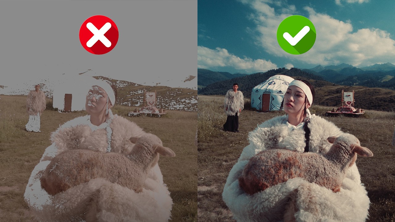
So, if I grab it and if I start moving it, look at what's happening to the door in the back. Look at what's happening to our lamb. Look at what's happening to her face. And I'm again cranking it all the way. You see like how look at what's happening to these guys. How is just popping their skin? And if I just park it right here. And if I just do before, lifeless. I mean, good. Natural. After. How it just pops. Look at what it's doing to her.
Right. Before and then after. And we're not playing it safe. We're pushing it. Okay. Before and after. At this point, maybe we can go rotate skin. Let's just add a little bit of more magentaish thing, right? Let's give it like a little bit more rosy tones before. Look at our color charts right here. And it really gets to tell us what we're doing with these tones. Okay. Absolutely gorgeous. If your skin tones are looking too rosy here and too yellow here, you can use even skin tones to like, you know, bring it all together.
We don't need that here. If the lips are looking too brown or something like that, rosy skin are going to make the uh lips and you're again seeing it here. What's happening, right? Like I mean we can just see it here and like you know fix everything just by looking at it like here what we're doing right. Um okay the skin got like I really like Kazzy that we're pushing the pop but the skin is getting too saturated. No problem.
Go to saturated skin. Pull it down. Right. So now we have the punch in the skin without making it looking too artificial. Radiant skin. Perfect for darker complexion because you can just go in here and lift it up. Look at what's happening to the door. Look at what's happening right here. Okay, if you really need it, it comes in handy for a specific job, for a specific project. Right now, if I do before and after, just look at this.
This is insane. All right, go to sky. What do we want to do with the sky? Do we want to like have fun with it? Keep an eye on this chart and let's start moving some things around. Do we want to add more depth into the sky? Like look at this, right? So, it's just like again bunch of different parameters working in the background to give you that for you. is just like moving couple of sliders. Do we want to add more blue?
I think in this particular example, a little bit bluer uh looks kind of nice. Do we want to saturate it? Do we want to add more punch into our sky? Maybe we want to keep it somewhere around here because I really want to put more punch into the browns. Okay. What do we want to do with the exposure? Do we want to bring it down a little bit? Make it like darker. It's about to rain. About to have a crazy storm. Let's go before and after.
Very subtle changes, but we get to see the changes right here. Okay. Now, foliage. This is the most fun part. Um, we shot this in winter and the client wants it to turn it into fall. How do we do that? Well, it's pretty simple. We just go under hue and we just start moving it around and we park it somewhere around here and we do before and after and all of a sudden just with a single swing, we turn it into a fall. I mean, this tool is like a samurai sword.
I'm I'm telling you like how it does this. Okay, let's burn it. Let's like burn the grass a little bit. Let's pull the exposure down. Let's take the depth and add that pop. Let's actually pull the saturation down even more. And now a completely different personality. I mean, just look at what happened here. Like, are you kidding me? Like, how much were manipulating the DNA of something that was already shot? It's not even RAW.
Like, it's not even shot in RAW. And like, what we're doing to this image so far, is this a joke? This is what I'm telling you. It's there's nothing like it. And there will nothing be like it because we're we're going to keep working on it and keep making it better. You have no idea the kind of massive upgrades we're making. Usually it would be a additional tool. We are bringing those things inside rapid grade. It it's mindboggling.
I mean I can't even give you a teaser because it's just too exciting. It's coming out. But that's going to be part of the same rapid grade package. It's not an additional tool because the entire idea is that I want you to do everything in here. Like how cool is this? one node. We're not going to post group clip. We don't have seven different nodes. All of that is being attacked in this one particular node. Best of all, eventually if you just go, "Hey man, I want to turn this into a lot." Because when I'm shooting out there, I want to ingest this, use it as a show L on set.
So then I'm shooting seeing this image right there through my eyes, bring it in, I just drop the same freaking L, make three changes, we're done. How crazy is this? You just saved days, months worth of work. This is what they did on Joker. They spent the longest cooking up a concoction that specific Joker L. and then once it was created, Lawrence Shot the entire movie with that L or multiple LUTs that they had for specific scenes, brought that back.
Jill Bogdanovich, freaking one of one, one of the greatest colors, goated to the max, comes in and then brings in all of that concoction that she created and then just made adjustments, balanced everything, add windows, do this, do that, blah blah blah, all that stuff that you will have to do always. But this sort of heavy lifting in one spot and especially this kind of result, this is unheard of on our level. It is heard of like with Hollywood and like e-ilm and those studios because they have their secret sauces.
We don't have something that is this quality and this easy to use. Okay. Yet gives you all the flexibility. So once again a professional colorist, advanced colorist like myself or somebody else out there, you can put this through its paces. It's not like, oh my god, I need something more outside of this. Let's just keep going. Okay. Enable film traits. This is my all-time favorite thing right here because as soon as I turn it on, look what happens to the entire image.
I mean, focus here, focus here. And what this does is 3 2 1. Just makes the entire image more filmike. Look at the vectors scope before and after. Ties everything up, tightens everything up, and gives it such a film character. Like all of a sudden, there's a certain weight that is added to my footage. And that weight is what is it? That weight is basically your film texture cuz texture is so important. So whether it's your grain, it's your halation, it's your bleach bypass, it's like your film saturation, which is very different than regular saturation.
And all of those things are happening. Okay, under film saturation, if I do before and after, you're seeing like how much weight we're adding to the midtones of our image. And again, preconfigured name of the game. I can take this and I can start moving it around and really go crazy with it. Or the best part when you basically reset this, it doesn't go to zero. That's another thing that was a very important decision to make.
I said when we reset this, don't make it go to zero. Make it go back to that preconfigured thing that I picked out. So that is the optimal setting for this concoction that you're creating. Now it's going to go back to that. So you're not afraid of then moving it and going, "Oh, where did Kazzy put it?" Because if I hit this, it's going to go to zero. That was a very conscious decision that we made. Okay. Um, you don't want any highlights, uh, any color in the highlights.
Very easy. Just grab the highlights and pull it back. And like look at a completely different thing going on. Very much like No Country for Old Men, right? Like the highlights were the bleach bypass was bleach bypassing, right? And that's what was going on. We don't need to do that. Come back. Film density is untouched. We're going to use it on a different shot. Okay? So, we're going to leave that as is. Film density for now. bleach bypass making all the difference.
Okay, other than that, it's sort of like a very digitalishesque look. You turn it on and it just h like you know it just it just tightens everything up. You want to go really crazy, push it, right? A little bit of color is still seeping through. Now we can go in film saturation. we can start cranking it a very different vibe, you know, like this grungy crazy vibe like where it's like everything is hella clean up top and at the bottom because of bleach bypass especially the top is silver.
This is like freaking silver crisp like I can taste it is crisp and then punch in the mid tones if we want to. Right. I'll just go back. And then we have uh film grain preconfigured already set up to 35 mm because it's not like too much on the nose. It's also not too light where you can't see it after compression uh when you upload something online. Halation chef's kiss. It's there. If I like really punch in and if I show you like right here, right here, it's there.
Because if we turn it off, that goes away. Takes away the weight, right? It's kind of thin. Now add it adds that punch. It's not on the nose. It's not like you know your your resolve halation. I mean what is that? What is that? Like what is that? Like what why why is the justification for like let me throw that on and it's going to look like this and then you can make it however you want. You really think that anybody even at the intermediate level will be like will have so much confidence with this tool when they drop it on.
They'll be like I know exactly how to dial it in. And then you're going to watch somebody like some advanced user doing a YouTube video spending 15 minutes, 20 minutes showing you how good that they can make this. That is a flaw. That is a problem. That's not a good thing. If you have to spend that much time to make something freaking work, like it's I'm sorry. I don't know what else to tell you here. Like we have all the presets that you want.
You want a little bit of like aggression. Go to super 35. How about super 16? Everything is tastefully done. Okay. We have selected 35 millimeter because it's just choice. It's just like gives it the right amount of weight. Lens effects to die for. Okay, now that we have our overall look created, I can just turn off the charts and then kind of show you like how fun these are. If I turn it on, nothing happens. And they were really built off of uh two of my favorite.
Actually, something is happening. But they were very much built off of like two of my favorite movies, like the presets that we have so far, and we're adding more. So, right now, we have preset B, which is built off of The New Batman. So, the new Batman did a lot of that, right? Lens effect and then uh the Hulu show Shogun. So, they did a lot of that as well. Okay, we're going to have probably some footage rolling and you guys will be seeing like what I'm talking about.
But let's just go and select preset B and like look at the edges. Okay, so 3 2 1 boom. All right. Like look at this. How beautiful this is. How natural it is. And it just like you know your focus just kind of goes to the main thing what's happening in the middle. And uh I can move it around, right? Like yes, it's a little bit taxing. So like that's one thing that we're working on right now to optimize the hell out of it.
So the next update is going to be pretty crazy. And then we go to Shogun. Completely different vibe. Okay. So in this shot, maybe the Shogun looks a little bit more like you know that 8bit belongs and it's very very cool. All right. And we can just like turn it off if you don't want to use it. Another trick like if you if it's slowing your system, just turn it on at the end before you export, just turn it on. So that's like a little pro tip.
Film mode is absolutely to die for. Um, we're going to actually need the charts for that. So, film mode is absolutely amazing because we have three different uh presets here. One is black and white, just a straight black and white conversion. Nothing else is happening. I mean, you can like literally look at the waveform. So, it's like bam, right? Like nothing. It's just going straight to black and white. Then we have orthochromatic black and white, which is very much like the movie The Lighthouse.
So, this is giving you that vibe, that film look. So now look at the difference even look at the color chart black and white and then ortho chromatic black and white how different this is a very unique stylized film look black and white and then we have two strip. So this is like if you remember any of the Hitchcock movies, Vertigo and all those u rear window like think of all those movies and they just had such a clean look and especially when you watch them in 4K today.
I mean chef's kiss, they look so amazing. That was the process that was being used around that time a lot. And what it does is that it just takes all the uh browns and it just shifts them a little bit toward like magenta-ish red. Okay. So if I do before, I'm sorry. Look at like where all my browns are sitting right here. a little bit past the skin uh indicator and if I do after they're going to tip over. Okay, so 3 2 1 they tip over.
So this is the overview of rapid grade but now I want to get into some special features. So we're going to start off with my favorite which is our uh oneclick look system. And the reason why I'm testing it on the same shot is because this is the true testament to how good a look is. Can 10 different looks go with a same shot? Because that's the real test, right? Anytime you buy a lot from somebody, you apply it to your footage, it doesn't look the same.
So, can in this example, can we prove that wrong? And can we have a look system that works on the same shot, all different looks, and we're just going to test it. So, I'm going to start off with our cinematic looks, which are basically based on our community. My community tells me what kind of looks they want and I went out there and I create those looks. Okay, so let's just start going through them. So we'll start with children of men.
So this is our Rex 709, right? Children of men looks like that. And look at how much of that characteristics um is showing through. So like if I go all the way down here and if I bypass everything like look at our before and look at our after like how deep and dull everything got, but in the right way possible. Because if I do before and after, like what a huge difference this is. And then let's keep going. If I go to interstellar cornfield, look at this.
How different that is. Yet it is looking amazing on this footage, right? So like, okay, let's keep going. Jurassic World Rebirth. This is like the new trend that's going on in Hollywood where it's like clean but little bit of pop, right? So that's exactly what's happening here because look at his shirt before and look at his shirt after. Okay. And let's go to uh Napoleon Cold. So the movie that came out, Napoleon, you know, it had that very stylized look.
Let's go to Sinners, brand new movie that just came out. Like how pushed that is and how push that look is. And it still holds like it looks good. It doesn't feel like I don't know the Batman, right? It's the Batman white because Batman has so many different color palettes. So the one that we picked is like when Alfred is sitting in his uh study in Batman's study and it's like this cold look. Look, I mean, look at how white this white looks, right?
Like looks super crisp. The creator, right? Uh, shot on Sony FX3. And then we're going in that world. We're creating that look. Or how about if we go to essentials pack and we pick out some looks from here. So, let's just do ' 90s vibe. So, it has that this punchy colors, right? All of that. And then neutral blacks and like clean whites, you know? That's very much like ' 90s vibe. like every like it's almost like a luma curve contrast change you know back then they did how about cinema light a very stylized very soft gentle look at the same time we have deeper reds I mean like look at the reds right so like if we go before and then after so like there's a good amount of color density but everything is breathing everything is very light how about if we do classic Hollywood I mean think like Terminator right so like the blues get like very deep like punchy blues Um, think about all the night scenes from the Terminator.
You get like a little bit of salmon in the highlights. So, we got that coming through, right? Very unapologetic. And if we do before and then after, how much of a punch is in there? And again, is there a single look so far that is looking like it doesn't belong? No. What about clean film? like a very nice punchy filmike look and it has like that, you know, that that yellowish green highlights but just the hint. And you can even see it right here.
And the blacks are still so clean and crisp and that's what sells this look. How about something crazy like the cliche teal and orange? You know, that's like really pushed, right? I mean, look at the look at the exposure ramp. But at the same time, it still holds. It doesn't make me go, "Oh my god, this is like so nasty. I can't use this." What about commercial white? That is that crisp look you're going to be asked to use when it's a car commercial or a product commercial, anything.
They just want like a very authentic, faithful punch in all the tones yet like still keep that true color of whatever that product is. Commercial white is giving you that and you're just like ready to go. How about something like fall? like look at what it's going to do in the background. And it's like how much of the DNA of the image is changing yet everything is going to hold. Everything is going to like stay the same when we move it around, right?
Like everything stays the same. Uh what about retro chrome? This is our community's favorite look. And for all the right reasons, it's just everything is happening, but at the same time, it's like such a gentle yet very stylized look. I It's kind of crazy to say those words, but it that's exactly what it is. there's a lot happening but then there's not a lot happening. So you can get away with this and a lot of people are using it on their um projects that they're working on.
We have tasteful teal and orange. Now this is a tasteful version of it because now if I go to cliche and show you this this is too much. This is like 2002 200 2004 teal and orange. This is very much like a modern-day teal and orange. Uh very very tasteful. And if I bypass it and bring it in like you know just a a chef's kiss. What about something like a vintage hint? So, this is again like very like all the changes are very controlled.
Um, and then what about a warm kiss? Like look at how deep our reds are getting. If I take you here and if I do before, like look at what's happening here. And then I do after. If I do before, look at the highlights. If I do after, look at the highlights. It's just a very, very gentle, very beautiful look. And uh we're going to be adding 52 looks per year. So I mean think about that. I mean if I just kept looking at there, it's not because I have a lazy eye.
There's another camera there. So I just keep forgetting which camera should I look at? But there's going to be 52 looks per year that we're going to be adding to Rapid Grade. And this is just something that you guys get to experience. Once you purchase it, you know, you're getting like the gift that keeps on giving. And uh I'm telling you, this is the true power because like once you come in, nothing is baked in. we can just go in, we can start making changes.
Like nothing is cooked, nothing is in there. Like I mean you can just manipulate like everything like the way you know your heart desires. So like everything is 100% customizable, but you're getting these that are not 70%. They're that are 100% giving you a head start that you need. Now the next thing that I want to show you is our film density tool, which is one of one. And it's going to make a lot of sense on a shot like this.
So let's go here. Let's go here. Let's reset this. And let's just completely get rid of that. Type in rapid grade. Bring it in. I want to show you this. Okay. So, what makes our film density different than any other film density out there? Because we're not playing by the book. Uh we're we're actually doing a lot more. So, let's just start off with a little bit of a look, right? So, like we can just like do this. So, that's enough.
Now, I'm going to come in here. I'm going to turn on film traits. And it does this, right? Let's go to film density. And let me show you what's happening. regular film density, you know, basically what it is is that, you know, drop the the luma values of a certain hue and you basically get that punch, right? We're actually using our spherical model saturation. We're grabbing that hue and also punching. This is one of the most sophisticated saturation models, way better than HSV and everything else that you've learned.
And we're using that, cranking up saturation. So punching saturation in those specific hues and then dropping the the actual exposure on a linear level of that hue. So like the result um is right in front of you. Okay. So let's just do this. Let me just turn on this guy and let's do something else so we can actually see this guy. We're going to go to aspect ratio and I'm going to do this so we can actually bring it in here.
So you see like how cool that is. So now we get to have this. Let's keep that here. And I'm going to go. So see, we thought of everything, right? Because if you're working on a 9 by6 uh in a in a um 16x9 timeline because if I were to change the timeline, it will be fine because it's set to use timeline aspect ratio. So then it would be fine. But now I'm in a 9 uh 16x9, but the image is 9 by6. So I can easily go and just like uncheck this and then move it around until it is perfect like the way it is.
So, we thought of all of these things through, okay? And we're constantly making changes. If you have any issues with a certain tool, let us know. Our community is very active and we make those changes. But let me actually now show you what's going on. So, let's go to our reds. I'm going to focus on that. Let's go to our reds. Reds. Okay. I'm going to take this and I'm going to start moving it around. Look at how rich the results are.
This is not something like I'm going to do before and after. This is just not something that you can get from any other tool. Go give it a shot. You're not going to get that. Not even close. Okay. Sure, it's going to drop the luminance and it's going to give you a perceived um look of like, you know, oh, there's like more punch in the reds. It's not going to be the same how we're just basically doing two things in one.
Uh the concoction that we're creating. Same thing with our yellows. Like look at what's happening here. Okay. Uh cyan. If we want to go in the opposite direction, I'm going to kind of pull back so you guys can see what's happening. So, let's go to cyan. Look at what's happening with the carpet, right? Look at what's happening with the map right here. Same thing here, like with this screen. Look at this. And nothing is cracking.
Like I can play this through and nothing is going to do anything stupid. Let's take the green, deepen it like right here. It's affecting it. And just look at the kind of image that we created. I mean, tell me this does not look like it is shot on film. Like you just cannot tell me if I take it and then turn this off and on. It is making such a massive difference and you just saw it uh firsthand how powerful this is. Or how about a shot like this?
If I take you here, if we go here and uh we just turn off our dynamic range so I can show you how much uh is this doing? Actually, you know what? We're just going to use our one of our looks and let's actually use like a very push look. So, let's just use this our commercial white. Uh we can also use like a clean film. Um I think this looks kind of cool. So, let's just use that. But you see the shadows are just kind of like really punchy, right?
Uh there's not much in there. And the shadows. Okay, let's go to our dynamic range tool. I can just like literally grab this and start pulling this up. Actually, as a matter of fact, let's do something. Let's turn on our exposure ramp chart. And we're seeing like what's happening. Like this information is pretty much gone. We can go in there and I can pull it up by like a full stop. Okay. And if I do before and after, like just look at how much I pulled up like an actual information.
So this is before just dark black. Don't see anything. Now I can start to see the details. Same thing here. If I go before like all this is cooked and then after and I'm starting to see so much detail down there, right? And at this point, you know, we can go again. We can select something like crazy like this. And we can just go give me one full stops. one full stop. Like pull that up and brought down the top by a full stop.
So now we're compressing highlights. We're bringing the highlights down. We're pushing the shadows up. We're literally just adding an additional stop of dynamic range if not more. And it's just that simple. We're doing that like that. And it's such a clean result because again, if I turn this off and if I go here and if I try to mimic that uh with our shadows, it it's it goes everywhere and it's just so gunky. Like look at the look at what's happening here.
It's so nasty. It's not the same. Whereas here, we just go into our dynamic range. We turn it on. I mean, look at this. Billion times cleaner. I mean, look at it. Way cleaner and so much more in control. And it's going to be all these small nuances that makes this tool one of one. Ever since I started using it, I mean, I created this and if I don't use it, I'm not going to sell it to you. If that is something that I just can't stand behind, I'm not going to sell it to you.
So, I highly recommend you guys checking this out. Link is in the description. And if you buy a perpetual license, it's usually hundreds of dollars cheaper than doing a split pay. Uh you can always do a subscription plan depending on the country you're in. And if you can't just like put, you know, a lump sum amount, a yearly subscription is a great idea to just test it out. Is it for you or is it not for you? But ultimately, you're not losing anyway because I'm giving you a no questions 7-day money back guarantee, right?
No questions asked. Like, if you have an issue with it, let me know. I mean, I will always be curious to know why you don't want it. I mean, that's just for my own like data collection, like just to understand like where we failed you. But outside of that, you you got nothing to lose. My reputation is everything. So if you just don't like it, reach out to me, get your money back. So you're not losing. But having this product and once you start using it and really putting it through its paces, there's no going back.
And we're just getting started. This is day zero for us, okay? We're going to be improving this so freaking much. And the more of you join this circle, the more feedback we're going to get, the faster we're going to make this better. Try Rapid Grade right now. Link is in the description. If you guys have any questions, let me know. I hope this product helps you land that client you've been meaning to land. Get to that dollar amount you've been meaning to get to to provide a better life for your family, for yourself, and just have more fun doing this.
Spend less time doing the grunt work, and more time having fun creating magic, creating art. I'll see you guys in the next one. Peace. >> [music]
The words are the caption track's own and nothing is reworded or re-transcribed. Paragraph breaks are placed between sentences so the text reads as prose.
Free tools for your own script. No signup, no login.
Paste your draft and see where viewers are likely to drop off, with a rewrite for each weak line.
Paste the first 30 seconds of your own draft for a hook score and rewrites.
Check your draft against YouTube's advertiser-friendly guidelines before you record it.
Read this channel's public videos and transcripts, and download a writing brief for it.