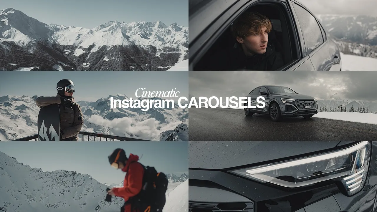
How to CRUSH your Instagram Carousels transcript
Ben Maclean · @BenMaclean
Words
3,570
Runtime
18:24
Speaking pace
194wpm
Reading time
15min
194 words per minute, between the 181 median and the 201 75th percentile of 349 measured videos. That distribution comes from the 349-video hook study.
Opening (first 30 seconds)
[Music] What is good everyone and welcome back to yet another video. I hope you guys are doing well. Today we're talking Instagram carousels, right? And why I think Instagram carousels at this current moment in time are so good for your personal brand. Before we start, I am very, very close to 100K. And from my statistics, 82% of you guys that watched my last video aren't subscribed. And I'm really, really trying to hit 100K because it will just allow me to do more things on the channel and make crazier videos for you guys.
97 words, the words spoken in the first 30 seconds at 194 words per minute.
Sentence shape
| Measure | This transcript |
|---|---|
| Sentences | 223 |
| Average words per sentence | 16.0 |
| Longest sentence | 48 words |
| Questions asked | 8 |
| Sentences containing a number | 17 |
Most used terms
- text32
- carousel20
- video20
- lot16
- carousels12
- sort12
- videos11
- main10
- bit9
- guys9
- yeah9
- audience8
Filler phrases
106 in total: like 61 · sort of 12 · kind of 10 · actually 7 · you know 5 · right? 3 · uh 3 · um 3 · basically 1 · literally 1.
A literal whole-word count of the same phrase list the Prepublish browser extension uses, so a phrase inside another word is not counted and a phrase used in its ordinary sense still is. It is a count and not a judgement.
What this transcript is
Every word below is the caption track YouTube publishes for this video, pulled from the video itself and reproduced unchanged. It is not Prepublish's writing, not a summary, and not a re-transcription: it is the video's own published captions. English captions, generated automatically by YouTube, in the video’s original language. Source: the video on YouTube. A channel that would rather this page did not exist can ask for its removal through the contact page, and it is removed.
Transcript
[Music] What is good everyone and welcome back to yet another video. I hope you guys are doing well. Today we're talking Instagram carousels, right? And why I think Instagram carousels at this current moment in time are so good for your personal brand. Before we start, I am very, very close to 100K. And from my statistics, 82% of you guys that watched my last video aren't subscribed. And I'm really, really trying to hit 100K because it will just allow me to do more things on the channel and make crazier videos for you guys.
So, if you could please hit the subscribe button, I would highly appreciate it. Let's get into it. Instagram carousels. This is going to be a good one. Reporting live from the Gumball Rally, ladies and gentlemen. I just want to take the time now to quickly give a massive thank you to the sponsor of today's video, which is Story Blocks. I've been using Story Blocks throughout a majority of my YouTube career. And it's just one subscription.
You can access unlimited 4K HD video templates, music, sound effects, images, and more. All in one place with no extra hidden fees. Everything on here is made by real creators from around the world. So stuff doesn't feel like stocky. It feels real, and it really helps your videos click with your audience. Alongside thousands of readytouse video templates for Premiere Pro, After Effects, and more. This really helps streamline my workflow and save hours each week, which means more time for creativity and less time hunting for the assets.
Thank you so much to Storyblocks for sponsoring this video, and you can get two extra months free with annual plans for a limited time only when you visit storyblocks.com/ben mcclan. When it comes to curating the perfect carousel, photo dump, even video carousel, which are very popular at the moment, there are three main ingredients I would say you should take into consideration. And this is something that I like to call the VSP.
This stands for value, stories, and personality. Okay? And in my opinion, if you can embed either of these three things into your carousel post, it's a great way of engaging with your audience as well as a potential new audience. Let's begin with value. Okay, so ask yourself this, what piece of valuable information can I provide to my audience within my niche? And I am very aware that a lot of people watching at home right now all have different interests.
For instance, you post a lot of outfit photos. You know, you could create, I don't know, a five or six slide carousel where you have your outfits all broken down and where you've got each piece from as a all round example. Okay? And like I said, it's a great way of just engaging with a new audience who are also interested in that niche, which will give them an incentive to follow you. Okay? And because you're giving them valuable information, they'll save it, they can share it.
When designing a carousel like this, you should take two things into consideration. your text placement, your color palette, and also choosing like a clean font and keeping the design consistent will just elevate that post massively. As you can see, the first thing you're going to notice on my main slide is my text, what it says, and my font pairing choice. And in my opinion, this is the most important thing, especially if you're including a lot of text within your carousel posts, is how to pair fonts correctly.
I draw a lot of inspiration from places like Pinterest, looking at storefront signage and movie titles. And one thing that you will always notice is that bolder fonts are almost always paired with lighter fonts as subheaders. Okay? And this creates a really lovely balance and hierarchy. Another thing to take into consideration is a process called kerning. Now, I've used kerning in both of my subheader and my main header.
And what this is, it essentially is the adjustments of the spacing between the letters or characters to enhance both the visual appeal and the ability to read the text. So what I've done here is my main text, I've actually used kerning and I've bought the letters closer together. And for my subheaders, I've used kerning and I've made the letters further apart. I want both of my subheaders and my main header to almost be like sandwiched in between.
And again, as you can see, I've used my bolder font. As Bro said he knew a spot, this is a lot bolder than my sub headers. I would suggest as well to not go like too crazy with like loads and loads of text on screen because it can be kind of overwhelming, but also you want to build your text around the subject. Make yourself stand out, but also use the images with good negative space. I'm going to show you guys a real quick example as to how we can utilize images like this, which have a very lovely contrast of light and dark, and how we can get really creative when it comes to using text.
Okay. And this one in particular, because we've got light and dark colors, it's going to work really, really well. So, what I'm going to do is I'm just going to duplicate our header real quick. And then bring that down. And then let's get rid of this one. And this one. We'll just hide that. So, what we're going to do is we're going to use the mountain as our foreground. and we're going to hide the text behind it. So, we're just going to highlight our text and we want to choose a font that's really bold and blocky.
So, maybe something like this one. I don't know the name of it, but we'll put the name on screen. Now, we just want to make our text box absolutely massive because we're going to make the text basically take up like at least 50 to 60% of our screen. This is where we can get super creative. So, let's get our text. We're going to change the blending mode to color dodge. And now, as you can see, we've used that mountain as a foreground.
We've got our text hiding behind the mountain, which looks really, really cool. And then we're going to go over to our eraser tool cuz it actually doesn't get rid of the text completely behind it because you can still sort of see it. It's very, very faint, but it is still there. We're just going to use the eraser to get rid of that completely. We'll turn down the opacity of the text a little bit as well. So, maybe like here. 70% 73%.
That looks really good. So yeah, that's just a real quick example of how we could essentially use this particular image to get really creative with our text. >> Ben, my guy, thanks for having me on to share my carousel strategy with your audience. And my carousel strategy is super super simple. There's two main things that I look for in every single carousel. Here's an example of a carousel that has done really well for me.
I got about 6.6 million views and 5,000 new followers. And the first thing that I try to do is I try and pick categories or topics that are super broad that a lot of people can relate to. This lets me capture the biggest audience possible. And I make it really obvious by just putting some text on the carousel. So you see that it says the best settings for iPhone for photography. I picked photography even though I'm a filmmaker because I know that most people care about photos more than videos even though I care about videos more.
And so it'll reach a much larger audience. And the second thing I try to do is I try and put all of my effort in the first slide. So, you'll notice that I actually took a proper picture with my camera. I color graded it, did the whole nine yards, made sure the photo looked good because the rest of my slides are just screenshots off of my iPhone. Super super low effort. And I do that because if the first slide sucks, most of the time people are not going to scroll and look at the rest of your content.
But if you can get it past that first slide, then you're in the clear and you're going to get the engagement for all of the remaining slides. But yeah, hopefully that's helpful. And those are my tips for getting really viral carousels. >> We are now going to be looking at stories. So storytelling within our carousel posts. Now, in my opinion, this is the most broad, right? You can get so creative with this. At the end of the day, anything is a story.
If it's true to you and you're posting content about, you know, your interests or what you like to do or an experience you've had, that in itself is a story. whether you're doing it through photos or videos. We're actually going to be looking at video carousels, which I've been really enjoying creating recently, as well as I've been enjoying watching them. I follow so many amazing creators who are so good at making these sort of like video postcards or video carousels.
You know, people like Hugo, Daniel, like there are so many amazing creators who do such a good job at executing these like video postcards or these video carousels. So, I'm going to kind of like run through with you guys this one that I created in particular for my recent trip to Cos. A lot of these I shot solo. So, just myself, camera, and tripod. Super simple. It's just a way of just sort of like weaving everything together and all of these like little moments from the trip.
You can kind of combine them all into one carousel and then obviously pairing it with the right music. It just really helps set the vibe for each slide. The video dimensions or the aspect ratio I like to use when creating video postcards is either 3 by two or 4x5. So my sequence settings is 3,000 horizontal, 2,000 vertical. All right. So here we have our main title, our main slide um using the same sort of techniques that we implemented before.
So you know pairing much bolder um fonts with a much lighter subheader. So as you can see we have cost grease. So establishing where we are straight away and then summer postcards which is our subheader. And I think the subheader really really sort of elevates the main title. It just looks a lot better and it looks a little bit more aesthetic in my opinion. One thing to keep in mind obviously color palettes when matching your text with your clips.
This clip is very very blue. We've got a lot of like different shades of blue. A color that contrasts really really nicely with blue is orange. So, as you can see, we've made our text here this sort of like deep orange because it works really, really well on that blue sky. We've used negative space at the top here. Using colored text doesn't always work, so you might have to settle just for like white or more off-white, but again, it depends on what clip you're going to be using.
Looking at the second clip now, this is where I've got a little bit more creative. I went on to Pinterest and I just searched up like Greek postcard and I gathered a few images as inspiration and then I ended up creating my own sort of yeah mini postcard in Photoshop which looks like this. We've got Port of Costown as our like main header in like a navy color, travel moments from Greece in more of like a scriptic font, handwritten font and then a series of moving pictures created and captured in August of 2025.
So, those were the sort of pieces of text that I implemented on our graphic to kind of make it look like a postcard. I've laid it out. So, we've got a lot of negative space in the middle and then our text is sitting at the top and the bottom. And then I've used obviously the Greek colors, so the blue and the white. And then I've added a film texture overlay over the top to make it look a bit like grainy. And then yeah, just saved that as a PNG, imported that into Premiere Pro.
And then yeah, that's essentially my my graphic. And then I just aligned my clip so I was central. And then that way we've got like a really nice sort of like moving video which also looks like a postcard. Looking at my third slide, this is something that I wanted to make into more like a magazine cover or like an editorial spread. I divided the canvas up into four quarters and used two videos with contrasting colors.
Since neither clip, by the way, has like much going on. I think this is why they worked really well together. For the text where it says the editorial method, I actually hand drew this on my iPad and then just implemented it into Photoshop. Got rid of the background and then inverted it. And then I just boldly just like placed it over the top to make it kind of look like a signature. And then lastly over here, I've added some blue text to tie in nicely with the clip beside it.
So it keeps the entire layout cohesive. I also selected clips shot at different times of the day so that I could take the viewer on a journey through various different places I visited throughout that entire trip. And I think this approach helps maintain engagement while also telling a cohesive visual story. Quick word from someone who you might be familiar with. Okay. Hi Ben. Thank you so much for having me. I wanted to do a little bit of a breakdown of how I do carousels.
This is not something I have like fully dialed in yet, but it's something I've had a lot of success with. And so for me, when I'm doing a carousel, like other than it being obvious that you're telling a story, I think one of the best things is that you need one of the strongest images first. You need something that's going to like grab people's attention. And as you're thinking about the carousel and the images that you're going to include in it, I think it's important to think about that every time you show a new image is another opportunity for someone to share that image.
So really think about how there could be like different audiences experiencing your content and you're almost like creating a chance to like 10x or 8x or how many ever photos that you put into your carousel your opportunities for that photo or that carousel to be shared. One of the reels I want to speak to in one of the carousels that I did that was uh something that was very successful for me was one that was about the cats of Mkos.
And while I was there, I wanted to pay attention to the things that were not obvious and the things that a lot of people love. So when you're in Mkos, everyone always like goes to the windmills. They're always going to the views. They're always considering a lot of other things other than the cats. That's like a subsection of that experience, but not the most like obvious one. When you're traveling to Greece, when I'm thinking about carousels, whether it's photo, whether it's video, I always like to have a obvious way of grabbing people's attention with text.
And text can be like either done by incorporating it into the photo or video clip in a unique way, whether it's masking or having unique text pop up with graphics. So that's a little bit of how I think about carousels. That's a little bit of how I think about uh just social media these days. And I hope that's a little bit of insight that uh you can carry with you moving forward. [Music] Something that I find quite fascinating that I see myself going back to watching time and time again are everyday day carry videos, right?
And I follow a lot of creators that make these kind of videos and they kind of talk about what they carry with them every day. So like what's in their pockets or my everyday tech, what phone or camera I have. I know GQ do one with the celebrities and it's like 10 things I can't live without. And that kind of goes back to the point that I was just sort of talking about is there could be something within those videos that you could then like connect with for instance.
So, what we're going to do today is I'm actually going to create an EDC Instagram carousel. So, these are the surfaces that we are going to be working with. These are both mouse mats which I've bought from the office. I'm kind of leaning more towards this sort of light gray color because a lot of my everyday carry items that I've bought with me are all black. You do have to spend a little bit of time when doing this, you know, setting things up and positioning things to make it look aesthetic.
As you can see, got my wallet, my rings, my keys, phone, airpods, video idea book, and my MagSafe SSD and Fuji X1006. So, that's literally my everyday carry. I'm shooting on 50 mil, by the way, um at F4 with a CPL, not a mist. So, this is just CPL 50 mil. And yeah, I'm just going to take a bunch of pictures like this and then maybe a few just like isolated areas. Again, we can just all work with this stuff in the edit.
This is the current setup, and I've just mounted a boom arm onto it. So, now all I'm going to do is I'm just going to move each object or item, sorry, out of frame, take a photo, and then just replace it so the camera just stays in the same place the whole time. I would honestly say that the longest part of that entire exercise was setting up everything at the start so that it all sort of like fits nicely together for the hero photo.
That was probably the longest part. But yeah, we're done. Very, very short, simple task. Again, helps you practice your product photography. So, now we're going to go back to the studio, see what we can cook. So, after about an hour and a half, maybe 2 hours, I would say, of editing, these are the final results. [Music] I'm going to run through some of the effects and the text that I used on this image in particular because what I've done here, I essentially applied the same thing to all of the other images within the carousel.
The first thing I did in Photoshop was change the image rotation. Then I went over with the spot healing tool and just got rid of any like spots or any marks that I had on any of the items. I then started to build out my graphics and my text. first of all was I implemented a UI inspired box. So this is actually a square to the center to highlight the carousel's topic. I added a border to the outline and then placed the text over the top.
Then finish the design off with a subtle dust texture overlay and then set the opacity to around 80%. We're then going to implement the same fonts and obviously the same overlays and things like that over the top of the rest of our images. And that way when they're viewed together, the added text, the overlays, and all the photos will now feel more intentional and cohesive, giving them a distinctive style. Just as long as you're having fun making the content, you're constantly learning, and you're experimenting with new things, that is all that matters.
So hopefully this video has helped you guys out and kind of given you something to work with if you want to create more carousels for your personal brand. So yeah, thank you guys so so much for watching. That is the end of the video. If you haven't already, please hit the subscribe button. I absolutely love making videos like this and I want to continue to help you guys and make more videos like this in the future. So, if you could please hit the subscribe button, that would be highly, highly appreciated.
And yeah, thank you guys so much for watching and I will see you lot very very soon in the next one. Thank you. [Music]
The words are the caption track's own and nothing is reworded or re-transcribed. Paragraph breaks are placed between sentences so the text reads as prose.
Use this transcript
Three free tools that work on the material around a video like this one. No signup, no login.
Hook Analyzer
Paste the first 30 seconds of your own draft for a hook score and rewrites.
Policy Pre-Flight
Check your draft against YouTube's advertiser-friendly guidelines before you record it.
Channel Skill Generator
Read this channel's public videos and transcripts, and download a writing brief for it.