Getting the transcript
Reading the captions from YouTube. A video nobody has opened here before takes 10 to 30 seconds; this page fills in on its own.
Getting the transcript
Reading the captions from YouTube. A video nobody has opened here before takes 10 to 30 seconds; this page fills in on its own.
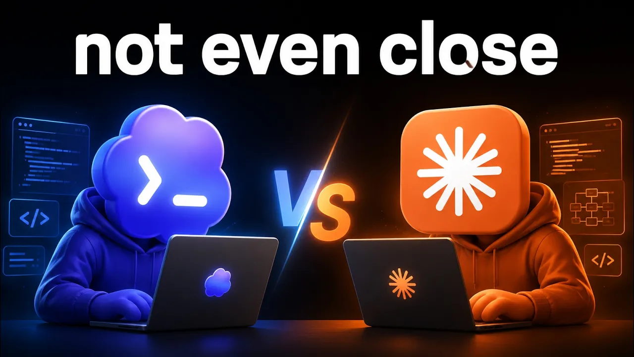
Nate Herk | AI Automation · @nateherk
Where viewers went back to watch this video again, from YouTube's public Most replayed graph, lined up with what was said at that moment.
Most replayed moment #1
11:535.0x the video's typical replay level
made by which AI? Well, let's just start taking a look at the results here. Okay. So, we've got Claude Code, we've got Codex. There's a few things that we're going to go over. First of all, let's do the reveal. Which one did Claude Code make? Claude Code made Formora and Codex made
Said at 11:46
Most replayed moment #2
19:584.4x the video's typical replay level
been more efficient with tokens and has also been quicker. But, you know, 5.6 Soul is new. You got Fable over here. You got Opus 4.8. You just There's so many different variables and it's always like you're pulling a lever to slot machine. You just don't know what you're going to get with these models. But anyways, I
Said at 19:51
Most replayed moment #3
18:033.6x the video's typical replay level
and cloud boundaries. So, maybe the back end at scale, the infrastructure Codex was building was much better and that's why I love to do a lot of development and planning with Cloud Code and I love to do security reviews, bug finds, bug fixes, all those types of things with Codex. You guys have probably seen the
Said at 17:56
The graph counts replays. It does not show where viewers stopped watching.
Words
4,893
Runtime
21:14
Speaking pace
230wpm
Reading time
20min
230 words per minute, above the 201 75th percentile of 349 measured videos. That distribution comes from the 349-video hook study.
Opening (first 30 seconds)
So, I had Claude Code and Codex build me the exact same app. I gave them the exact same prompt, but the results are extremely different. Not only the outputs, but the way that they actually got to the output, very different. One of them took 3 days, one of them took 5 hours, one of them spent $3,000, one of them spent $800. So, today I'm going to break down the two outputs, why they're so different, and it's very clear to me now what Codex is better at and what Claude Code is better at. So, by the end of this video, hopefully you have some clarity. Let's not waste any time and
115 words, the words spoken in the first 30 seconds at 230 words per minute.
Free, no signup. See how the first 30 seconds hold attention, with rewrites.
Sentence shape
| Measure | This transcript |
|---|---|
| Sentences | 375 |
| Average words per sentence | 13.0 |
| Longest sentence | 62 words |
| Questions asked | 23 |
| Sentences containing a number | 26 |
Most used terms
Filler phrases
145 in total: like 81 · kind of 12 · right? 11 · you know 10 · actually 9 · um 8 · I mean 6 · basically 6 · sort of 2.
A literal whole-word count of the same phrase list the Prepublish browser extension uses, so a phrase inside another word is not counted and a phrase used in its ordinary sense still is. It is a count and not a judgement.
Run the check on the words above: where attention is likely to drop, with a rewrite for each weak line. The free check shows the scores and the one issue costing the most.
What this transcript is
Every word below is the caption track YouTube publishes for this video, pulled from the video itself and reproduced unchanged. It is not Prepublish's writing, not a summary, and not a re-transcription: it is the video's own published captions. English captions, generated automatically by YouTube, in the video’s original language. Source: the video on YouTube. A channel that would rather this page did not exist can ask for its removal through the contact page, and it is removed.
So, I had Claude Code and Codex build me the exact same app. I gave them the exact same prompt, but the results are extremely different. Not only the outputs, but the way that they actually got to the output, very different. One of them took 3 days, one of them took 5 hours, one of them spent $3,000, one of them spent $800. So, today I'm going to break down the two outputs, why they're so different, and it's very clear to me now what Codex is better at and what Claude Code is better at.
So, by the end of this video, hopefully you have some clarity. Let's not waste any time and get straight into the video. All right, so real quick, before we start going over the outputs, let me just show you guys the actual prompt. I utilized a {slash} goal, and I did the {slash} goal inside both Codex and Claude Code, gave them the exact same prompt. So, here it is. I'm not going to read the whole thing, but here it is.
I basically said build a production-ready, originally branded Typeform alternative. So, we're kind of trying to clone Typeform here. I said orchestrate specialized agents throughout three phases: the research phase, the build phase, the verify phase. Now, looking back, I'm not saying this is the most optimal prompt. I honestly, if I was to redo this, I would probably add another phase between research and build that would be of all about planning and mapping out the whole flow.
I honestly think that that would result in a much better output from both of these systems, but we'll take a look at them in a sec. Anyways, I'm not going to read this whole thing out. You can screenshot it, you can reuse it as you want. I do want to call out what I put at the end though here, which was do not stop at a prototype or first successful build, continue researching, building, testing, breaking, fixing, and retesting until the app is genuinely complete.
So, I basically just wanted something that was like production-ready, maybe we could go to market the next day. Cool. So, like I said, I gave both coding agents, Codex and Claude Code, the exact same prompt. Okay, so let's take a look. I have not looked at either of these yet. This first one I had to do on my Mac because I was actually out of town, I was traveling when I kicked off this first one. And then I had the idea to like, oh, you know, I should have the other one do the same thing.
So, anyways, this is the first version that we have. I haven't actually tested any of this yet, I haven't clicked through, so we're getting the real raw reaction. My first reaction here is that this is called Realform, and it looks pretty solid. Like, honestly, I, because I've built a lot of sites with AI, I can tell this was AI generated. You know, we've got the hero image over here, which is still pretty a pretty cool UI element.
We've got the text over here. We've got this little pill. It just feels to me like AI, but the background, the depth, it's not too bad, right? Like an average person probably wouldn't look at this and just assume, oh, AI vibe coded site. So, we've got experience, which will take us down a little bit. We've got reliability, which takes us down again. We have pricing, which goes down to the bottom. We can build a private draft, which will take us to a sign-up page.
I'm going to blur this out right here because it says it basically gives away which agent built this version. And we can also click right here to start building. So, let me just sign up real quick for an account, and then I'll show you what the experience inside looks like. And by the way, this whole sign-up page, not too bad at all. I like this vibe. Okay, so we are in a demo workspace because it didn't have any keys to make like real authentication and real whatever.
So, this is a demo workspace. Let's take a look at how this thing runs. So, we can make a product launch survey. We have the ability to structure how this works. This is the welcome screen of our form. So, let's plan a launch people remember. We can play with this text right here. We can put variables, so we can put a score or a price. Interesting. Okay, so this is how we like insert different elements, and we can play with the sizings on them.
Okay, very interesting. I don't know how I don't know how we remove these. So, like if I wanted to remove these elements right here, these two boxes, I'm not exactly sure how I do that. Do I click delete there? Delete. Oh, this will delete the entire thing. No, I don't want to do that. We can add text right here. Okay. So, I think this is a little bit, honestly, like looking at this, it's a little bit overwhelming. Like I'm kind of confused.
There's a lot going on in this UI. I can change the label of the button. Cool. We can upload an image for the welcome screen. Okay, so I put in an image, but it actually says the image preview is unavailable. So, this just goes to show that even though there was testing, there's so many different scenarios that agents might not think to actually test, especially if you're not the one driving those tests. So, that's kind of like a bug that we already found, right?
You can put alternative text, you can change the focus and the placement of everything. Okay, so that's the home screen. Let's see what's on page one. So, this first thing is what would you most like to improve? And once again, this is just too much going on. I mean, clearly this is a multiple choice type of answer. As you can see, we could have made this also short text. And yeah, let's change that to short text. There's still all of these variables up here, which I don't love.
I mean, this is supposed to be the title. I just think that there's too much going on, right? Like, this is a description. Please answer in one sentence max. People can put in their answer right there. But, we've got short text, long text, email, phone number, website, contact info, opinion scale. Okay, let's see what that one looks like. It's asking me to confirm, and I don't know if you guys realized, but like when this pops up to confirm, it kind of like pops up over here on this left side, which also kind of feels like a UI bug.
That's not perfect. We can do a matrix, we can do a file upload. So, there's a lot of things that it is letting us do. So, I think that this agent did really good about thinking about kind of like from the admin side, the data you want, and maybe the way you want the data to be collected. But, from a UI perspective, like from the user perspective making forms, this is confusing. Like, I think this would probably have me churning out really quickly because of how simple other things truly are, like Typeform.
We can have multiple pages. Okay, so I think we're starting to get the gist here. We can set up a workflow, right? So, we can make kind of like logic-based conditions within the form, which obviously is very important. We can set up a theme. So, corner radius, we can do different colors, which honestly though, if I look at this, like this isn't letting me click. So. That's really interesting, right? Like, this doesn't really seem to be even changing anything.
So, that's not good at all. Accessibility, we can see if there's anything blocking. Publishing, we can connect this to a webhook, email notification, partial response. We can share the actual link to the form. You know, I think because it assumed that this is basically just a demo, it's showing me the UI, but it didn't actually maybe build out like the full functionality of this. So, I don't love that, right? Now, I do have to say that I do think that there's promise here, but because it built that out purely with the idea that it's a demo, even though I told it, "Hey, I'm looking for this to be like a a real genuinely complete product." That's not great.
Okay, so now we're hopping over to my PC where we're going to test out this other version. So, this version's called Formora. Immediate reaction is that this was not really being thought about from like a design perspective. I don't even know what this is supposed to be. I mean, this looks like it's supposed to be a landing page, but this thing is just brutal. It's brutally ugly, right? Anyways, build beautiful one question at a time forms, share a link, and watch the answers roll in.
Self-hosted, private, and fast. So, let's go ahead and get started for free. I'll go ahead and create an account. My name will be Bob. Oh, oh, no. My email will be bob@ test.com, and my password will be 1 2 3 4 5 6 7 8. And that will be it cuz it's at least eight characters. Sign up. Okay. Cool. So, this Yes, I agree. This looks vibe coded. But, at least as a user, I know exactly what to do. I'm not staring at something and immediately overwhelmed.
I've got my account down here, which Okay, that is another UI bug, right? Like it's not letting me I don't know what this button is for. Okay, it opens settings, but I'm not able to I don't see log out. I assume that log out would be down here, but we can't actually access it even if I change the sizing. So, that's one bug that didn't get caught, unfortunately. We have different workspaces. So, right now I'm in a workspace up here, but I can create another one.
So, let's call this one business. We can create another workspace, and we can switch between those. Okay, that's pretty cool. That's pretty slick. Let's go ahead and create a new form. Okay, this is very nice. This is way less intimidating. I actually feel like I know what's going on. This looks way more like a Typeform. Let's see. Default display mode is either conversational or stacked. So, I'm assuming we can either have it be one at a time or we can have all questions showing in one form.
So, we can also have a progress bar showing up. We can have question number showing up and this is responding. We can have keyboard hints. Um we can have auto save and we can have capture partial responses. Okay, cool. And over here we're able to just customize the stuff easily. So, page one, first question goes here. What is your mood? Okay, cool. That pops up. Description. Happy. Okay. This is called question one. We can make it required.
We can have max characters, pattern, blah blah blah. Um where do we control the field type? Is Oh, right up here. Short text. Okay, this is showing is Oh, I think it's because it's like a default. So, if we add another one, there we go. So, when we add a new type of content, that's where we control what it is. Email, phone number, website, drop-down, picture choice, net promoter score, opinion scale, rating, ranking.
Okay. So, these are pretty cool. Let's see if we go ahead and do like an opinion scale what that looks like. Um Okay, so it made it but it kept the same questions already. So, Oh, okay, no it didn't. I just had to switch over to it. Okay, so this is saying how much do you agree? Now, one thing I just noticed though is this is keeping the number here as one. So, like this should obviously be two. Um how much do you agree though?
That looks good. Opinion scale. Okay, let's try to add something else. Let's add a website. Um right here. This is a bit of a bug. I've clearly selected this one, which is what is your website, but it's not showing that. I have to click off of it and then I have to click back on it. So, that's another bug. Man, like you really cannot underestimate how much testing has to go into finding bugs. There are so many different bugs and it's not as simple as just telling Cloud Code, "Hey, {slash} goal, build me an app." But anyways, this is giving a keyboard hint.
That's pretty cool. Once again, I'm a little confused why it's not fixing these page numbers or question numbers. It's showing that all of them are just question one. But what I've noticed is that like up here it says one of three. And then if I go here it says one of two, and up here it says one of one. So, there's some other logic bugs going on. But anyways, this is honestly a much better experience. Let me go ahead and do Let's see what else we got.
We got logic. So, once again, if they answer a certain thing, we can route them to a different place. We can add these branches. We have design, so we can change the way the form looks. Okay, that's pretty cool. You can also upload your own themes, which is pretty cool. Let's just say we like this dark theme for now. Now, one thing I don't like about this design is once you click click design, you can't easily navigate back.
You'd have to like, you know, hit the back arrow. But once you click design, it puts you in this new UI where you There's not like a button to just navigate back. So, that's that. We can share it. We can look at our results. Okay, same thing. I guess we can click up here to navigate. We can go to webhooks. Same thing. It has this issue where once you navigate into one of these versions or one of these buttons, you can't nav back very easily.
So, that's a little bug we need to fix. We can change the theme from up here, which is pretty cool. Anyways, let's go ahead and publish this. So, when we publish this, it gives us a link. And let me just call this form real quick test one. So, when I publish this, um I'm able to then open up a new page, and here's the form. Okay, this looks like Typeform, right? So, I am happy-ish. I agree three. My website is um google.com, and that is our response.
Let's go ahead and see. If we go to results, oh, nice. We got an actual result. I guess we're just seeing Oh, because this is just the insights of drops, right? This is If I go to summary, now I can see the actual answers. If I go to responses, I can see each individual submission and where it came from as well, which is pretty interesting. But that's not bad. And if I go back to my dashboard, we can see our forms. Um I think that I I thought I titled this one.
I guess it didn't save. So, I'll just call it one. Oh, I have to publish it. Okay, republish it. Dashboard, it's called one. If I go to a different workspace that doesn't exist. Okay, cool. So, like, this obviously is far far better than the first one. The first one from a design perspective I think was better, but as far as functionality and doing what I wanted it to do, this one definitely takes the cake. So, now I'm curious, what do you guys think?
Which one do you think was made by which AI? Well, let's just start taking a look at the results here. Okay. So, we've got Claude Code, we've got Codex. There's a few things that we're going to go over. First of all, let's do the reveal. Which one did Claude Code make? Claude Code made Formora and Codex made Realform. So, Claude Code made this one. Claude Code made this one, which from a design perspective wasn't as good, but from a, you know, design of the actual like method, the functionality, the actual output, definitely much better.
And I will be honest with you guys, I wasn't expecting that. I was expecting Codex to have built a better one just based on the way that I've been using Codex and Claude Code and how much I've been using Codex lately, I was honestly expecting Codex to win this challenge, but so far, when we're just looking at the actual like output so far, I think Claude Code is taking the cake. Obviously, that's not to say that Claude Code's just better right out because it has to do a lot with this prompt, and I'm going to explain what I mean by that as we keep digging in here.
But anyways, let's take a look at the cost. Claude Code costed me, if I was using API billing, 832 bucks, which means that Codex costed almost $3,000, which is just insane. When it comes to the output tokens, Claude Code used a little over 2 million while Codex used almost 11 and a million output tokens. Now, when it comes to Codex, it used GPT 5.6 Soul. That's what I was using to drive. I was using it on high, and it orchestrated all of its sub-agents and everything like that to use GPT 5.6 Soul.
So, all of this is 5.6 Soul. With Claude, it did this breakdown where it had Fable 5 going, it had Opus 4.8 going, and it had Opus 5 going. Now, look at this. You see here that Opus 4.8 was the main orchestrator, which really threw me off because I didn't start the session on Opus 4.8. I started the session on Fable 5 and I gave that slash goal. I think that it for some reason had some sort of security safeguard check and it reverted back to Opus 4.8 and then Opus 4.8 became the main orchestrator and it started spinning up Fable 5 agents to do the work, which I thought was really really interesting, but it was still able to be pretty efficient.
I mean, 832 bucks with 2 million output tokens compared to what Codex did over here with 11 million output tokens, man, that's really interesting. Time-wise, Claude Code took 5 and 1/2 hours while Codex took 61 hours, almost 62 hours. So, that's like 2 and 1/2 days. That I was genuinely shocked when Claude Code was like, "Hey, I'm done." and I had been running Codex for almost a day and a half already, you know, cuz I was traveling.
I kicked it off on Codex. I was like, "Oh, when I get home, I'm going to send the same prompt off to Claude Code and just see like, you know, how they compare." I was really shocked to see how fast Claude Code finished here. It's interesting because in previous testing, I've always felt like Codex was a bit better with being efficient and being quick, but obviously this very different things and I think it has to do with the way I prompted once again.
So, we'll dig into that in a sec. What did the shape look like? All right, so now how about the shape? Well, Claude Code did this with one orchestrator, 35 sub agents and about 2,800 tool calls, whereas Codex did this with one orchestrator, 126 sub agents and 32.5k tool calls. So, I we're kind of understanding the gist of what happened here. Codex worked longer, it used more agents, it used more tokens, it used more tools and Claude Code did less and honestly, I think it would did better so far.
Now, what's really interesting is the tests. We clearly saw bugs in both of them, which was a little bit disappointing, but this tells us a lot about the way that these models work. So, Claude Code did 296 unit tests, 199 test cases and 102 browser tests, whereas Codex did 2,300 unit tests, 341 test cases and 391 browser tests. So, I've always felt like Claude Code or I guess Fable is kind of the wise owl. I like to use it for being creative, for planning, for brainstorming, for helping me figure out the path.
Whereas Codex has never felt that good at that for me. For Codex, it feels like the just it's going to be obedient, it's going to do what you say, and it's going to do it well. It's going to run tests, and it's going to make sure that the job has been done. Which means for me, when I prompt Claude code, I like to give it a prompt like this. I give it a high-level goal. I say, "Hey, this is what I want. This is what good looks like.
This is when you stop." And with Codex, it almost feels like you need to be a little bit more specific. You need to be more like, "Here's kind of like step one, step two, step three, step four." I just made a video about getting out of the model's way, and that video was based on a talk that Boris Cherny had done. And obviously Boris Cherny is the creator of Claude code. But clearly in this experiment with Codex, it just didn't seem to interpret what I meant well enough, and it didn't seem to be creative enough to explore enough to figure out what sort of experience I was looking for at the end of the slash goal prompt, even though it worked so hard and so long.
I feel like this was a waste of money here. So I thought that was really interesting. And then what I did is I basically inspected the entire sessions, I inspected everything they did, and I consolidated all that, and then I had Codex look at both of those and tell me which agent did better. And agent A is Claude code in this case, cuz I I kept this anonymous. Codex said that Claude code did better, which was really interesting.
Now, before I dig into this, guys, I'm not trying to bash on either one of these tools. I use them both on the daily. I will be honest with you guys, lately for knowledge work, I've been using Codex to drive my sessions. I've been using Codex probably 80% of the time and Claude code probably 20% of the time. But I think it's really important for you guys to realize that I still like them both because I use them both for different scenarios.
And I like to, as the models improve, as new updates come out, I switch around a lot. I'm not just going to choose one and say, "Hey, this is my driver for the rest of my life." You know what I mean? So anyways, let's take a look at these categories that Codex said that Claude code won in. So product judgment and scope. Agent A, Claude code won with judgment and scope, and that aligns with the way that I feel about it.
Cloud Code made clear must slash defer decisions and focused on valuable differentiators. While Codex pursued 135 capabilities including several expensive operational features with less restraint and I feel like that's exactly what we saw. Codex's version was overwhelming, wasn't thinking about the user, wasn't thinking about the experience. Codex was just building just to build and and it just was too much. Then, the next one, architecture and execution.
This one went to Codex. Cloud Code's contract first waves produced zero merge conflicts, but Codex built the more operationally mature system with immutable revisions, offline recovery, migration safety, concurrency handling and cloud boundaries. So, maybe the back end at scale, the infrastructure Codex was building was much better and that's why I love to do a lot of development and planning with Cloud Code and I love to do security reviews, bug finds, bug fixes, all those types of things with Codex.
You guys have probably seen the Codex plugin for Cloud Code where you run the adversarial review and it's really really helpful and it almost always finds things that my Cloud Code workflow missed out on. Bugs, edge cases, things like that. Now, the next category, testing and reliability, Codex won by a wide margin. Cloud Code performed strong security and data correctness testing, but Codex added cross-browser testing, property tests, fault injections, blah blah blah.
Codex was able to do things like it tested on so many different types of browsers, it tested on mobile and we did not see that happening with Cloud Code. As you can see here with the tests, there are just obviously significantly more tests that were being run by Codex. And yes, it worked for a lot longer and spent more money, but still the model harness in this case seemed to just do better with the testing. Now, I guess some of you could argue like, okay, well, maybe Cloud Code needed less tests because it did a better job building in the first place and that is also a valid argument, but I'm just trying to show you what I found here.
And the last one here was basically around efficiency. Cloud Code got a 9.0 out of 10 while Codex got a 5.5 out of 10. Cloud Code finished in 5 and 1/2 hours for roughly $447 using 35 agents. See, I know that I said earlier 832, there was a mismatch somewhere. The point being Cloud Code spent a lot less. I inspected the session logs and I was mainly for the most part getting this answer. So, I think that this must have been a little bit of a hallucination somewhere along the way.
I'm not sure where, but according to the slash usage stats of the session and all the sub agents, the number was more like 800. But anyways, Codex took 2 and 1/2 days and spent way more money, way more sub agents. So, Cloud Code did this about 11 times faster and 6.6 times cheaper. And that once again kind of goes against what I thought was going to happen because a lot of my tests in the past when I've done Cloud Code versus Codex, Codex has been more efficient with tokens and has also been quicker.
But, you know, 5.6 Soul is new. You got Fable over here. You got Opus 4.8. You just There's so many different variables and it's always like you're pulling a lever to slot machine. You just don't know what you're going to get with these models. But anyways, I hope that this experiment was insightful to you guys. I hope that this at least made you think about the way that you think about these two model harnesses and the way that you think about prompting these things cuz it's always changing and that's why it's so important to kind of be hands-on doing little experiments like this because you never know how it's going to fit into your workflow.
I think that it's great to be following along with Boris Trchony and Andrej Karpathy and all of these thought leaders in the space and people that are actually developing these tools, but something I said in my previous video was like you should not be just taking their advice and blindly applying it because they do different things with it. They have different motivations. It would be like if you're a professional triple jumper and you're taking advice on your jumping from a high jumper.
Like maybe there are some similarities there and maybe the fundamentals and you know, some of the foundational things are consistent, but like at the end of the day it's a completely different sport. It's just a completely different ball game and you probably want to be taking advice from people that are also triple jumpers. That's a real sport, right? Okay, yeah. So, I knew that this was obviously like in track and field, but I just wanted to make sure that it triple jumpers sounds like a weird term.
But anyways, guys, that is going to do it for today. So, if you enjoyed the video you learned something new, please give it a like. It helps me out a ton. And as always, I appreciate you guys making it to the end of the video, and I will see you all in the next one. Thanks, everyone.
The words are the caption track's own and nothing is reworded or re-transcribed. Paragraph breaks are placed between sentences so the text reads as prose.
Free tools for your own script: paste a draft and see where it stands before you record it.
Paste your draft and see where viewers are likely to drop off, with a rewrite for each weak line.
Paste the first 30 seconds of your own draft for a hook score and rewrites.
Check your draft against YouTube's advertiser-friendly guidelines before you record it.
Read this channel's public videos and transcripts, and download a writing brief for it.