Getting the transcript
Reading the captions from YouTube. A video nobody has opened here before takes 10 to 30 seconds; this page fills in on its own.
Getting the transcript
Reading the captions from YouTube. A video nobody has opened here before takes 10 to 30 seconds; this page fills in on its own.
CodeTrading · @CodeTradingCafe
Where viewers went back to watch this video again, from YouTube's public Most replayed graph, lined up with what was said at that moment.
Most replayed moment #1
14:065.2x the video's typical replay level
predictions in the bearish category as well. And we have category zero as well, so it's populated with a precision of 68%. So, this is how we can play with the model parameters, prediction probability, the hyper parameters, and
Said at 13:59
Most replayed moment #2
2:415.0x the video's typical replay level
will show you how the indicator looks like on the trading chart, so we can analyze its potential for trading strategies. Now, for the labeling, we will choose a fixed time horizon, meaning we will look into how the price changes in a fixed number of candles in the future. Imagine
Said at 2:33
Most replayed moment #3
1:584.3x the video's typical replay level
description of this video, so you can download it for free and run this experiment from your side. Our quick plan is the following. First step is to get the data, add some technical indicators. I have added more than 20 indicators as input features ranging from momentum indicators, oscillators, trend detection,
Said at 1:50
The graph counts replays. It does not show where viewers stopped watching.
Words
3,174
Runtime
17:50
Speaking pace
178wpm
Reading time
13min
178 words per minute, just under the 181 median of 349 measured videos. That distribution comes from the 349-video hook study.
Opening (first 30 seconds)
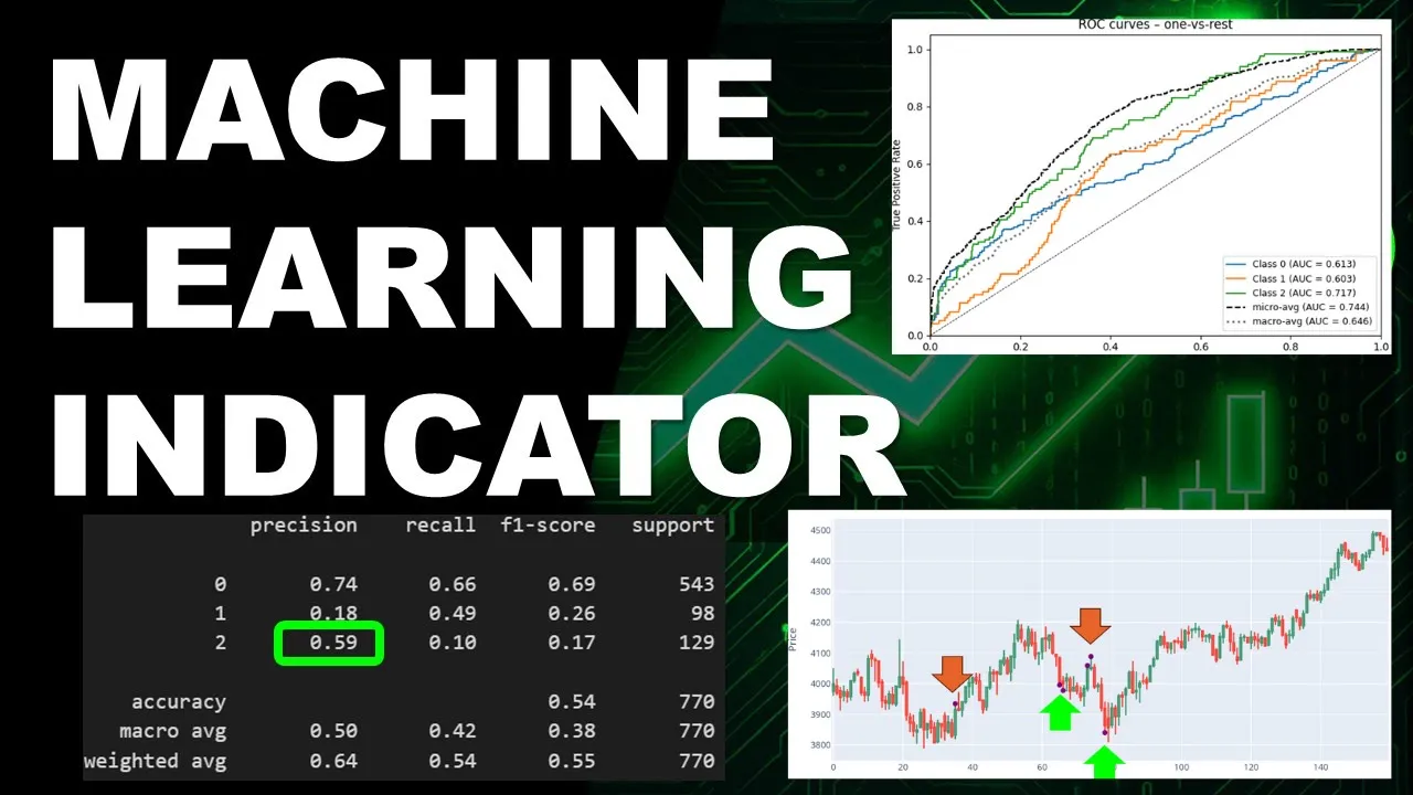
Hi, and welcome back. In this video, I'm going to show you a machine learning indicator using a classifier for trend predictions. This table shows the prediction results on validation data, meaning on new unseen data, and the total accuracy is around 52% for this particular example. This is going to be dependent on the model we're going to use. Also, we have access to the separate accuracies for the three trend categories that we considered in our simulation in this experiment. So, first we have the ranging price,
89 words, the words spoken in the first 30 seconds at 178 words per minute.
Free, no signup. See how the first 30 seconds hold attention, with rewrites.
Sentence shape
| Measure | This transcript |
|---|---|
| Sentences | 191 |
| Average words per sentence | 16.6 |
| Longest sentence | 50 words |
| Questions asked | 0 |
| Sentences containing a number | 33 |
Most used terms
Filler phrases
69 in total: uh 46 · um 10 · actually 7 · like 5 · kind of 1.
A literal whole-word count of the same phrase list the Prepublish browser extension uses, so a phrase inside another word is not counted and a phrase used in its ordinary sense still is. It is a count and not a judgement.
Run the check on the words above: where attention is likely to drop, with a rewrite for each weak line. The free check shows the scores and the one issue costing the most.
What this transcript is
Every word below is the caption track YouTube publishes for this video, pulled from the video itself and reproduced unchanged. It is not Prepublish's writing, not a summary, and not a re-transcription: it is the video's own published captions. English captions, generated automatically by YouTube, in the video’s original language. Source: the video on YouTube. A channel that would rather this page did not exist can ask for its removal through the contact page, and it is removed.
Hi, and welcome back. In this video, I'm going to show you a machine learning indicator using a classifier for trend predictions. This table shows the prediction results on validation data, meaning on new unseen data, and the total accuracy is around 52% for this particular example. This is going to be dependent on the model we're going to use. Also, we have access to the separate accuracies for the three trend categories that we considered in our simulation in this experiment.
So, first we have the ranging price, category zero, downtrend, category one, and the uptrend that we labeled category two. If you are into machine learning classifiers, and you've already used and you are already familiar with this field and related metrics, the ROC curves show positive signs of predictability, meaning the forecasting, although not perfect at this stage, is still capturing a signal about the future of the trend.
And this is how the signal looks like on the chart. So, here we have um false bearish signal because the price went up afterwards. Here we have a bullish signal. We didn't really have an uptrend afterwards, although we have one day of a green candle. This is daily time frame, by the way, so each candle represents one day. These two signals are bearish signals, and they are good because for the coming uh four or five days, we have a downtrend.
So, this is a really wide range. It could have been a really good uh trade right here. And this is an excellent bullish signal as well detected by the model because the price went straight up afterwards. So, if you notice we're trying to use the model to pick entry points at candles where we can enter with maximum chances of profit. So, now I will show you how I trained the machine learning model, so you can reproduce the same results.
And if you are here for the coding part, the Python code I'll be using is available for download from the link in the description of this video, so you can download it for free and run this experiment from your side. Our quick plan is the following. First step is to get the data, add some technical indicators. I have added more than 20 indicators as input features ranging from momentum indicators, oscillators, trend detection, volatility, and volume-based indicators.
We will go through the details later on in this video. Then we need to label the data. I will also show you how I did this step-by-step in details looking into the average closing price of future candles and comparing it with the current candle. Then we train the machine learning model on the training data set. We will evaluate its prediction metrics on the test data and the validation data or using unseen data set. And finally, I will show you how the indicator looks like on the trading chart, so we can analyze its potential for trading strategies.
Now, for the labeling, we will choose a fixed time horizon, meaning we will look into how the price changes in a fixed number of candles in the future. Imagine this is the current candle, and it closes at this price level. We will define a threshold area in number of pips or a percentage of the price. We will look into the future considering a fixed number of bars. Next, we compute the average closing price of these candles, and we check if the difference with the original closing price of the current candle exceeds the threshold boundaries.
In this example, the average is still within the threshold area, so we have a ranging market, and the label of this current candle is zero. If the average of future prices crossed above the threshold area, we have an uptrend, and the label is two. In the opposite direction, if the average closing price of the future candles is below the threshold, and the label is set to one. So, at the end we will get a data set with all the input features, but also the labels.
We can compute the multiple labels in this case, changing the number of future bars and the threshold width, so we can optimize our labeling method as well. We will be using a grid search approach to compute those different labels using different thresholds and different future candles. Now, just as a side note, this is not a look-ahead bias. This is a labeling technique, a labeling approach. It allows the model to peek into the future just during the learning or training phase.
But these values are not provided to the model during the prediction or the testing phase or the validation phase. Now, we can move on to the Python code, train the model, apply predictions, and have a look at the results. So, this is our Jupyter notebook file. First of all, I'm importing whatever is needed, so I'm using Wi-Fi for the data to import the data, then scikit-learn and XGBoost, matplotlib for plotting, and so on.
I'm downloading the data for now. You can change the label to download different stocks, the date, the starting date, and so on. So, this is just to download the data. We will get a data frame that looks like this. We have the close, high, low, open, and the volume and the date for each of those rows. Then we have the feature engineering part or technical indicators added using pandas_ta technical analysis. So, this is just a helper function that we're going to use later on now to merge the indicators into our original data frame, and then one function named add_indicators is going to compute the indicators, the momentum indicators, and the RSI with different length.
For example, we are using RSI length 5, 10, and 15. This is why it's in a for loop, so it's going to add three different columns. We have the ROC 10, momentum 10. Uh we're going to merge these together. We have the CCI 20, uh WR 14, and so on, the MACD as well. Uh we're also adding simple and exponential moving averages with length 5, 10, and 20, as you can see here. And the um volume W moving average, volume-weighted uh moving average 20, and so on.
So, I'm not going to list all of these. You can add all kind of indicators here. You can add your custom indicators. This is where you can experiment by adding as many indicators that you want and probably applying some dimensionality reduction later on if needed. And now our data frame will look like this. On top of the original columns, we'll get the additional columns of the technical indicators we just added. Now, for the label, we're going to compute the average closing price of future uh candles using a certain look-ahead and negative look-ahead.
For example, for the future five candles by default, and then there's a threshold of 0.01, so that's a percentage of the current price. If the price went above by a certain percentage above the threshold, then we have a return two. It's a bullish uh trend, let's say, bullish future trend. Otherwise, if the average of the future closing prices of the future candles is below the threshold, it's uh downtrend, so we return one in this case.
Otherwise, we return zero. We don't have a clear trend. It's a ranging market. So, we can uh I put this into a function so-called generate label, so we can change the look-ahead into uh let's say from five candles to 10 candles in the future, 15 candles in the future, and so on. And also, we can change the threshold. And also, we can change which part of the candle we're looking at using the closing price by default for for this example.
So, here you can see that we're using a grid search approach. The look-aheads we're going to test are two candles in the future, four, six, eight, and 10 candles. And we're checking only two thresholds, either 1 or 2%. You might want to add more values here to make the test more complete, but it's going to cost you more compute time. And now in the data frame, we can see that we have the original columns, open, high, low, and close, and the volume.
We have the indicators, but we also have different labels that you can see here. So, that's label, let's say, two candles in the future with a threshold of 1% change, uh two candles, 2% change, four candles in the future, 1%, 2%, and so on. So, we can see that we have all the labels of the grid that we have defined in these two lines right here. Then we're going to split the data into training, testing, and validation or validation and testing.
You might want to name it differently depending on which book you've been reading recently, but anyway, we're splitting these into three um slices. Uh you might want to use 60 20 20 or 80 10 10%. It's not that important, really. When it's working, it's working. When it's not working, we'll know that it's not working. Then we're defining the um baseline XGBoost performance. So, we're defining the model first of all with the hyperparameters.
We're not going to fine-tune the hyper parameters at this point. We're just trying to check which of the labels in this data frame will provide the best result. And the way we're going to do this is that we're going to train and test the model on all of the labels. So, we're going to use all of the labels, and we're going to concatenate the results in this list. Remember, this is a for loop. It's going to loop over all the labels.
It's going to split the data, train the model, test the data. This is the training training here with the fitting function, then it's going to predict on the testing part or the validation part again. Then it's going to compute the accuracy, the F1 score, and we're going to append the results in the results list. Then we sort the list of these labels for for one same model, actually, uh depending on either accuracy or the F1 score.
So, this way we can see how the label is affecting the same model using the same data. So, we can have an accuracy of 0.86, which means actually nothing because if the model is uh very not sensitive, let's say, and it's predicting uh category zero by default, like this category. We're going to easily get uh something above 60% of accuracy cuz most of the uh candles are not uh labeled either one or two. So, I have the tendency to look both at the F1 score and the accuracy together as a first glance.
But, anyway, the good thing good news is that we can try all of these. So, now that we can choose which label we are going to use, so probably you will want to use either the highest accuracy or the highest F1 score. In this case, you can say, let's say the best label is the maximum among among the results using the F1 score, for example. I've used the F1 score maximum. So, that's going to be this model right here. 10 candles in the future, a change above 2%.
You can also uh if you want, you can also override this. So, uh you can uncomment this line and choose whatever label you want to experiment on. So, now that we have chosen the label that we're going to use, we can uh tune the hyper parameters of our machine learning model. So, this is where it's happening. We're also using a grid search approach. So, these are the hyper parameters and we're providing a range or few values for each of these parameters.
And then we're going to test the um model with the different parameters using our best choice of the uh label. We're using the grid search function, providing this dictionary where we have different values for different hyper parameters. So, that's around 810 fits for this example. It's going to repeat this job 810 times in order to provide the best set of hyper parameters. And now we have a total accuracy of 76% for now.
And then we can see the um classification report. We can see that for the category zero, which is not of interest, to be honest, for us. This is a ranging market, so that's not uh our purpose. 73% precision. Unless if you want to apply this for a ranging market strategy, that might be interesting. Then we have category one, which is the downtrend prediction with a precision of 16% and the bullish prediction is 62%, so that's a bit more uh accurate in this case, a bit more precise.
We have the recall and we have the F1 score for these two. Now, if we test the uh model, the machine learning model, on new and unseen data, let's say the validation set that we haven't used so far, we're losing the precision that we uh got on the bullish part. The bearish part is somehow kept the same. We kept the uh F1 score, we we kept the uh recall, and we kept somehow the And also the category zero is kept as is.
So, this is again, we're not using the best label. I've chose the label with the best or the highest F1 score. We could try with the highest accuracy or just choose something which has a compromise in between. If we check the classification reports of these different labels, we might want to choose a label manually, which will probably provide better results. Now, there is a way to make the model a bit more selective and improve the results, improve the precision.
Instead of making the model predict a category straight away, we're going to extract the probability for each of these categories, the predicted probability by the model. And in this case, we're going to set our threshold manually. So, if the of a certain category is above, let's say, a threshold 55% or 0.55. In this case, we're going to confirm that this is a bearish sell, for example, or a bullish in the case in the other case.
So, we have two thresholds, one for the category one, a bearish, and one for the bullish category. Then we can use this function in order to uh extract the um probabilities. And then we're going to compute the um predicted categories based on the new thresholds that we uh we have set. So, in this case, we can see that we have few predictions in the bullish category. We have few predictions in the bearish category as well.
And we have category zero as well, so it's populated with a precision of 68%. So, this is how we can play with the model parameters, prediction probability, the hyper parameters, and the labels that we've started with in the beginning. We can also improve the uh indicators that we started with in the data frame at the beginning of this video. Another interesting thing that we can use is SHAP. It's a library where we can compute the um effect, actually, the weight uh of each of the indicators that we have used on the results and for each of the classes.
You can see that we have three colors, so each color is for one class, class one, two, and zero. And this graph is going to show for each of the indicators, each class, how much is it affected uh by the indicator itself in terms of predictability or forecasting. So, we can see that the simple moving average 20 is affecting mostly the pink category, which is the bullish class two signals. Uh it's also affecting this green thing, which is class zero and class one.
I could say in a very equilibrate way. You don't have a lot of uh bias in here. Instead, this one, for example, the NVI, you can see that it's mainly the blue category, which is the bearish signal. And so on. We obviously tend to keep in the data frame the uh indicators that are going to have the highest effect as a stacked effect on the three different categories. So, this is just to provide an idea that some of the indicators are contributing a lot to the predictions and some others are contributing much less.
And now we can plot the uh indicator itself. So, I'm going to show you here in red triangles, we have the labels. So, this is how our label uh our labeling worked. And then we have the um purple points are the generated or the forecasted uh signals. And as you can see, in some cases, we have opposite signals. This is really bad because we have a bearish uh prediction here while the label is bullish. Here we have bullish signals, bullish labels, and the model is predicting bearish.
But, sometimes, actually, in this case, for example, it's predicting a good bearish signal and it's capturing actually the exact moment where we could have entered with a good return. It's at the closing price of this one. It's a good bearish signal. Here as well, we have a good prediction, as you can see. Uh this one as well is a good signal, a bearish signal. This as well, here, they are good bearish signals. So, in total, we have some good predictions and some bad predictions, and this obviously can be improved, but you have now the uh this Jupiter notebook is a good frame to start with.
You have the visualization part, you have the starting part, you have the different labeling parts, and so on. And just to make sure that we're not uh totally working in the blind, the ROC curves actually here, they show a positive pulse. So, the model is not totally dead. It's not a random model. It's not randomly uh choosing between uh zero, one, or two. It's actually showing a positive predictability potential when it's showing these curves above this middle line, which somehow represents a totally random model.
So, this is a good news. It can definitely be improved. And this will be it for this one. I hope you guys liked it and found the information helpful. I know it's not a full trading strategy that's going to print money overnight. Please don't trust me in the comments section. This content is mainly dedicated for people who are learning to code their own strategies, to put them into a Python, backtest these, and include complex indicators using AI, machine learning, and so on.
Until our next one, trade safe and see you next time.
The words are the caption track's own and nothing is reworded or re-transcribed. Paragraph breaks are placed between sentences so the text reads as prose.
Free tools for your own script: paste a draft and see where it stands before you record it.
Paste your draft and see where viewers are likely to drop off, with a rewrite for each weak line.
Paste the first 30 seconds of your own draft for a hook score and rewrites.
Check your draft against YouTube's advertiser-friendly guidelines before you record it.
Read this channel's public videos and transcripts, and download a writing brief for it.