Getting the transcript
Reading the captions from YouTube. A video nobody has opened here before takes 10 to 30 seconds; this page fills in on its own.
Getting the transcript
Reading the captions from YouTube. A video nobody has opened here before takes 10 to 30 seconds; this page fills in on its own.
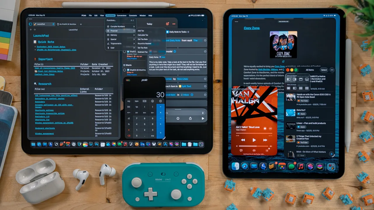
Christopher Lawley · @ChrisLawley
Where viewers went back to watch this video again, from YouTube's public Most replayed graph, lined up with what was said at that moment.
Most replayed moment #1
15:383.1x the video's typical replay level
Really I just wish Apple would give developers an API to make a proper clipboard manager. If you are going to use this new windowing mode, I highly encourage you to use the More Space setting that was introduced a few years ago. It's under settings, display and brightness, then scroll down to the bottom and look for
Said at 15:32
Most replayed moment #2
40:332.5x the video's typical replay level
there are now APIs that are available to developers that they can take advantage of. For example, MindNode now has a feature that helps you brainstorm mind maps. I was able to type in stuff like everything I need for a camping trip, and it built out the basic mind map
Said at 40:27
Most replayed moment #3
22:282.2x the video's typical replay level
Right now they aren't discoverable without looking them up online or accidentally stumbling across them. The dock got some really useful upgrades. On a 13-inch iPad Pro, you can now have up to 29 items in the dock. On the smaller iPads, it's 23 items.
Said at 22:22
The graph counts replays. It does not show where viewers stopped watching.
Words
9,548
Runtime
48:50
Speaking pace
196wpm
Reading time
40min
196 words per minute, between the 181 median and the 201 75th percentile of 349 measured videos. That distribution comes from the 349-video hook study.
Opening (first 30 seconds)
iPadOS 26 is the biggest update to the iPad ever. It brings in proper window management, background task support, files app improvements, and so much more. This update reboots the iPad. In fact, this month marks the 10 year anniversary of the very first iPad Pro announcement. So it's kind of fitting we're getting this update to go alongside that. In this video, I'm gonna go through everything that's in iPadOS 26. So maybe grab something to take notes with. This video is sponsored by Paperlike. Let's get into it. A big piece of all the OS updates
98 words, the words spoken in the first 30 seconds at 196 words per minute.
Free, no signup. See how the first 30 seconds hold attention, with rewrites.
Sentence shape
| Measure | This transcript |
|---|---|
| Sentences | 625 |
| Average words per sentence | 15.3 |
| Longest sentence | 48 words |
| Questions asked | 0 |
| Sentences containing a number | 44 |
Most used terms
Filler phrases
63 in total: like 52 · kind of 6 · basically 3 · actually 1 · literally 1.
A literal whole-word count of the same phrase list the Prepublish browser extension uses, so a phrase inside another word is not counted and a phrase used in its ordinary sense still is. It is a count and not a judgement.
Run the check on the words above: where attention is likely to drop, with a rewrite for each weak line. The free check shows the scores and the one issue costing the most.
What this transcript is
Every word below is the caption track YouTube publishes for this video, pulled from the video itself and reproduced unchanged. It is not Prepublish's writing, not a summary, and not a re-transcription: it is the video's own published captions. English captions, published by the channel, in the video’s original language. Source: the video on YouTube. A channel that would rather this page did not exist can ask for its removal through the contact page, and it is removed.
iPadOS 26 is the biggest update to the iPad ever. It brings in proper window management, background task support, files app improvements, and so much more. This update reboots the iPad. In fact, this month marks the 10 year anniversary of the very first iPad Pro announcement. So it's kind of fitting we're getting this update to go alongside that. In this video, I'm gonna go through everything that's in iPadOS 26. So maybe grab something to take notes with.
This video is sponsored by Paperlike. Let's get into it. A big piece of all the OS updates from Apple this year is a new design language. It's called Liquid Glass, and it focuses on bringing transparent UI to various systems so there is greater focus on content. I want to start with a look at the lock screen. There's a new option to scale the clock. You have to use the default font for this. When in the edit mode, use the drag handle to make the clock larger.
Depending on your wallpaper, the clock might dip behind some elements or the liquid glass design might blend the clock into the wallpaper a bit. It really depends on your wallpaper, but it can look really good if used right. Another feature of the lock screen is spatial scenes. Go into the edit mode on your lock screen by long pressing on it. If the image supports this feature, you will see this spatial image icon. Tap on it. iPadOS analyzes your wallpaper and generates this 3D effect from a 2D image.
It doesn't have to be a new image or even a photo taken with an iPhone, but the photos that work best are the ones with obvious depth to them. It's really interesting how this works. On the home screen, there is a new theme option, clear icons. Go into the jiggle mode and hit edit, select customize. In here, there is a clear option. This will make the app icons and widgets transparent. This is a nice way to get the UI elements of the home screen to kind of blend into the wallpaper.
Personally, this isn't for me. I like the colors of the icons and widgets to quickly gauge where things are, but it's an option on both the iPad and the iPhone if you want it. I'll point out other liquid glass elements and design changes throughout this whole video. Let's get into the meat of iPadOS 26. When installing this update for the first time, you will be presented with an option to pick which version of multitasking you want. a full screen app mode or the new windowing multitasking system.
If you're watching this video, I can pretty much guarantee you want the new windowing mode. One thing I want to note before jumping into this, every iPad that runs iPadOS 26 gets this new windowing mode. There is no more "iPad Pros get this and older iPads get that." When you open an app for the first time, it will launch as a full screen app. At the bottom, you will notice a drag handle. You can use these to resize the app and put it into the new window mode.
Once you've made an app a part of the new windowing mode, it will remember that going forward. You can always restore an app back to full screen if you wish. A big part of the new windowing system is that the windows are now freely resizable and placeable wherever you want. No more snapping to a specific size class. Whatever window size you want, you can have. You can scale from a small iPhone style app to a full screen iPad app, or you can place it somewhere in the middle. you want, you can use.
Just grab the handle at the bottom and drag. If you're using a mouse or trackpad, you can grab any corner or any side to resize the window. Previously, if you used Stage Manager, there were a few pre-determined window sizes that you could have. Now, it's whatever size you, the user, want. Most apps respect this, even Electron apps like Obsidian or Discord that aren't really native apps. But there are a few apps you may come across that snap to a couple of sizes.
Like Apple's Final Cut Pro app for the iPad, it basically just lets you pick from full screen landscape or full screen portrait size. The nice thing is that most apps I have tested over the summer respect this feature and can scale to whatever size you the user want. Like I mentioned, windows are now freely placeable. If you used windows on the iPad in the past, there was this invisible grid that they would snap to. Now you can place them wherever you want on the display.
With the old system, you were also never able to place a window fully on top of another window. The background window would always peek out a bit. This is no longer the case. You can completely cover windows now. Windows can also be pushed off the edge of the screen. I find this extremely helpful for when I'm dragging and dropping files around. Even a 13-inch iPad Pro screen can get cramped with a lot of windows. So being able to slide something off to the side for a minute when you don't need it is a nice touch.
When launching an app in the new windowed mode, it opens in the same space as the rest of your apps. No need to drag and drop, shift click, or any weird dance from the previous versions of iPadOS. You just tap or click on an app and it will launch in your windowed space. It sounds like a small thing but this has been such a welcome improvement to iPadOS. I never liked having to shift click on an app to add it to my current workspace in the past.
Currently, on my M4 iPad Pro, I can have open 12 different app windows at once. I say windows because if you have, say, two Safari windows open, each one of those would count as an app window. So that would be two of the 12 right there. If you use mail and open the compose window, that compose window counts as an app window, so mail and that new compose window would be two of the 12. Over the summer, this limit was never an issue for me.
Unlike with Stage Manager in the past where you could only have 4 windows, which was a real problem for me, 12 seems to be a decent number for my workflow. In a perfect world, I would love not to have a limit at all, but I understand the core of iPadOS is different than MacOS, and if this is the compromise, I can live with that. Now the limit of app windows you can have open on your device is going to depend on what iPad you have.
I've been able to confirm on both the 8GB and 16GB of RAM versions of the M4 iPad Pro it's 12 windows. On an older iPad mini that I have with the A15 chip, it was 4 windows. When you swipe up to go home, now you will see all the windows get pushed to the side. They are essentially suspended here, not closed. You can interact with your home screen, widgets, run shortcuts, or even open a new app. Once you open a new app or tap on an app that you had open, all of your windows will come back.
You can of course also tap on all the windows on the side to bring them all back. If you wish to close all of your apps, you swipe up from the bottom and it moves all the apps to the side, then swipe up again and that will close everything. In settings multitasking, you can change it so that it closes all windows when you go home. But I strongly encourage you to try this new behavior, especially if you launch apps from your home screen.
This video is sponsored by Paperlike. This is the Paperlike screen protector, specifically the 2.1 version which is designed for iPad users to feel like they are writing on premium paper when using their Apple Pencil with their iPad. This version of the Paperlike screen protector uses advanced nano-dot technology to give it tactile feedback when you're drawing or writing, all without compromising screen clarity. Something new I learned recently is Apple actually issues guidelines to people making screen protectors so that way your iPad and Apple Pencil work properly and you don't get any compromises from the input of your pencil.
The Paperlike screen protector is one of the few on the market that meets these guidelines. It measures at just 0.095mm thick, meaning you get proper response from the Apple Pencil when drawing or writing. Another great feature of the Paperlike is the matte finish. This helps cut down on light reflection on your iPad screen. This works a lot like the iPad Pro's nano-texture display. The Paperlike works with every iPad and isn't just limited to the 1 or 2TB M4 iPad Pro model like the nano-texture display.
There's a Paperlike for every single iPad out there and it's not a $100 upgrade like the nano-texture display. I have a Paperlike on all my personal devices. Over the summer, I've been using the Apple Pencil more. I'll talk about that in a future video. And this has made working with the Apple Pencil so much nicer. Plus, I work under big lights, so cutting down light reflection is really important to me. And for those that are worried about the difficulty of applying a Paperlike, they have a unique process for easy application and bubble-free results.
Plus, you get two in the box, so if you happen to mess up, you can have another go. Paperlike has a 100% satisfaction guarantee within 100 days of purchase, so there's really nothing to lose here. also has a bunch of other iPad accessories as well. I'm gonna put some links in the description below so you can go check out the Paperlike screen protector. My thanks to Paperlike for sponsoring this video. On every window you will see the new stoplight controls.
Well, new to the iPad but borrowed from the Mac. The red button quits that app's window, basically like force quitting. It kicks it out of memory and when it's launched again it will start fresh. If you have more than one window open for that app, it will only quit the window that you tapped button for. The yellow button minimizes that window, this suspends it, so when you open it again it keeps the place of where you were in that app.
The green button makes that window full screen. An app's position and size is always remembered. It doesn't matter if you minimize it, force quit it, or even reboot the iPad. When you go to open that app after any of those actions, it will return to that same size and position you previously had it. This is killer, especially the fact it remembers past a reboot. This means you don't have to waste time making apps the size you want or putting them in the position you need.
The active window in iPadOS will have colored stoplight controls, while the background windows will all have grayed out controls. This is handy for quickly figuring out what window is currently in focus. So if you start typing or trigger a keyboard shortcut, it will happen here. The keyboard shortcuts for all three of these controls still work in iPadOS 26. Globe F will make your active window full screen, Command M will minimize the active window, and Command W will quit that active window.
To me, the stoplight controls work best in tablet mode, or just sitting back and using the trackpad. Keyboard shortcuts are still the fastest way to manage windows. Full screen apps get treated as their own space. You can swipe at the bottom of your iPad to go between full screen apps just like before. Plus, you can swipe to the space that has all of your windowed apps. I like this a lot. I use Final Cut, Lightroom, and Photoshop in full screen mode, but can swipe over to my other workspace to check on something.
After making an app full screen, if you drag it back down from the top, it returns to its previous size. I love this detail. You can long press stoplight controls to get several different tiling options. There are two levels. The first level will only affect the position of the window you have selected. There are options to move the window to the left or the right, and top or bottom. The second row controls your current app plus your recently used app.
These are the arrange options. The way these work is the app that you have selected will go into the highlighted spot. Then the app that you used last will go into the shadowed spot. The options for this are full screen, a 50/50 split view style, this is my personal favorite, a 1/3 split view style for the last 3 apps you used, this has been incredibly handy over the summer, and a quarter view for the last 4 apps you've used.
This has been great for moving files around. When you have apps in the tile mode, you will see a familiar UI element, the split view slider. This will appear between any apps that are butted up against each other and not overlapping, even in the triple window view. What's great about this over the classic split-view multitasking system is that you can adjust it to any size you want. No more locked to half and half or a two-third and one-third view.
You can adjust this to any ratio you want. There's also a flick gesture built into the new windowing system so you can quickly tile apps. window open, start to move that window and then flick it to the left or the right side. This will make it a 50% view. It's key that you flick the window. I got hung up on this at first trying to drag and hold the window to the side. That does not work. It is a flick gesture. If you flick a window to the top, it'll go full screen and flicking a window down will minimize it.
These are incredibly handy for quickly tiling windows when you're using the iPad in tablet mode. If attached like the Magic Keyboard, there are keyboard shortcuts for tiling windows. Globe Control Left Arrow will make a window 50% and move it to the left side. Globe Control Right Arrow will make a window 50% and move it to the right side. These two are my new favorite keyboard shortcuts in iPadOS. Globe Control Up Arrow will make the window 50% in the horizontal orientation and move it to the top.
And, I bet you can't figure this one out, Globe Control Down Arrow will make the window 50% in the horizontal orientation and move it down. These two have been incredibly handy when I use my iPad in portrait mode at my desk. Globe Control + C will center a window on your screen. This one has also been really handy. The Arrange Tiling actions also have keyboard shortcuts. These use Globe Control + Shift and then the respective arrow keys, and these will arrange the last two windows that you used.
Unfortunately, the quarters or three columns view doesn't get any keyboard shortcuts. There are a few other really handy keyboard shortcuts to know with the new windowing system that iPad users may already know, but they are too useful not to be mentioned. Command + H will go to the home screen and Command + Tab will cycle through your open apps. iPadOS 26 tiling respects if a window is currently covering the dock. This means if there are no windows that are open that are covering the dock area, then the dock will be visible.
When you go to tile a window, it will keep that window above the dock. If you have a window covering the dock, then the dock will hide. When you go to tile a window, it will still cover the dock. I like this better than just having a setting to always show or hide the dock. When I'm working in a lot of apps and jumping around, I want the dock. That's my app launcher. When I'm really focused on something like email or writing, I hide the dock.
If you do hide the dock, you can just swipe up from the bottom or move the cursor to reveal it. Just like with Stage Manager and previous versions of iPadOS, iPhone apps run in a window mode. There are only two sizes you can use them and they don't work as full screen apps. But if you need an iPhone app on your iPad, this is a lot better than the old system that just had a thick black border around it. A great side effect of this new windowing system is apps can be more useful in the background.
Clipboard managers have always had an issue because they can't stay open in iPadOS to watch your clipboard all the time. Now with an app like Paste, if you leave it open as a windowed app, it can get your clipboard history. The trick is you have to make sure it doesn't become one of the apps to get kicked out if you hit your window limit. So command tab over to it occasionally. Really I just wish Apple would give developers an API to make a proper clipboard manager.
If you are going to use this new windowing mode, I highly encourage you to use the More Space setting that was introduced a few years ago. It's under settings, display and brightness, then scroll down to the bottom and look for display zoom. What this does is it renders everything at a higher resolution, thus making everything smaller so you can fit more on the screen. Now not every iPad has this feature. All 11-inch iPad Pros, the M1 13-inch iPad Pro and newer, and the iPad Air 5th generation and newer.
I've seen a lot of discords online, from my comment section to Reddit, about the removal of SlideOver. I'm not too upset about the removal of Slideover, and I'm somebody that used Slideover a ton. The fact that apps remember their Windows size and placement makes for a better use case. I can have Windows in a classic Slideover position and size, or I can put them in a different spot. I filled my dock up with my most commonly used apps.
This is my main launcher, so I can quickly open anything I would have used in Slideover before. I just tap on it. For apps that aren't in the dock, I use Spotlight or the app library to open them. But most of these aren't apps I would have used in Slideover anyways. I mostly use files, my task manager, calendar, messages, music, a safari window, and a PDF viewer in Slideover. The only thing I would want added is the ability to pin a window so that way it always stays on top.
This could be added to the stoplight controls. With that, I think that would completely solve Slideover being removed for me. Xpose is still a big part of iPadOS multitasking. On the iPad screen, swipe up and over slightly to get Xpose. On the trackpad, three fingers swipe up. You can also use the keyboard shortcut "Globe Up Arrow" on the keyboard, or if you have the Magic Keyboard there is of course the built-in function key.
There's a lot of ways to get to Xpose. Xpose will show you all of your windowed apps and also all of your full screen apps. It displays them as their own space. One really nice change to Exposé is that app icons appear under the window. You can tap on the icon to see all of the windows of that particular app. The way I've been thinking about how iPad apps work now is that windowed apps all live in one space. Fullscreen apps live in a separate space.
You can move between these spaces by freely swiping at the bottom of the display or three fingers swiping on the trackpad. The iPad now has a menu bar. To get to the menu bar, swipe down from the top or push the cursor into the top edge. This will reveal the menu bar. The menu bar is an evolution of the old keyboard shortcut menu when you used to be able to hold down the command key. This old system is now gone. All the keyboard shortcuts are now menu bar options.
You can tap on anything in here to perform an action. If the app developer assigned a keyboard shortcut to an option, it will show up next to it. And anything that was already a keyboard shortcut in the app will show up in the new menu bar with the keyboard shortcut right next to it. Even if you don't use a keyboard with your iPad, the menu bar is useful because you can quickly get to all of those actions, whether it's text formatting, windowing, or an app-specific feature.
I love this because it combines the information of a keyboard shortcut list with the usability of an options menu. My hope is this gets developers that have held out from adopting keyboard shortcuts app to now add them in. There are standard tools in the menu bar across all apps, so even if the app doesn't have keyboard shortcuts or actions built into it, there are still features in the menu bar for it. There are things like cut, copy, paste, and my personal favorite, paste-to-match style, find and replace, writing tools, autofill, dictation, and emoji, and formatting text options like bold, italics, and underline.
Under the app name, there is an option to open the settings for that app. If the developer does nothing, it will take you to the app's settings page in the settings app. But the developer has the option to have this open the settings page in the app if it has one. In drafts, I can jump to the app's setting by going through the menu bar. Or I can just hit command comma. The developer also added the ability to open the editor settings and go to the app's settings page in the settings app.
With Apple apps like Reminder, their settings are in the settings app. So selecting this action or hitting command comma jumps me into what would be settings app's reminders. Under the window menu there are options for creating new window for that app, also showing all of the windows for that app. This also has a keyboard shortcut of globe down arrow. There is also more tiling options under move and resize. There are options to move both of your current windows or multiple windows into a tile.
Plus there are options to put a single window in a quarter view. In here you can also see all of the keyboard shortcuts related to tiling, most of which I mentioned earlier. iPadOS, like MacOS, also has a help menu. In here you can just type what you are looking for, really helpful if you can't find the menu option you want. This is something I did a lot back in my early days of using the Mac so I could learn keyboard shortcuts.
You might notice it now takes two swipes to bring down notification center. Or if you're using a trackpad, pushing up into the top center no longer brings notification center down. If you just swipe down once on the clock, this will reveal the notification center now. You can also click on the clock as well with the cursor. This is just like the control center behavior. You can either click on the battery icon or swipe down from it.
So swiping down on the left side gets you notification center, swiping in the middle gets you the menu bar, and swiping on the right gets you control center. You can turn off the swiping gesture for the menu bar if you don't want it. This is under settings, tasking "Swipe to reveal menu bar". This basically turns off the menu bar when you are in tablet mode, but if you have a mouse or trackpad paired, you can still push up into the top to reveal the menu bar.
I highly encourage you all not to disable this setting and give the menu bar a shot. I found it to be really useful over the beta period and a lot of great third party apps are putting good controls in there. Now some collateral damage from the introduction of the menu bar is the system wide keyboard shortcut menu is gone as well. In the past version of iPadOS, if you held down the globe key, you would see a list of all the system-wide keyboard shortcuts.
Most of these are in the menu bar for apps now, but not all of them. Stuff like globe up to get to expose, globe left and right arrow to jump between apps, command tab for the app switcher, that stuff's not there. I would like to see Apple add a list of system-wide keyboard shortcuts to settings or someplace. Right now they aren't discoverable without looking them up online or accidentally stumbling across them. The dock got some really useful upgrades.
On a 13-inch iPad Pro, you can now have up to 29 items in the dock. On the smaller iPads, it's 23 items. This does not count the app library because if you turn it off, you don't get an extra space. If you turn off the option to show recent apps though, this is under settings, home screen, then you get an extra 3 spots. In addition to being able to have apps, shortcuts, and bookmarks in the dock, you can now add folders from the files app.
In files, just drag and drop a folder to the right side of the dock next to the app library. This will add that folder to the dock. I did this with my documents folder, downloads, and projects folder. When selecting a folder in this menu, it will open the contents in the files app. When selecting a file, it will open it in its respective associated app. There are two different views folders have to display from. Long press on a folder and you can either pick from grid or fan view.
Fan view can cut off after 6 items, but you can scroll through it to see other items. Grid view is pretty standard. Scroll through and select what you want. With the updates to the dock, between the increased limit and the folder support, this has become my main app switcher. I loaded the dock up with my most used apps, a shortcut, and folders. I can access a lot of what I use regularly right from here. Like I mentioned, every iPad that runs iPadOS 26 gets this version of multitasking, including the iPad Mini.
I put iPadOS 26 on my 6th generation iPad Mini, this is the one that was released in 2021 that got the major redesign, and it ran fine. I was only able to have 4 windows open at once, but I was able to do everything I could on my iPad Pro with them. Tile windows, flick them around, resize and place them anywhere. The windowing mode on iPadOS is definitely at its best when it's on the bigger screen iPads, but it works on the mini.
If you need to move files around, reference documents or webpages, or just have a couple of things open, you can do it on the smallest iPad. Stage Manager is no longer a totally separate multitasking system. If you want to use Stage Manager, it now exists as a layer on top of the new windowing mode. It's more of a feature than a separate multitasking system. Plus, it is no longer limited to a handful of iPad models. Even my old 6th gen iPad mini has Stage Manager now.
Stage Manager has all the features of the new windowing mode except automatically open apps in the current space. When tapping on an app in Stage Manager, it opens in a new space. You still either need to drag and drop the app to add it to the current space, or you can hold down the shift key and click on the app. I wasn't the biggest fan of Stage Manager in the past. In fact, it was one of the reasons I got a Mac to work from earlier this year.
But with the changes in iPadOS 26, I've been using it a lot more. The freely resizable and placeable windows are really nice. Windows can now cover up other windows if I need that. And that four window limit that Stage Manager previously had that was very limiting on my iPad Pro is now gone. If you're using a trackpad, you can three finger swipe between stages. Also the keyboard shortcut globe left and right arrow will jump between stages.
You can also swipe at the bottom of the screen as well. And App Exposé will show you all of the stages you have set up. A really handy keyboard shortcut to know if you use Stage Manager specifically is Globe Backtick. This will cycle through the windows you have open just in that stage. It's kind of like Command Tab but it never leaves the stage that you are in. External monitor support also benefits from the new windowing mode.
You no longer have to use a specific mode. You can either use the new windowing system or stage manager. In fact, a few times when I was working at my desk over the summer, I forgot I was using an iPad and thought it was a Mac for a second. The windowing feels that good. When using an external monitor, there are different windowing shortcut options under the stoplight controls. You can set up three apps in a tiled space.
One window gets a 50% view on the left side, and then two other windows get the 25% view on the right. I'm disappointed to see this isn't an option in the menu bar on the iPad's display. I could see this being really handy just on the iPad. Though you can still technically do this, you just have to set it up one window at a time. On the external monitor, the menu bar can be always visible. As long as no apps are covering the menu bar, it will stay on the screen like the dock does.
For some reason, this is just on external monitor support. The more I had this here, the more I wanted it when I was just using the iPad with the keyboard. Another change to external monitor support is notifications now show up on the external display instead of the iPad's display. This is a nice change considering you're probably looking at the external display when working here, not the iPad's display. Though you can still only get to notification and control center on the iPad's display. iPadOS already benefited from using a keyboard with the globe key, but iPadOS 26 makes that even more important with the addition of windowing and tiling.
If you're like me and prefer to use third-party keyboards at your desk and don't have Apple keyboards, you can reprogram a modifier key in iPadOS. You go to Settings, General, Keyboard, Hardware Keyboard, and select Modifier Keys. I changed my Caps Lock key to be a globe key. You may see your keyboard show up in here twice. Just change it for both. This used to be pretty buggy and reset every time I would plug and unplug my iPad in.
Now it seems to stick. A good keyboard shortcut to know if you use external monitor support is globe control backslash. This will move your current window to the opposite display. So external monitor to the iPad or vice versa. One big thing external monitor support is still missing is proper full screen video for windowed apps. If I'm watching a YouTube video in Safari, and I hit the full screen button for the video, it will only take up the screen size of that window.
You've probably already seen but the cursor in iPadOS got an overhaul. It's now pointy. Previously, it was circular and tried to imitate a finger. It was a decent idea but as more complex apps came to the iPad, it started to show its issues. It was especially hard to use with apps like Photoshop. The new cursor has a point and is a lot more accurate to work with in apps like Final Cut, Fairlight, Photoshop, Lightroom, etc.
It no longer snaps to buttons and is much more of a traditional cursor. Overall, this is a big improvement. It still adapts like becomes an I-beam when moving the insertion point for text, but this is stuff we've come to expect from a cursor for a decade now. Apple also added the "Shake to Enlarge" feature from macOS to iPadOS. This is handy if you lose track of your cursor. Scribble on the trackpad fast and it'll grow.
I still use the accessibility feature that puts a highlight around the cursor so it's easy to find. the light gray can easily blend in with dark mode apps. A big complaint over the years about the iPad is how tasks couldn't be handled in the background. That is now being addressed with the new Background Tasks API. When moving files around in the Files app, you can now close the app and tasks will get moved to the background.
A live activity will start and you can see the progress of it. Once the live activity goes away, you will see this Background Task icon in the top right corner. You can tap on this to check the progress of the file transfer. This also works the same way when downloading files from Safari. A background task will start and you can move on to other tasks. You don't need to keep Safari or Files open to do these tasks. You can move on to whatever is next for you.
While the system handles all of this in the background. I did a couple of tests by moving files to my NAS. When leaving the files app open, the file transfers faster, not by a ton but it is noticeable and it wasn't a margin of error. That being said, it was a lot nicer to be able to move these tasks out of the way and move on to other work while my iPad handled that stuff in the background. AirDrop also supports background tasks now, so you can transfer files now but your devices aren't essentially locked until that's done, though you do still need to keep them near each other.
Apple at WWDC announced an update for Final Cut Pro for the iPad that will bring background tasks to it. Final Cut Pro isn't a system app so I haven't been able to try that. The update will probably come out alongside the official iPadOS 26 release. But this will bring background exports to the app. A big finally for me. In the past, whenever I would export a video from my iPad, it would become unusable. Now with this, I can move on to other tasks.
Third party apps will also be able to support background tasks for various things. This is an API they will have to implement, so an update to the app will be required. Files also got some huge updates and is probably the sleeper hit of this release. There is now a proper list view. This has become my preferred view in files. You can tap on a folder to jump into it, or you can tap the arrow button next to it to reveal the contents of it.
Folders will nest inside this view. You can also use the arrow keys to navigate this list. Up and down arrows will move through the list. The right arrow will reveal the contents of a folder and the left arrow will hide the contents of the folder. And as always, spacebar will preview the file, command O will open the file, and enter will rename it. My favorite change to files is there is now an open with option for files.
Long press or right click on a file and in the menu there is an open with sub menu. In here you will see a list of all the apps you have installed that can handle that file type. Tap on any one of these to open that file in the app. But that's not all. If you go into the Git info menu for that file, there is now a "Always open with" property. When changing this property to a different app, you will get a popup asking if you want to change how this app opens with a specific file or every file for this file type.
A big issue previously was that iPadOS had no system like this. Files would open in whatever app you installed last that could support that file type. This was a very bad way of handling this. Now users have control. In the open with menu, you can select preview with quick look or hit the spacebar if you have a hardware keyboard attached. Sidebars and columns are now resizable in any proper native app. You can expand or shrink data as much as you like.
This works in other apps like Mail and Notes. It does need to be a proper native app, not something like Obsidian where it is an Electron app. Confusing I know, but just play around with the apps you have. This next one might be a bit more niche, but for people like me it is extremely welcome. Apple added the ability for local audio and video recording when on a call. This is mostly aimed at podcasters and video creators, but I'm sure people will come up with clever uses for it.
The way this works is it hooks into voice and video calling apps like FaceTime, Zoom, WebEx, and more. Then go into Control Center and there is a new toggle you can add called "Local Capture." When you tap on this you are given an option to "Record Audio Only." If this is off, Local Capture will capture your video and audio. If on, well it just captures your audio. When done, you can tap on the local record icon and the file will be saved to your downloads folder.
This works with both external microphones, audio interfaces, webcams, and capture cards. No matter what your setup is, you should be able to record right on your iPad. Now the way this works is it just captures your audio and video. So if you're recording a podcast with other people, they will need to do this on their end as well. One, this gives you the best quality for all participants because it's all local and not some compressed video call.
Two, a lot of places have laws about recording people on calls, so this helps keep people out of trouble. I don't mind this hurdle. Most podcasts I've done, everyone records their own local track and the editor syncs them up. The Preview app is now on iPadOS and iOS as well. This is a native app for dealing with PDFs and images. It has a good chunk of the tools the Mac version of Preview has. You can autofill forms by selecting the text input button.
With this you can add stuff the system knows about you like name, address, phone number, etc. This will also try to auto detect any other fields and make them fillable. This way you don't have to spend a bunch of money on OCR software. You can also add text boxes to a document. After selecting the text input button, a blue plus button will appear. In here you can select text box. If the system doesn't auto detect a field, this is a way you can fix it and add text.
There is also a signature option in here. Once you've added your signature to the system, you can just drop it in wherever you want. Preview will even give you the option to auto-fill it when it detects that field. If you use an Apple Pencil, you have access to the full toolset of Pencil Kit. This is the standard iPadOS toolset when working with the Apple Pencil. You've probably seen it in Notes, Freeform, the Screenshot Utility, and some third-party apps.
There is a new tool added to it this year and it works with all of the apps that use Pencil Kit. This is the Read Pin. It's designed for calligraphy. This isn't something I'm great at, but have seen some examples of it used and it's really cool if you're into that. Under the menu there is an option to toggle a dark background. This is perfect if you prefer dark mode and don't want a blinding white PDF document next to your dark mode themed notes app.
There is also an information button where you can see the metadata of the document. And of course a search button so you can, well, search through a document. You can also hit command F on a hardware keyboard to toggle the search field. On the left side there is a sidebar. You can use this to jump between pages in a multi-page document. You can also insert a new page as well. Tap on the menu for a page. You can then either insert a blank page, insert a page from files, or scan a document.
There is also options for rotate, crop, and delete page in this menu as well. Preview uses the system document picker so you can quickly open up recent documents. On this page you can select new documents. There are two options in here. Create blank page. This will give you an empty page you can add text fields to, or design something with the apple pencil, or add stuff in from a scan document or files. There is also create from clipboard.
This will take an image you have on your clipboard and build out a document around it. You can then add text or use the apple pencil to mark it up. Also on the documents picker page there is a scan document option as well. This just uses the system scanner that has been built into notes and files for a while now. This has support for multi-page scanning, filters, and flash. I kind of alluded to this earlier, but you can use Preview to open image files, not just PDF documents.
In files, you can set Preview to be the default image provider. You can also mark up images with the Apple Pencil, or even insert text fields if you want to call something out. Documents and images of course can be exported from Preview. Hit the share sheet button, but what is different about Preview than a lot of other apps is there is an options button. In here you can pick a format of how the file is exported. There are several image file formats and PDF, but by default it keeps the current file type.
This is a really handy feature if you need to change something for compatibility reasons. If you use the dark background feature and export a document, it does not export it with the dark mode. It will keep the white or whatever color the background was originally. Last thing on preview, on the document picker page you can move the magnifying glass in the previews document picker. This is just a fun whimsical thing. When taking screenshots there is now support for visual lookup.
For things like plants, pets, places, etc. iPadOS will give you a rundown of what that is in the screenshot. This was a feature in photos already but it's nice to see it coming to the screenshot utility as well. Shortcuts got a handful of new actions, all of which are related to Apple Intelligence. I already made a video going into how all of these work and the shortcuts I built with them. I'll link that in the description below.
But I'll also go over some of it here as well. There are a bunch of new writing tools actions including proofread, adjust tone, and rewrite. With these you can pass text to them and it will run the corresponding writing tools action. Then there is also tools for making a list from text and a table from text. I use the list one to build a grocery list shortcut that doesn't require me to do any formatting at all. I just type out my grocery list in any notes app, it handles all the formatting for me and then passes it to my task manager.
Then there is the new use model actions. These are killer. These actions let you work with three different AI models in natural language. Apple's on-device model, private cloud compute model, and chat GPT. You can pass variables and output information with this action. I found it to be really good for filtering and analyzing data. I have two shortcuts in particular that I've been using this for. One that adds tags to notes based on the context of the note so I can quickly filter in Obsidian.
The second takes a look at my daily note in Obsidian, pulls out anything that might be a task and then adds it to Todoist. This is the biggest action Apple has added to shortcuts in a long time. Even making complex shortcuts simpler to build because you can use natural language to tell it what to do. The last thing I want to highlight in shortcuts is the old split screen actions work with the new windowing mode. They are limited to the fact that they can only do a 50/50 and a 2/3 and 1/3 view.
Plus each action can only open two apps at a time. But what is cool about them is you can stack them. This means you can build shortcuts that open up specific apps to create a workspace for you. With Apple having an on-device AI model, there are now APIs that are available to developers that they can take advantage of. For example, MindNode now has a feature that helps you brainstorm mind maps. I was able to type in stuff like everything I need for a camping trip, and it built out the basic mind map for me that I could work off from there.
There is also a transcription API that uses this on-device model now. A new app that will be on the App Store called Quick Subtitles lets you feed in audio or video files, and it will output the text extremely fast and locally. You can copy the plain text or export it as an SRT file for subtitles. The benefit of this is the model is already on-device, so the app isn't going to take up extra storage loading some third-party model.
There's also a bunch of other third-party app updates and new apps coming out that I will highlight in an upcoming video. The Journal app is finally on the iPad, and it's really good. It has all the tools from iOS, suggested entries, embed photos, location, voice notes, or even health information. Plus there's formatting tools for text. But what makes Journal unique on the iPad is the Apple Pencil. Journal has full support for Pencil Kit, so if you want to draw on an entry you can, you could use the new Read Pen to make something really fancy, or you can just of course hand write out your journal entry.
Journal has Smart Script, a feature that came to Notes last year. What this does is it learns how you write, and then will clean up your handwriting and straighten it out for you. This doesn't replace your handwritten text, it just cleans it up so it's legible, or just a bit neater depending on your handwriting. The journal now has support for multiple journals. These can be found on the sidebar, so if you want to break things into home, travel, work, hobbies, whatever, you can.
One of the apps to get the biggest design overhaul is Safari. Both the toolbar and the sidebar have been overhauled. I've come to like the new liquid glass look. It feels different but modern. There are a few places that some rough edges need some sanding, but overall, I'm not somebody screaming that Apple is doomed because of it. If you are having trouble with the toolbar transparency, you can go into Settings > App > Safari and turn "Show color in toolbar" off.
This gives it a bit more contrast between the page and the toolbar. If you need to go even further and make system-wide changes, you can go into Settings > Accessibility > Display and Text Size. Turn on "Reduce transparency and increase contrast." Going back to Safari, the option to add to home screen gives you the option to make any web page a PWA. This means this bookmark will be treated more like an app rather than a website, and even have support for things like notifications.
Another system level change I want to touch on is the share sheet. I've been saying for years it needs to be rethought, but not like this. The share sheet now hides any action behind the first three. And what's worse is when you select the more button, that option goes away and is replaced with an action. So many times I couldn't find what I was looking for because the button I just clicked was replaced with what I was looking for in the list and I scrolled right past it.
For me, the share sheet is the biggest design setback in iPadOS and iOS 26. Reminders got some really cool updates. In Control Center, there is now a new control called New Reminder. This brings up a new UI that gives you various options for creating a new task in Reminders. This includes changing the project, adding a reminder time, adding a location as a reminder, and flagging it. As far as I can tell, Reminders is the only app to get this new UI.
I really hope this is something that is opened up to third parties in the future. Reminders now has the ability to auto-categorize lists. This works like the auto-sort grocery list feature. It will take a look at the tasks in this list and rearrange them in a more logical and manageable way. is pretty cool but I don't have a ton of use cases for this. Most of the time when I sit down to make a list I already know what the best order is and I write it that way.
The coolest new feature is suggested reminders. This will look at a website, note, email, text, whatever you are sending to reminders and it will pull tasks from it. So if you have a recipe it'll pull the ingredients that you need. If you have an email say about a meeting you had it can pull the action items from it and and turn them into tasks. It can also look at a note and take the task from it and pull them into reminders.
This is pretty cool. Notes now lets you import Markdown files. This is a big finally for me. I write everything in Markdown. From any app you write Markdown in, or even the files app, you can just select the share sheet and pick notes. It will then convert the Markdown to a rich text format supported by the Notes app. You can also export a file as Markdown as well. Under the share sheet, there will be an option that says export as markdown.
In any app now, the long press menu got a change when you're using the iPad in tablet mode. When selecting something like text or an image, you still get the bar above it. But now if you hit the arrow, you get a full menu like if you right clicked it. This is so much nicer. No more paging through the edit bar looking for something. Though I do think the full menu should just be the default when you long press on something, just like if you were to right click on it.
One of the four new apps on the iPad is the Games app. This is a hub for all of the games on your device, kind of like Steam. The Games app will recommend games to you, you can download them right from here. It will also show you what your friends are playing and any achievements they've got. There's also a library tab where you can launch any game you have installed or see all of your previously installed games. Overall, I'm not sure about the Games app.
You can still download games from the App Store and launch games from the home screen or app library, so I don't know what is going to get people to start using this. That being said, it's a really beautifully designed app. Messages got some nice quality of life improvements. You can now set a background for a conversation. There are a few built-in options, but you can set one of your own images as the background as well.
You can also create polls for group chats. Really handy if you're trying to, well, decide what to eat. Sorry, this video is going long and I'm getting hungry. The OS will even suggest when it thinks you should create a poll based on your conversation. Messages also filter spam text now. You can see all of these by going into the filter icon and selecting the category. The best feature in messages is you can now copy just part of a message.
Long press on a message and tap on select. Then drag the handles to the selection that you want to copy. The last new app on the iPad is the phone app. This works a lot like SMS text messaging on the iPad. It uses your iPhone and any calls you make or receive will show up on your iPad as well. The iPad kind of already did this with receiving calls with the FaceTime app, but now it's broken off into its own thing and I think this makes a lot more sense for users.
Music got two features I really want to cover. First, you can now pin playlists and albums to the library page. Just long press on it and select pin. This way you can have quick access to your favorites. One of my favorite small touches about Apple Music is the animated wallpapers. I just think they're a nice whimsical touch. Those are now on the lock screen on your device as well. Probably more of an iPhone feature, but I wanted to highlight them because I think they're really nice. iPadOS 26 is a great update.
Apple showed that they can balance adding power user features while still keeping the iPad simple for those that want that. I really hope Apple keeps their foot on the gas when it comes to iPadOS. This is a fantastic update and there's something in here for everyone. After WWDC, I mentioned in a couple of videos that this release checks off about 80% of my wishlist. And that wasn't me exaggerating. I literally went through my wishlist and marked things off.
Now, I don't expect massive updates like this every single year, but updates like these that show Apple is listening to their users and cares about the platform are fantastic. And I really hope we see more of these. Let me know what your favorite feature in iPadOS 26 is in the comments below. My thanks to Paperlike for sponsoring this video. If you liked the video, hit the thumbs up button, subscribe if you haven't already, and have a great day.
The words are the caption track's own and nothing is reworded or re-transcribed. Paragraph breaks are placed between sentences so the text reads as prose.
Free tools for your own script: paste a draft and see where it stands before you record it.
Paste your draft and see where viewers are likely to drop off, with a rewrite for each weak line.
Paste the first 30 seconds of your own draft for a hook score and rewrites.
Check your draft against YouTube's advertiser-friendly guidelines before you record it.
Read this channel's public videos and transcripts, and download a writing brief for it.