Getting the transcript
Reading the captions from YouTube. A video nobody has opened here before takes 10 to 30 seconds; this page fills in on its own.
Getting the transcript
Reading the captions from YouTube. A video nobody has opened here before takes 10 to 30 seconds; this page fills in on its own.
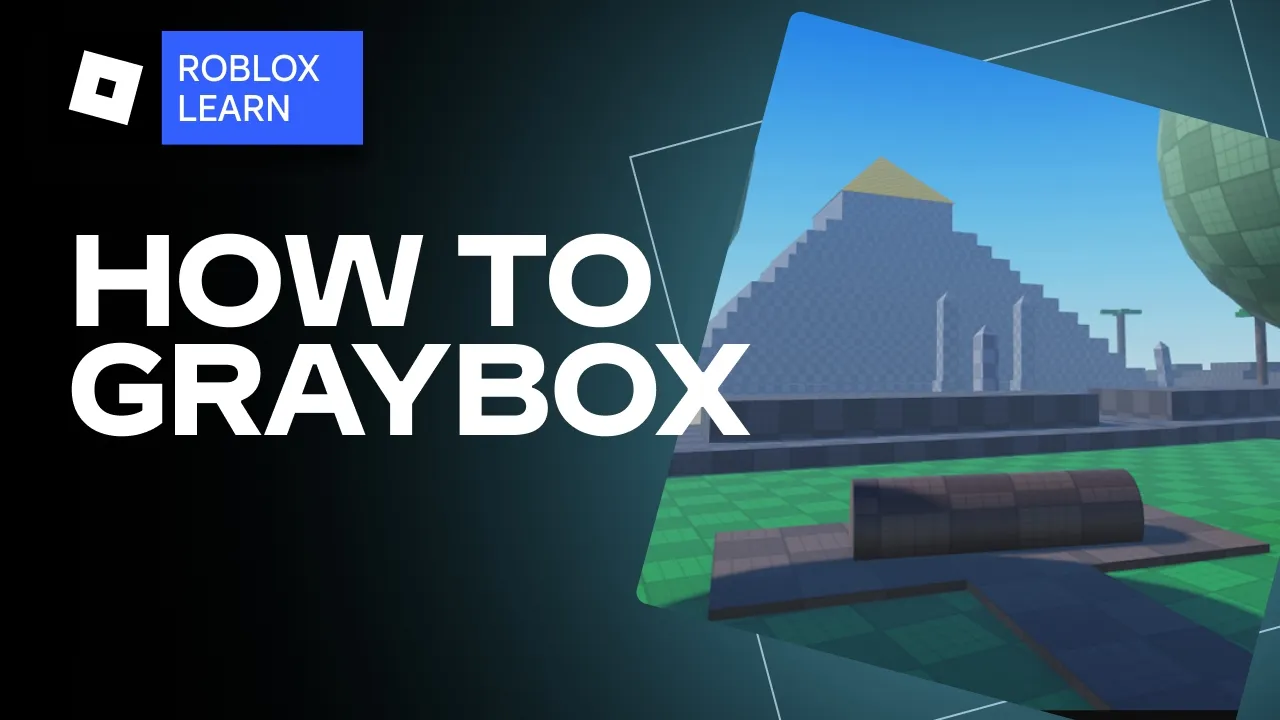
Roblox Learn · @RobloxLearn
Where viewers went back to watch this video again, from YouTube's public Most replayed graph, lined up with what was said at that moment.
Most replayed moment #1
3:0510.1x the video's typical replay level
texture objects later. You can do this by inserting a material variant object to the material service, then swapping out its color map for this texture ID and setting its studs for tile to eight. If you'd like a little bit of light reflectance and depth, you can also set the normal map ID to this, but it's not
Said at 2:58
Most replayed moment #2
2:219.8x the video's typical replay level
into subfolders. Keep in mind, you should set yours up based on the objects you plan on using in your map, which may differ from mine. As you can see, I set up a main map geo folder. And then from there, we're setting up cottage, village, desert, forest, and mountain temple folders as I need them.
Said at 2:13
Most replayed moment #3
6:174.1x the video's typical replay level
what makes a good gray box so we can use that design moving forward. Here I have three gray boxes in a more urban linear environment. This one is great and exactly what you should be striving for. But the other two, not so much. As you're designing your gray box, you
Said at 6:12
The graph counts replays. It does not show where viewers stopped watching.
Words
2,340
Runtime
12:19
Speaking pace
190wpm
Reading time
10min
190 words per minute, between the 181 median and the 201 75th percentile of 349 measured videos. That distribution comes from the 349-video hook study.
Opening (first 30 seconds)
In this video, we're going to be learning about the art of gray boxing and setting yourself up to create a successful environment for your experience from the very start. Now, when making a new experience, many artists want to jump right into making the best version of their grand vision. But you should always take a step back and make sure you follow the fundamentals first, with one of the most crucial being gray boxing. Gray boxing is using cheap and easy to edit models and primitives to test the core of your experiences
95 words, the words spoken in the first 30 seconds at 190 words per minute.
Free, no signup. See how the first 30 seconds hold attention, with rewrites.
Sentence shape
| Measure | This transcript |
|---|---|
| Sentences | 120 |
| Average words per sentence | 19.5 |
| Longest sentence | 52 words |
| Questions asked | 13 |
| Sentences containing a number | 0 |
Most used terms
Filler phrases
17 in total: like 14 · actually 1 · literally 1 · sort of 1.
A literal whole-word count of the same phrase list the Prepublish browser extension uses, so a phrase inside another word is not counted and a phrase used in its ordinary sense still is. It is a count and not a judgement.
Free, no account. See where attention is likely to drop, with a rewrite for each weak line. The free check shows the scores and the one issue costing the most. Or run it on the words above first.
Free · No login · See a sample audit first if you prefer.
What this transcript is
Every word below is the caption track YouTube publishes for this video, pulled from the video itself and reproduced unchanged. It is not Prepublish's writing, not a summary, and not a re-transcription: it is the video's own published captions. English captions, generated automatically by YouTube, in the video’s original language. Source: the video on YouTube. A channel that would rather this page did not exist can ask for its removal through the contact page, and it is removed.
In this video, we're going to be learning about the art of gray boxing and setting yourself up to create a successful environment for your experience from the very start. Now, when making a new experience, many artists want to jump right into making the best version of their grand vision. But you should always take a step back and make sure you follow the fundamentals first, with one of the most crucial being gray boxing.
Gray boxing is using cheap and easy to edit models and primitives to test the core of your experiences design without the risk of committing to complex models and details early which can be timeconuming to change later if your environment isn't working out. I'm Jalapeno and I'm going to show you just how to do this by breaking down into four parts. Organizing your workspace, making primitive props, gray boxing your terrain, and then gray box detailing with the props you made.
Now, I'm going to be using gray boxing to help design this cool fantasy world that consists of four distinct biomes for players to hang out and explore. [Music] But before we dive in, I want to point out a couple of quick disclaimers. One, art is subjective. Although these are great fundamentals, some may not always apply to the type of experience you are making. For example, what is good for an open world game may not be best for a racing simulator or first person shooter, and that's okay.
Two, if you have a team, it's important to work with them and get their opinions on some of the topics we'll be discussing, especially when it comes to file structure and organization. Your programmers may have some particular asks when it comes to these. All right, let's get into it. You should start by organizing your files via Explorer. Remember, a clean workspace is a happy workspace. You should break your map up into folders by first setting up a core folder for your map and then branching into subfolders.
Keep in mind, you should set yours up based on the objects you plan on using in your map, which may differ from mine. As you can see, I set up a main map geo folder. And then from there, we're setting up cottage, village, desert, forest, and mountain temple folders as I need them. Then each one will have a set of subfolders like foliage, buildings, terrain, light sources, and various other folders that I can organize my props into so they're easy to find later.
I also recommend using underscores instead of spaces so it may be easier to type in code later. Speaking of code, in a future video, I'll show you how a clean workspace now can save you time on tedious tasks later. Now, while setting up my file structure, I also set up a grid material so that we don't have to do any messy cleanup with texture objects later. You can do this by inserting a material variant object to the material service, then swapping out its color map for this texture ID and setting its studs for tile to eight.
If you'd like a little bit of light reflectance and depth, you can also set the normal map ID to this, but it's not necessary. Now that we have our file structure set up, we can begin gray boxing. Like many other game engines, Roblox provides a set of primitives like parts, wedges, and cylinders so that we can create any shape easily for our blockout that we might need right here in studio. Before blocking out your map, you should first decide what core props you'll be utilizing and make basic versions of them out of primitives.
This could be crates and cars used for cover in a first person shooter or foliage pieces or really any other core asset that would affect gameplay. In my case, I know I'll need two to three cottage buildings, a fence, some barrels, and a few other props. So, I'm going to make those. Now, now, the key to making a good primitive prop is to focus on the key silhouette of the object, and not so much the little details. For example, as I make this cottage building, I know the doors and windows will be modular in the detailing stage, so I can add them to any path.
They aren't important to the player's gameplay, so all I really need is the full shape of the building. I can easily get that shape by adding a cube part for the base and two wedges for the roof. Then I can copy that and scale it down to easily get the addition to the back side of the building. For something like a lantern hanging from a post, really the only key parts I need are the wooden post itself and a neon part floating slightly below it.
Details like the chain it's hanging from or the metal casing just aren't needed at this stage. As long as your early testers get a general idea of what you're portraying, you're on the right track. [Music] I'd recommend now that you have your permanent props done to put them aside and begin gray boxing your terrain and landmarks next so you have somewhere to put them. You might be thinking, "Hey, can't I just use the terrain tools for this?" No.
Although technically you can, you probably shouldn't. The terrain tools can get messy quickly and sometimes can be hard to make quick small adjustments to a layout. So, even for this, you should be using primitives. As you go through gray boxing your map, make sure you're testing often to make sure your scale and positioning is how you'd like. And remember, it's okay to make tons of iterations in this stage. That's what gray boxing's for.
[Music] Sometimes as you're gray boxing, you realize you should have made some props you forgot about, like I did here with the large cliff rock. That's okay. Just make it now so you have it for later. You can see as I go through designing the terrain, I copy and paste from other areas often, saving time on filling in things like cliffs around the edge of the island, especially if the shape is going to be similar to areas I've already done.
Now that our terrain's done, we can start placing the permanent props we made. But first, let's take a look at what makes a good gray box so we can use that design moving forward. Here I have three gray boxes in a more urban linear environment. This one is great and exactly what you should be striving for. But the other two, not so much. As you're designing your gray box, you should keep a few goals in mind. Does a player know where they should be going?
This can be done via vista points and landmarks. Vista points in games are areas that provide a small break in the environment with either one clear objective or sometimes multiple smaller ones in the distance for the player to journey to. For example, a break in the trees along the cliff side where the player can see a looming castle in the distance or some stables or smaller village a bit closer or like the large building at the end of a road in a post-apocalyptic city like the one we have here.
It stands out compared to the other buildings and is always in view at the center of the frame when looking directly down the road. Landmarks, on the other hand, are a way of guiding the player once they've already reached a point. For example, a memorable statue in the center of a city, reminding players of the layout, or like we have here, a specific restaurant that is only along one path that really stands out to remind the players, "Yes, this is the direction I should be going." Both vista points and landmarks are a great way to guide players to an objective without constantly having to remind them or literally point an arrow in the direction they have to go.
Now, let's talk color. Although this is called gray boxing, you can absolutely use other colors to simulate paths, the infamous yellow paint marks or colored lights and other guidance tools that be present in the final map. Don't feel limited to just shades of gray. Next, does the map flow smoothly to the player? Does it take too long to get somewhere too short? Are there interesting paths to get somewhere or are they more bland and direct?
And finally, is the camera accessible to the player at all times? Are doors and entries to new areas large enough? Is the ceiling tall enough? Often times, we must make these things abnormally large to accommodate a third person camera and ironically feel more natural to the player despite the size difference to the real world. Let's take a closer look at these gray boxes and test them from a player's point of view. This first gray box has multiple bad practices you should always avoid.
The artist who made this didn't keep to any of the goals we just discussed. The main path is confined and confusing, and the ground is the exact same color as the main terrain. The doors and ceilings are far too small and do not fit a camera, especially on mobile. And if I can vibe my way through, the path is overly long, taking forever to get to point of interest, causing even more frustration and confusion if I'm even going the right way.
This could result in a player actually having a negative reaction to completing their current task rather than a positive one, being happy it's over rather than excited to move on to the next objective. Now, this second gray box is closer to our goal. It utilizes a nice vista point to keep the player moving forward towards a clear objective. However, the camera still does not play well with the map with confined spaces being very hard to go through.
And although the players kept focused by blocked roads and the splash of color added to the map, the path is also still very long and a bit of a slog to get through. There are a lot of repetitive tasks clearly designed to just drag out my time as a player rather than let me feel like I'm exploring a living world. Now, this third gray box is perfect and exactly what you should be aiming for. The path is clear and defined with both the vista point and multiple landmarks to keep the player moving forward.
Fire is used to mark off clear danger zones and lights are utilized to catch the player's attention. The doors and rooms that may affect the camera are just large enough to not feel out of place in the world while seamlessly allowing the camera to pass through and giving a chance to look around without feeling confined. Tedious tasks are replaced with storytelling and interesting spaces for the player to explore if they want to.
But the overall path is just long enough for the player to not lose interest and feel like they're going through tedious motions to drag out gameplay. Notice how we continue to use light sources and color to keep it clear where the player's meant to go. And in the second room, we take advantage of the natural brightness of the outside to attract the players attention away from areas that aren't as important. We make sure the landmark is the immediate focal point as they emerge from the dark.
So, we don't want them to be turned around or confused. By doing this, they can continue directly on their path without needing to think about where to go next. If we head back to our fantasy world, we can see how we utilize some of those goals already to make a great gray box for our terrain. This is still a bit plain, though. So, let's finally add in the props we made earlier. You should once again be testing as you go, making sure the map flow stays smooth and understanding to the player.
It's okay if areas still feel rather plain during this stage. The only props you should be adding are those that are core to gameplay, leaving plenty of room for detailing later. This is also your chance to begin planning out some environmental storytelling. They get easy to brush props down and not think much about why they're there. But believe me, even if your players don't consciously know it, adding in that little bit of extra thought will make them much more immersed in that.
Some examples of this in other games and experiences are, does that really need to be a doorway? Or should I swap it out for a break in the wall? Should every chair be tucked perfectly under their desks? Or should some be knocked over or even left on top of it as if someone missed work? In my case, should that beast point just be a dirt patch, or should it have a fallen log for villagers to rest on? These sort of small details will make your map stand out next to the rest of the competition out there.
[Music] Well, great. Now that the gray box is done, we can now send it off to the rest of our team to get started on adding gameplay. Now, this gray box looks pretty cool, but imagine how much better it' look if we did this to the lighting. Check out the next video in the series to see how to achieve it. And in the meantime, you can explore the final build and other great content in our brand new Roblox Learn experience linked below.
The words are the caption track's own and nothing is reworded or re-transcribed. Paragraph breaks are placed between sentences so the text reads as prose.
Free tools for your own script: paste a draft and see where it stands before you record it.
Paste your draft and see where viewers are likely to drop off, with a rewrite for each weak line.
Paste the first 30 seconds of your own draft for a hook score and rewrites.
Check your draft against YouTube's advertiser-friendly guidelines before you record it.
Read this channel's public videos and transcripts, and download a writing brief for it.