Getting the transcript
Reading the captions from YouTube. A video nobody has opened here before takes 10 to 30 seconds; this page fills in on its own.
Getting the transcript
Reading the captions from YouTube. A video nobody has opened here before takes 10 to 30 seconds; this page fills in on its own.
Kole Jain · @KoleJain
Where viewers went back to watch this video again, from YouTube's public Most replayed graph, lined up with what was said at that moment.
Most replayed moment #1
8:214.7x the video's typical replay level
interest payment because who cares about that and then add this Kabab icon just in case someone actually does care about it then we can slot that perfectly into our empty space follows that is a solid looking Financial dashboard that is slightly more usable now if I missed any changes let me know in the comments down
Said at 8:14
Most replayed moment #2
0:164.3x the video's typical replay level
me thinking about the entire design in common dribble fashion it looks amazing but doesn't actually make that much sense once you start zooming in what bro what are you talking about man so today we're redesigning it from scratch from the ground up so you know
Said at 0:09
Most replayed moment #3
4:423.5x the video's typical replay level
if you want the entire breakdown check out that video after this one but basically curving data lines like this bad and fading of the data line worse other than that we just moved things around added some grid lines and a time scale selector however in an effort to
Said at 4:35
The graph counts replays. It does not show where viewers stopped watching.
Words
2,069
Runtime
8:42
Speaking pace
238wpm
Reading time
9min
238 words per minute, above the 201 75th percentile of 349 measured videos. That distribution comes from the 349-video hook study.
Opening (first 30 seconds)
so I was scrolling through dribble trying to find UI elements to redesign for my last video when I came across this design I did end up taking this chart card to redesign but later it got me thinking about the entire design in common dribble fashion it looks amazing but doesn't actually make that much sense once you start zooming in what bro what are you talking about man so today we're redesigning it from scratch from the ground up so you know the right way to design UI dashboard and so you don't post your work on dribble and get made fun of by some dumb guy on YouTube with 1500 sub subscribers let's go quick side
119 words, the words spoken in the first 30 seconds at 238 words per minute.
Free, no signup. See how the first 30 seconds hold attention, with rewrites.
Sentence shape
| Measure | This transcript |
|---|---|
| Sentences | 1 |
| Average words per sentence | 2069.0 |
| Longest sentence | 2,069 words |
| Questions asked | 0 |
| Sentences containing a number | 1 |
Most used terms
Filler phrases
22 in total: like 8 · actually 5 · you know 3 · I mean 2 · basically 2 · kind of 1 · sort of 1.
A literal whole-word count of the same phrase list the Prepublish browser extension uses, so a phrase inside another word is not counted and a phrase used in its ordinary sense still is. It is a count and not a judgement.
Free, no account. See where attention is likely to drop, with a rewrite for each weak line. The free check shows the scores and the one issue costing the most. Or run it on the words above first.
Free · No login · See a sample audit first if you prefer.
What this transcript is
Every word below is the caption track YouTube publishes for this video, pulled from the video itself and reproduced unchanged. It is not Prepublish's writing, not a summary, and not a re-transcription: it is the video's own published captions. English captions, generated automatically by YouTube, in the video’s original language. Source: the video on YouTube. A channel that would rather this page did not exist can ask for its removal through the contact page, and it is removed.
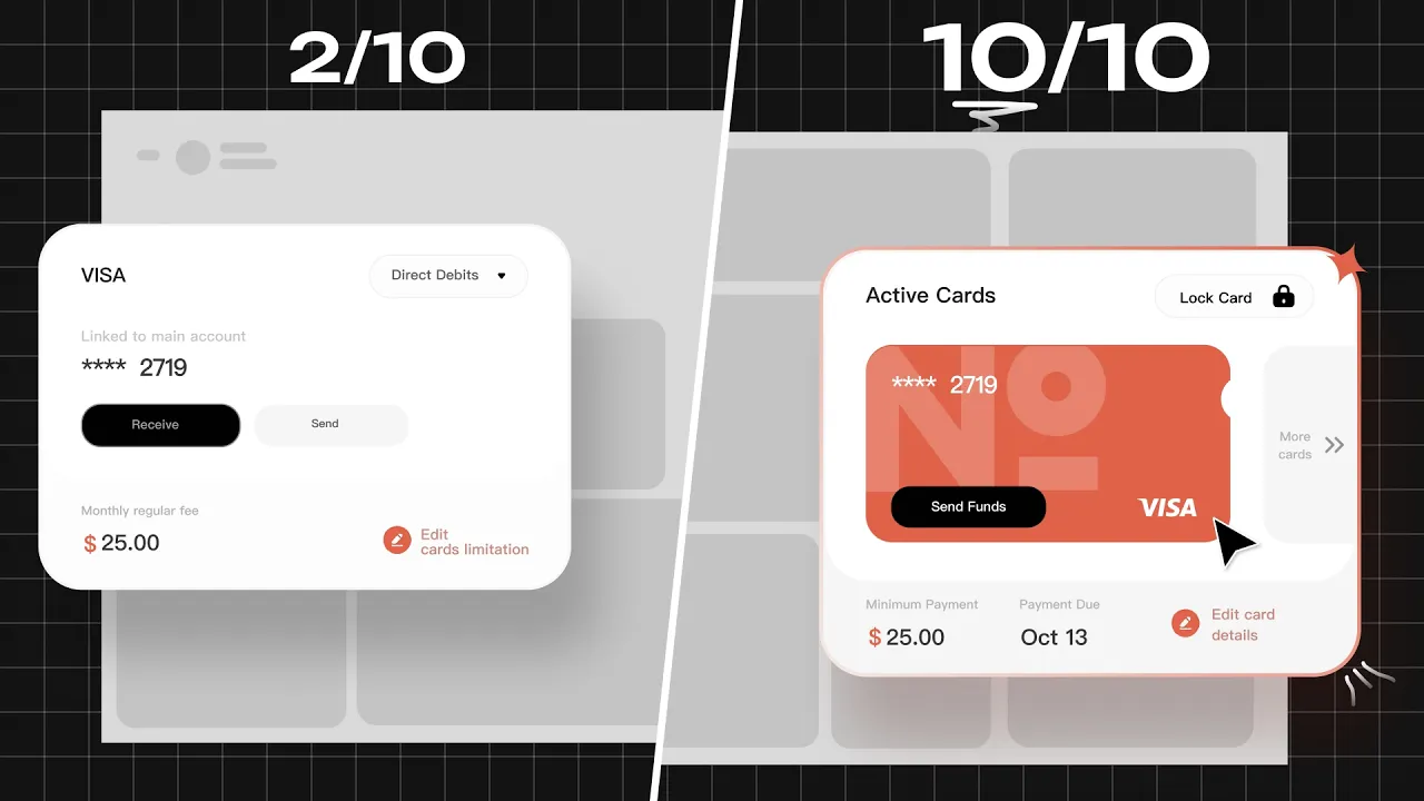
so I was scrolling through dribble trying to find UI elements to redesign for my last video when I came across this design I did end up taking this chart card to redesign but later it got me thinking about the entire design in common dribble fashion it looks amazing but doesn't actually make that much sense once you start zooming in what bro what are you talking about man so today we're redesigning it from scratch from the ground up so you know the right way to design UI dashboard and so you don't post your work on dribble and get made fun of by some dumb guy on YouTube with 1500 sub subscribers let's go quick side note before we begin if you do want to edit any of these files we're working on stick around to the end of the video to find out how to get access to them for free when I'm looking at this the first thing I can think is that things are going to get cut off by the fold somewhere around here and that's fine I can scroll but if I'm going to have to I don't want all this space up here while the important is down at the bottom so our first order of business is to do an assessment of the hierarchy and probably end up tossing a few elements in the process let's break this down into what I'm going to call the header of this UI and the rest of it for this header I'm thinking we could shove this all into a sidebar that could also be handy for navigation firstly the menu and logo look good to me that's a hell of a lot better logo than I could certainly make but we definitely don't need to announce that this is a financial dashboard since that should hopefully be apparent next we're going to give Dwayne Tatum some co-workers so he's not a CEO assistant without a CEO we'll also add a button to manage the team just in case Dwayne wants to fire someone in the future now we have two search bars that look like they do exactly the same thing so we're going to get rid of one I also don't know the last time I saw Financial dashboard with the option to dictate text but I'm going to go on a limb and remove that too I don't think the date is entirely necessary but we might add it in if we have room however this button is definitely necessary and more than that we shouldn't have to click on the button to see our tasks we'll move this to the side and turn it into a separate section later let's build out our sidebar now that we've gotten down to the essentials log go at the very top followed by the menu icon then we'll put our team next and the settings all the way at the bottom lastly I assume this button is to add a widget or a section to the dashboard this is a pretty good feature but it's in an awkward spot so we'll put it in our sidebar instead if we choose to collapse the menu I'm thinking it could look something like this all right now we've opened up all the space up here but also kind of screwed it up down below let's move the sidebar for a second so we can get a better understanding of what we're working with there are 12 cards or elements here and many of them look pretty useless for example the system lock should be integrated with the credit card information so you can lock the card online when you accidentally send Bill Gates a Bitcoin after he promised to send you two back anyways the growth rate should definitely be part of the annual profits card I don't even have a clue what is going on with this 13 Days card but I'm getting rid of it this chart also should be included in the annual profits card too this questioner at the bottom is bulky and provides no real value to us maybe we'll find a way to work it in later but we're getting rid of it for now that just leaves these elements for us let's start with the modals that we'll be adding elements to so the credit card widget and the annual profits widget you know when I said in common dble fashion it looks amazing but doesn't actually make that much sense once you start zooming in well this this is what I mean this looks like a credit card which can receive direct deposits or send them for that matter either so I'm going to scrap this direct deposit button and instead replace it with our lock card button we'll also get rid of this receive button since you can't really receive money with a credit card I don't know what the hell is going on with this design I like the idea of actually having a credit card on here with our number on it I'm going to take some inspiration from the wise card and by that I mean steal it entirely we'll apply our brand colors but this is lacking something we going to take our logo blow it up and reduce the opacity now things are starting to make sense with these changes we need to retitle the card to something better I'm going to replace the monthly fee with a minimum payment and add the due date lastly I'll add a way for us to scroll to more cards if we wanted to add more than one to this dashboard when it comes to laying out the dashboard let's think about this as a grid where the more important information should be higher and farther left without knowing how the other models will shape up let's just try ranking the importance of the modals as we make them think about this as our tier list credit cards are certainly important Financial information so I'm going to give it a mid-level priority for now you know what makes less sense than receiving money on a credit card this chart it design is honestly pretty sound but without any labels these numbers don't mean anything we don't need any massive changes just to add some much needed context a made the executive decision that having a chart like this along with the growth percentages is repetitive so we're trashing the chart entirely to add the growth percentages we're going to use these chips with the percentages for every level not much else needs to be changed but as far as the importance of this information I'd say it's pretty low let's move on to the next one this is the chart we redesigned in this video so if you want the entire breakdown check out that video after this one but basically curving data lines like this bad and fading of the data line worse other than that we just moved things around added some grid lines and a time scale selector however in an effort to match the theme of the dashboard a little better I'm going to make a few minor tweaks instead of having the slider to select the time scale we'll change this into a drop down I'll also add a compare Buton button just in case there are multiple portfolios that they want to compare across finally I'll put this icon back to take the user to a full screen version of this chart I'm going to put this in the low priority level to since while it's nice to view your Investments you don't generally need to access them on a regular basis the largest and probably second most important model is the activity manager let's examine everything up here looks pretty good except for this minimize icon since I'm not entirely sure how we'd make this much smaller or replace that with an all activities button instead however the same cannot be said for down below this wallet verification makes sense but the other two let's start with this card it's a pretty diagram but entirely useless same with this navigation am I expected to click on these tiny circles to navigate around I honestly have no clue what they were going for here so we're turning this into a fraudulent activity alert every good alert starts with this icon we can then add the amount date and place the transaction took place that makes much more sense than what we started with next up for the business plan we're once again missing too much context to make sense of what this is I do however like this diagram so I'm going to flip this 90° and change the colors a little bit we'll turn this into a bank loan approval instead just add the loan amount and the repayment date and we're good to go activity of the day-to-day business is definitely a high priority function so up it goes okay now we're going to take this button and turn it into an entire model so we can actually view our tasks for the layout we're going wide and thin and I was originally thinking we could fit four reminders in here but in keeping with the margins from the other models we'll do two cards and add some filters too of course with only two here we'll need a way to view them all so let's put a big red button up here for that of course we'll also need a way to add new reminders so we'll put that right beside our all tasks button seeing as this was pretty much our call to action this should be a high priority model brilliant our next model is for income and expenses it contains some pretty important information but has basically no visuals or anything to represent the data let's fix that I'm thinking the best way for us to represent money coming in and out is is by having a two-sided bar chart with the bars that extend upwards representing income and the bars that extend downwards representing expenses let's slap that at the bottom of the card we'll give this one a title of Revenue and expenses and pop the dollar values back on there lastly We'll add an icon to take us to the full screen chart from a business standpoint income and expenses seem pretty important so high priority all right that is all of our sections designed out so let's start putting them together starting with our high priority models with the task calendar being the furthest top left left we have two orientations but this one leaves an awkward Gap that will be difficult to fill with something while the other does not our only mid-level priority is the active cards so we're going to slot that in here lastly we can pop our low priority modals down here and look at how well that fits together I may have planned that out a little bit but we have a clear Gap that we do need to fill out no offense to the original Creator but I just don't think there was a ton of financial thought behind this dashboard it's clearly lacking some sort of line of credit section so that's exactly what we're going to slot in here originally I was thinking of using a layout like this but then I thought wait a minute let's use a pie chart instead data representation people it'll make or break the UI and ux of your dashboard so anyways we throw in a pie chart toss the interest payment because who cares about that and then add this Kabab icon just in case someone actually does care about it then we can slot that perfectly into our empty space follows that is a solid looking Financial dashboard that is slightly more usable now if I missed any changes let me know in the comments down below below and if you want access to all the files that we worked on today it'll be the first link in the description down below thanks for watching if you enjoyed consider subscribing and I'll see you in the next one [Music]
The words are the caption track's own and nothing is reworded or re-transcribed. Paragraph breaks are placed between sentences so the text reads as prose.
Free tools for your own script: paste a draft and see where it stands before you record it.
Paste your draft and see where viewers are likely to drop off, with a rewrite for each weak line.
Paste the first 30 seconds of your own draft for a hook score and rewrites.
Check your draft against YouTube's advertiser-friendly guidelines before you record it.
Read this channel's public videos and transcripts, and download a writing brief for it.