Getting the transcript
Reading the captions from YouTube. A video nobody has opened here before takes 10 to 30 seconds; this page fills in on its own.
Getting the transcript
Reading the captions from YouTube. A video nobody has opened here before takes 10 to 30 seconds; this page fills in on its own.
Stefan James · @stefanjames.brandbuilding
Words
4,553
Runtime
21:10
Speaking pace
215wpm
Reading time
19min
215 words per minute, above the 201 75th percentile of 349 measured videos. That distribution comes from the 349-video hook study.
Opening (first 30 seconds)
If you're building a brand and you want it to feel premium, elevated, and worth paying more for, this is exactly what you're going to learn in this video. See, there's a bakery in the UK. Whether you've heard of it or not, I know a lot of my viewers are in the US. If you've never set foot in one, it doesn't matter. What matters is they've managed to elevate themselves above every other coffee shop and bakery in the country and become a genuinely premium brand in their category. So today you're going to learn how they use creative visual language to elevate their brand alongside
108 words, the words spoken in the first 30 seconds at 215 words per minute.
Free, no signup. See how the first 30 seconds hold attention, with rewrites.
Sentence shape
| Measure | This transcript |
|---|---|
| Sentences | 294 |
| Average words per sentence | 15.5 |
| Longest sentence | 62 words |
| Questions asked | 5 |
| Sentences containing a number | 23 |
Most used terms
Filler phrases
53 in total: like 20 · you know 12 · actually 10 · basically 5 · kind of 2 · sort of 2 · I mean 1 · right? 1.
A literal whole-word count of the same phrase list the Prepublish browser extension uses, so a phrase inside another word is not counted and a phrase used in its ordinary sense still is. It is a count and not a judgement.
Free, no account. See where attention is likely to drop, with a rewrite for each weak line. The free check shows the scores and the one issue costing the most. Or run it on the words above first.
Free · No login · See a sample audit first if you prefer.
What this transcript is
Every word below is the caption track YouTube publishes for this video, pulled from the video itself and reproduced unchanged. It is not Prepublish's writing, not a summary, and not a re-transcription: it is the video's own published captions. English captions, generated automatically by YouTube, in the video’s original language. Source: the video on YouTube. A channel that would rather this page did not exist can ask for its removal through the contact page, and it is removed.
No Script X-ray for this video: YouTube shows a Most replayed graph only once a video has enough views.
If you're building a brand and you want it to feel premium, elevated, and worth paying more for, this is exactly what you're going to learn in this video. See, there's a bakery in the UK. Whether you've heard of it or not, I know a lot of my viewers are in the US. If you've never set foot in one, it doesn't matter. What matters is they've managed to elevate themselves above every other coffee shop and bakery in the country and become a genuinely premium brand in their category.
So today you're going to learn how they use creative visual language to elevate their brand alongside real psychological biases. Whether that's scarcity, social proof, reciprocity, and a handful more. Same universal principles. Whatever brand you're building, I'm going to go through them in a practical way so you don't just understand them, you know how to implement them. And if you want to actually apply this rather than just watch, I put together a free downloadable workbook, beautifully designed hopefully, and that walks through every point in this video and you get specific prompts about how you can bring this into your brand and use this stuff in a practical way.
So, it's free. Grab the workbook, go through it while we're watching the video. The link is in the description. Follow along. Whether you're new or a regular to this channel, this is a new series I'm going to do every, say, 2 weeks. Why this brand feels so premium. See, every episode we're taking one standout brand from a completely different category, breaking it down exactly how they engineer that premium feeling. So you as a brand builder, you understand that this stuff is universal.
The stuff that I teach on this channel is art direction, brand psychology, brand positioning, and founder mindset. This stuff is universal. I've used it to build my own brands and I've used it to consult for brands. I've used it at agencies and this stuff works because the psychology is the same no matter what your products you're selling, no matter what category you're in. So, if you like the sound of that, grab the workbook and let's dive in.
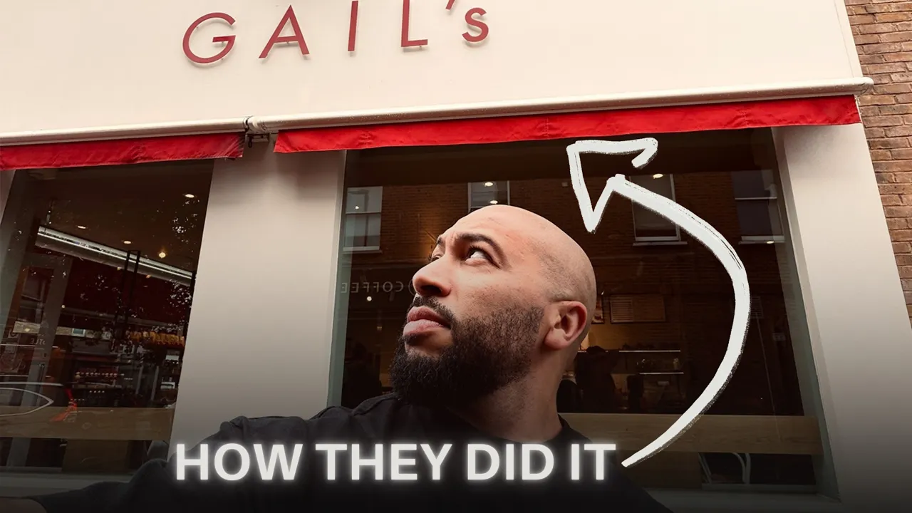
So, number one, art direction. I'm going to keep it real basic at the start and then we're going to elevate and get a bit more deeper as we go on. So, let's start with the logo. Easy, bold, uppercase red on cream. Beautiful, very refined, and a functional sans serif font. No script, no bakery cliches. See, that restraint is the entire message. Confident brands don't need to decorate themselves to be noticed. They don't need to scream louder.
Often premium and luxury brands are very understated. They use what I like to call the law of refinement. See, the font choice specifically is doing more than just looking clean. A functional sand serif removes complexity and clutter. And what that means is it's legible from a distance. It's easy to process at a glance and it doesn't ask the customer to work at understanding what the brand is. You could be 100 m down the high street and you can spot the cream and the red Gales font and you know instinctively that's a Gail's coffee shop.
And that, my friends, is cognitive fluency. Basically, the easier something is for your brain to process, the more it defaults to reading that thing as trustworthy and of high quality. So, if you're building a premium brand, this is why it matters. Every extra second someone spends decoding your logo or your name is a second of friction working against you, not for you. Let's take this a step further because they do something really interesting.
Look closer. And the pallet isn't actually fixed. So, they have their brand visuals and their brand visual language and their branding components. Where they're really clever is this branding isn't actually fixed. It's fluid. See, each location gets its own color cues tied to the neighborhood it's in. Whether it's green developed to echo Cliss Old Park at their Stoke Newington branch, which is very hipstery, where it's blue tiles referencing the spa baths in Buckton.
See, the core identity is the logo, the type, the red that never moves. everything else. It flexes by postcode. And that's very clever because on the surface that reads as your friendly local bakery. In reality, they're aggressively expanding into every upand cominging high street and high-end postcode in our country. That contradiction is deliberate. See, people trust independent local businesses more than they trust chains.
I don't know about you, but I'm so put off by Starbucks and and those coffee chains. They serve crap coffee. The interior always looks the same, and it's never nice. And the music is absolutely so they're doing these clever things to look and appear like a local even while scaling like a corporation. It borrows a level of trust that a chain wouldn't normally get for free. And it's a way of getting you to warm to the brand and open up a bit more and lower your defenses.
Very subtle, but once you see it, you can't unsee it. It's also worth noting that the buildings themselves often have real character. See, a lot of these buildings are converted banks or Victorian properties, old high street buildings with existing architectural weight or heritage rather than generic new build retail units. I mean, they do have a few in the portfolio, but a lot of the gales that I've been to, they are in these really like nice buildings on the high street.
Now, I can't say for certain how much of that is deliberate versus what's just available. We all know the UK has a genuine property shortage, so there's only so much choice given by postcode. they can only rent a handful of properties, but intentional or not, it adds real character to the brand. And it reinforces that local and that considered feeling. And it elevates the brand a bit more by giving it a bit more heritage and making it feel like it's been around for a while, not just popped up everywhere overnight, which it basically has.
So, it's more local, less corporate roll out like Starbucks, Cafe Nero, Pre. I don't know what coffee shops you have in the US, but you get my drift. Point number two, brand positioning. See, in their book, Brand Positioning from the Godfather of Brand Positioning, written in the 80s or the '9s, that book, The Battle for Your Mind by Al Rice and Jack Trout, made the case that positioning isn't something that just happens to your product.
It's something that happens to the mind and inside the customer's head entirely independent of what you're actually selling. So, that's the whole game here. When you're building a premium brand, you want to elevate your brand positioning because brand positioning is the cornerstone or the foundation of everything you do going forward. See what they argue and what I've seen over the last decade or so of building brands, consulting for brands, working with big brands, working with top agencies, you don't win by being better.
You win by owning a specific position in someone's mind before your competitor does. So, if you notice what Gail calls themselves, Modern Craft Bakery, they could have just said coffee shop. Modern Craft Bakery. It's popping up in a load of different brand communications. On the Instagram is one which screams they're not just a coffee shop. They're not just a cafe. that positioning is doing its job before you've even walked in.
So, you think you're popping in for a coffee and the brand has already reframed itself in your mind as something much bigger, much more elevated, a fullyfledged bakery that happens to serve coffee. So, now let me jump into the decor and how they use the illusion of effort. See, inside the first thing you see when you walk in is a wall full of bread. Full loaves stacked visible. That's an abundance cue. Then the open kitchen, flower dusted aprons, exposed ovens, bakers. you can actually watch baking the stuff.
That's the labor illusion at work, which basically means visible effort makes you value the output even more or the product or the service. Even though the recipe hasn't changed, you see this a lot in high-end restaurants, too, because they showcase this illusion of effort through open kitchens, chefs shouting, prepping food right in front of you, you know, hand rolling your sushi or cooking up your 70 lb ribeye steak that you just ordered over frying pan that's got fire on it.
You know, all of this stuff is performance. And make no mistake, this stuff is intentional and it's all premium signaling and it's authority signaling, too. So, you're not just buying bread, you're buying from someone who's visibly good at their job. But here's a funny thing. I can't prove it, but I have a sneaky suspicion that half of this stuff is made off site and then just slung in the oven and heated in store. There's also a reason they want you to sit down rather than grab and go.
The classic third space idea, not home, not work, but somewhere in between. The longer you stay, the more the brand becomes quietly part of your routine instead of just a transaction. So all of a sudden you find yourself going there for a coffee, bringing a laptop, doing a bit of admin work for the first two hours of your day. And you do that two, three times a week. I know I do. Another premium signal they use, and this is good if you've got a a physical store or if you have an unboxing experience, is the smell and sensory branding.
So anyone who's been to a G will know the smell is absolutely lovely. It's that smell of warm, sweet baked croissants and pastries the second you walk in. That's not incidental. Smell is one sense that's wired directly to the brain's lyic system, bypassing the more analytical filtering that sight and sound go through. So, it's basically a shortcut to the pleasure centers of the brain, which is why a scent can trigger emotion and memory faster than anything else.
And why does that happen? Because it's evolutionary. The smell of baked sugar and fat and carbs has always signaled calorie dense safe food. So, your brain responds to it before you've consciously decided anything. Super clever. And Gales isn't relying on willpower to sell you a pastry. They're bypassing that entirely. They're using these clever little techniques. If you're enjoying this so far, please click subscribe.
I drop deep dives like this all the time on the channel. And if you haven't already, download the workbook, go through that, and it will give you practical prompts to actually elevate your own brand using this sort of stuff. Now, let's jump on to creative direction, the art direction, and the tone of voice of the brand, cuz it's got a certain personality about it, and it's brought out through the creative and art direction.
Even their photography plays by the same rules. Single product, plain background, soft light, more negative space than food photography usually allows. It looks like a skin care packaging rather than bakery marketing. The packaging system is just craft cream and one block of red repeated everywhere. So your eye finds the word gales instantly regardless of the product. And they allow themselves exactly one moment of looseness, which is the flexibility I talk about in the brand.
Whether it's scattered, tumbling typography, the letters falling over each other on the walls, or the pavement sign that reads like a sentence built to make you taste it, not just ingredients. All of these things bring out the brand personality. There's also a great one. I'm going to put it in the B-roll somewhere here of the words forming a whisking movement to, you know, to signify the illusion of effort of whisking.
And this is freshly baked stuff. We're whisking the eggs and, you know, all the mixture. Very clever stuff. But the great thing about the art direction and branding and any imagery that you see from them is very restrained. Restrained everywhere, simplified, stripped back, except everything seems to be considered. A brand that sounds and looks human doesn't read like it's selling you something. It reads like it's talking to you.
And that quietly lowers your guard before a single price ever enters your mind. So before you know it, you're buying a a quissant for £5 or five bucks, six bucks. Now, let's jump onto the price psychology that I use. Again, this channel is about brand positioning, brand psychology, creative direction, and founder mindset, and founder coaching. So, let's jump into the brand psychology side of stuff. There's a ladder happening here, too, when it comes to pricing.
See, coffee is the entry point to the brand. It costs pennies to make, and it's probably where a lot of their real margin lives because they can turn out, you know, 50, 60 coffees in an hour and it's relatively cheap to produce and it gets you in the door. Everyone loves the smell of coffee and you go in there for a coffee. But that low easy price point is doing a lot of heavy lifting when it comes to the psychological work.
See, it sets a small painless anchor. Once you've mentally agreed to spend about £3 without a second thought, which is actually reasonably priced for a coffee, they could justifiably charge more. A £5 next to it or next to the teal or outrageously £7 kiche or a £10 sandwich next to it doesn't get compared against that £3. It gets judged completely on its own. See, that's mental accounting. You process each purchase as its own small decision, not as one growing total.
So, it's a coffee, then a sandwich, then a pack of brownies for later, which are [ __ ] delicious, by the way. None of those decisions feel connected, even though your basket has quickly just become £15, 20 when you only intentionally wanted to spend £3. And that's built from a lot of small easy yeses. See, the coffee acts as a bit of a Trojan horse. It's a low entry price point. you don't give a second thought about.
And once you're inside it, everything after gets judged on its own terms, not against the number you started with. See, here's the clever part. There's no cheap loaf of bread in the room to compare against. So, when you're looking at their arteasonal sourdough that's meant to be far more superior to any other sourdough that's out there in the market or in the supermarkets, when you're in the store, there's no other comparison set.
So, your mind is completely forgetting about the fact that you can buy that same sourdough, maybe not as great, but you can buy sourdough for a fraction of the cost elsewhere. Or you can bake it at home for cheaper. So £450 for a loaf, a small loaf of bread becomes the price of bread here. That is the expected price you pay for bread. See, the language does more work, too. It's never simply framed as bread. It's sourdough, natural, stonebaked, handcrafted.
And that's where they play with the halo effect. The halo effect quietly lifts the whole range of products through this kind of language and this positioning. And all of the good stuff from that halo filters on to all the other products and everything you buy in the store, which include products that have nothing to do with sourdough bread at all. See, underneath all this is the underlying psychology that when you can't judge quality by looking, by seeing it up and close and personal or by experiencing it, i.e. tasting it, you're not going to walk up and take a bite out of the massive loaf of bread, are you?
But by looking, see price in this case becomes the quality signal. Cheap alternatives, they just wouldn't build the same trust here. So you're looking at price and saying, "Hey, if they're charging £4 pound50 or I think £7 for some of the bigger loafs, this must be great. Let me try it." And once you try it, you're already invested because of all the other premium signals that they do. And suddenly that becomes your favorite bread.
I know I go in there once a week to buy a loaf for myself. And if you would have asked me a year ago how much I would spend on bread, it probably wouldn't have been more than £1. Now let's jump into some other psychological biases. Scarcity and loss aversion. See, everything in this bakery is made in limited supply. If they run out, they simply don't make anymore. You can go in there at 400 p.m. and ask the lady behind the till, hey, I don't see any of these available.
Can you make me one? And they'll outright say no. If you go to any other place, they'll probably say yes because they want the business and don't want to turn you away. There is no emergency batch in the back of the stock room. See, that is real scarcity. And while we're on the subject, I've done a deep dive on scarcity on this channel. It's all about inherent scarcity, authentic scarcity, not the manufactured kind that's fake.
People can spot from a mile off that stinks. So, if you like the sound of that, subscribe. You'll find that on the channel next. I'll probably link it after this video. But that's real scarcity. That's not a countdown timer. It hits harder because of loss aversion. See, when you see an empty shelf where the cinnamon buns used to be, that registers as a small lost. Even if you weren't planning on buying one, even if you don't like cinnamon buns, it's still subconsciously filtering through your mind.
And that is what gets you buying on site. Instead of saying, "I'll grab it later." Subconsciously, you're thinking, "Oh, I might as well grab this now because this is scarce." Not that I could probably come back tomorrow and there'll be a full range of stock. Now, let's jump on to social proof and belonging. See, a queue out the door isn't an operational failure. It's one of the strongest social proof signals a brand can get for free.
See, if 10 people are stood outside snaking down the street, and if you've ever been to London, a lot of them are small shops and during lunchtime it gets really busy and you got cues going out the door and the streets in London are quite tight. So if you're spilling out into the street, people are having to walk down the road and move around you and wondering why the [ __ ] you're in the way and then they look up and there's a massive gales there.
If 10 people are still outside snaking down that street, your brain draws one simple conclusion without you even deciding to. See, your brain makes that decision that that £5 must actually be worth it because why else would people be queuing up to get one? Nobody cues for something bad. We all know that. And with 50 plus locations, you're also seeing this brand constantly whether you buy it or not. That's the mere exposure effect.
Building trust before you've ever purchased. You're seeing it everywhere. You're seeing people walk around with the bags, seeing more people walking around with the coffee cups, which are branding is designed to be very public, very visible, and you're very much inclined to go in there. Even when you go into a store, there's a nice glass display case and one visually distinct pastry that looks like it's been handcrafted, very beige, and then it's got a, you know, some sort of color on top of it.
It always stands out and anchors the whole case as curated, not mass-produced. Like these are a few things we baked today that our professional chefs have made for you to enjoy. These things stand out and that is also what's known as the ven roster effect. Again, I do another deep dive on this channel. I'm working on that at the moment. Depending on when you watch that, that will be live too. Let's talk about public visibility.
See the tote bag that they make that cream bag, cotton fabric, striking red logo, really big large cream bold red logo, right? Big enough. It's never tucked away. It's high contrast enough to read from across the train carriage or across the road. wellmade enough that it extends the considered language of the shop and it's wellmade enough that you will use it time and time again until it falls apart. This ties into one of my favorite people on marketing and branding is Jonah Burger book called Contagious.
He basically said that the best brands are ones that spread when they're built to be seen in public and Gales employ exactly the same mechanism as Apple's white earbuds or the front-facing Apple logo. When you open your laptop, everyone can see you're working on an Apple Mac. Before you know it, you look around, there's 10 people next to you using an Apple Mac. The height of this was when Apple released the white headphones.
And those iconic white headphones were plastered everywhere in the big colorful bold advertising with the silhouette of a person using the white headphones to when you look around you and everyone around you is wearing white headphones and watching the iPhone like that at a time when phones were still relatively new or the MP3 player was around. It wasn't an iPod. We see this today with the white earbuds or the AirPods.
The design itself acts as a visible signal telling everyone around you exactly what you own without even saying a word. See, every customer that walks up with that cream big Gales bag is a walking billboard for free for weeks or months or whenever they decide not to use that bag anymore. This is how Gales uses habits and loyalty to elevate themselves and become that premium brand. See, once a routine forms, same order, same time, recognized by the same barista you've seen three times that week, switching bakeries starts to feel like a bigger decision than it is. when really it shouldn't be.
See, that's consistency bias. And every time someone walks out with that bag, it's still working. Status carry through. Then there's the loyalty app. See, when you sign up, you'll be back tomorrow to rack up the points. And that is reciprocity at work. See, when you give someone something small for free, whether it's a stamp, a reward for signing up, or a free coffee when you sign up, or free, you know, handbaked sourdough loaf after you collect eight stamps, they feel a quiet pull to return the favor.
And then when you stack that with the goal gradient effect, the closer you get to a reward, the harder you push toward it. So it becomes like gified in your mind, which is why the last stump on the loyalty card always feels more urgent than the first. And then I don't know about you, when when I actually get that free stamp, I kind of want to save that for a special occasion or, you know, push the boat out and and really take the piss and get the most expensive coffee I can for free, not just on my average coffee.
So I tend to hold on to that reward, which is so counterintuitive. See, what this stuff does is turn a coffee habit into a daily ritual before you even notice it happening, and you're less inclined to go elsewhere. Let's jump on to the companion magazines. All of this stuff I talk about, they've taken this all the way to print. Companion, which is a real bianual magazine on bread, ethics, and food culture, exist purely to reinforce one thing, that they're not just bakers, they're genuine experts, credible enough to publish some information on this.
Now, let's look at digital touch points. Even their app loading screen isn't wasted space. It's a handdrawn baker warming up the oven, steam lines coming off from the bread, signaling a smell you can't quite get through the screen. And that's the open kitchen effect I talked about earlier, translated through an app, through a digital experience. The personality doesn't switch off the moment you leave the shop. It's constant reinforcement of the illusion of effort, people working hard to make the best possible product for you to enjoy, whether you're in the store or looking on an app.
Guys, if you haven't already, download the workbook. You're going to get a couple of practical prompts of how you can actually implement this stuff. I also do a 30 free day email send out which is a practical tip every day for you to implement brand psychology and great art direction, brand positioning, all the stuff that I teach on this channel. It's free. My goal with you guys is to create enough value, talk about all the stuff I've learned over a decade of experience working with some of the best brands, top London agencies, building my own premium and luxury brands, learning from my wins, my losses.
It's been a very long hard road and I'm ready to start monetizing some of those painful lessons. So, at some stage, I'm going to be putting together a cohort. I want to invite 10 founders or brand builders, and we're going to go through your brand, deconstruct it, and elevate it. This channel is all about premium brand positioning and elevating your brand, no matter what stage you're at, taking the brand you have, taking it from here, not up to here, but to here, so you can be the premium option in your category of whatever you sell, whatever you're doing, whether you're a personal brand, product focused brand, whatever it is.
So, none of this stuff I talked about on the video is one clever trick. What you'll notice is it's dozens of small deliberate decisions all pointing in the same direction so consistently that by the time you're standing at the counter the price doesn't even register as a question. You're like, "Oh yeah, I'll spend £7 in that kiche. That could probably get one 10 times bigger in M&S for £2." That's genuinely what I teach in this channel.
How these premium signals layer on top of each other. One small decision reinforcing the next until they add up to a brand that feels premium and luxury without even having to say it. So if you're building a brand, subscribe. I'll see you on the other side.
The words are the caption track's own and nothing is reworded or re-transcribed. Paragraph breaks are placed between sentences so the text reads as prose.
Free tools for your own script: paste a draft and see where it stands before you record it.
Paste your draft and see where viewers are likely to drop off, with a rewrite for each weak line.
Paste the first 30 seconds of your own draft for a hook score and rewrites.
Check your draft against YouTube's advertiser-friendly guidelines before you record it.
Read this channel's public videos and transcripts, and download a writing brief for it.