Getting the transcript
Reading the captions from YouTube. A video nobody has opened here before takes 10 to 30 seconds; this page fills in on its own.
Getting the transcript
Reading the captions from YouTube. A video nobody has opened here before takes 10 to 30 seconds; this page fills in on its own.
The Secret Mindset · @TheSecretMindset
This video has no Most replayed graph yet: YouTube shows one only once a video has enough views. These are the moments viewers replayed most in The Secret Mindset's most watched videos.
Most replayed moment at 5:17
3.2x that video's typical replay level
pushing and winning. That move is real, too. This is when you can trust what you're seeing. Delta and price are telling the same story. But watch what happens when delta diverges from price. Price makes a
Said at 5:11
Most replayed moment at 15:49
4.0x that video's typical replay level
And now, the ultimate tool... ________________________________________ FOOTPRINT CHARTS (S-TIER) Footprint charts. S-tier. This is order flow on steroids. Imagine splitting a regular candle open and seeing every trade inside it. Normal candles just show you the end
Said at 15:46
The graph counts replays. It does not show where viewers stopped watching.
Words
4,186
Runtime
28:29
Speaking pace
147wpm
Reading time
17min
147 words per minute, below the 160 25th percentile of 349 measured videos. That distribution comes from the 349-video hook study.
Opening (first 30 seconds)
If I had to learn trading again from zero, I wouldn't start with indicators, strategies, or 50 different chart patterns. I'd learn one skill, how to look at a chart and recognize what is starting to happen before everyone else sees it. By the end of this, you will read a chart in five moves: pressure, attempt, failure, control, change, and first pullback. Right now, those are just words, but if you master this,
74 words, the words spoken in the first 30 seconds at 147 words per minute.
Free, no signup. See how the first 30 seconds hold attention, with rewrites.
Sentence shape
| Measure | This transcript |
|---|---|
| Sentences | 392 |
| Average words per sentence | 10.7 |
| Longest sentence | 36 words |
| Questions asked | 21 |
| Sentences containing a number | 13 |
Most used terms
Filler phrases
6 in total: like 5 · actually 1.
A literal whole-word count of the same phrase list the Prepublish browser extension uses, so a phrase inside another word is not counted and a phrase used in its ordinary sense still is. It is a count and not a judgement.
Free, no account. See where attention is likely to drop, with a rewrite for each weak line. The free check shows the scores and the one issue costing the most. Or run it on the words above first.
Free · No login · See a sample audit first if you prefer.
What this transcript is
Every word below is the caption track YouTube publishes for this video, pulled from the video itself and reproduced unchanged. It is not Prepublish's writing, not a summary, and not a re-transcription: it is the video's own published captions. English captions, published by the channel, in the video’s original language. Source: the video on YouTube. A channel that would rather this page did not exist can ask for its removal through the contact page, and it is removed.
If I had to learn trading again from zero, I wouldn't start with indicators, strategies, or 50 different chart patterns. I'd learn one skill, how to look at a chart and recognize what is starting to happen before everyone else sees it. By the end of this, you will read a chart in five moves: pressure, attempt, failure, control, change, and first pullback. Right now, those are just words, but if you master this, you will know what to look for before the move happens, not after it is already gone.
So, a beginner opens a chart and sees individual candles, green ones, red ones, big ones, small ones, with no apparent logic connecting them. An experienced trader opens the same chart and sees pressure building near a level, a failed attempt by buyers to push through. And the moment sellers begin taking control. The candles on the screen are identical in both cases. The reading is completely different. Beginners see details, but experts see relationships between the details.
And the good news, pattern recognition is not a natural talent that you either have or you do not. The brain learns this skill through exposure, prediction, and feedback. And most important, this system is not about memorizing more names. You'll learn to recognize the relationship between what price tries to do and what happens after that attempt. I'll show you. So why over 90% of traders fail because of how patterns get taught?
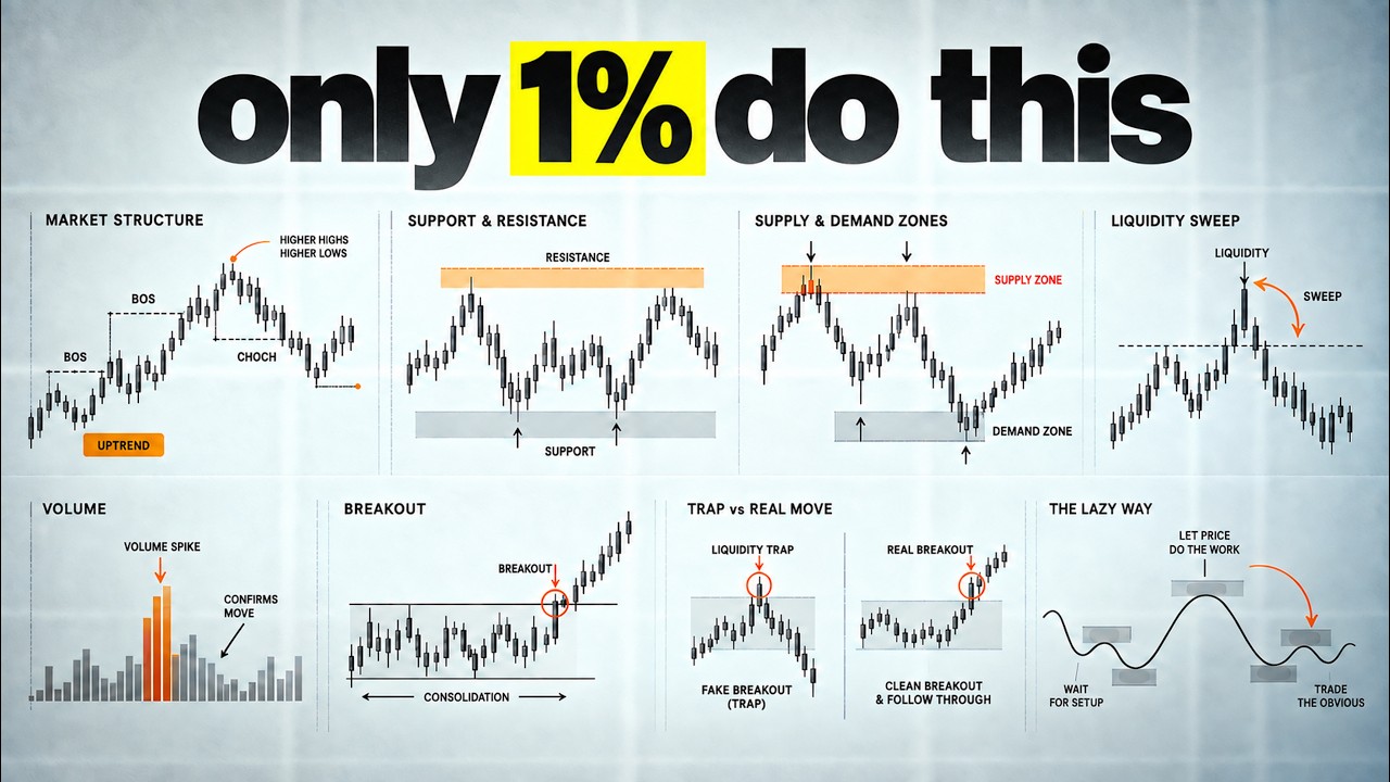
Open almost any beginner trading book and you will find beautiful diagrams, two pigs exactly level, a perfect triangle with clean touches. Those pictures are useful for one thing, which is naming something after it is over. The shapes look elegant on the diagram. Then you open a real chart and nothing matches. Look at what a real one looks like. This is a 15-minute chart with what a textbook would call a double top, except the second peak is higher than the first.
There is a third small peak in between. One candle has a wick twice as long as anything around it. Now you are stuck wondering whether this qualifies as the pattern or not and that hesitation costs you real money. And while you are trying to decide whether the shape deserves a name, the useful part of the move is already happening. Price has been moving higher. It reaches an obvious high and drops. Then buyers return and push through that high for a moment.
The breakout looks strong, but price cannot stay above it. the next candle slide back under the level and then selling becomes aggressive. You could give that sequence several technical names depending on the method you trade but none of those names changes what happened. Buyers tried to claim higher prices. They failed to hold them. Sellers responded. This is what happened. Real charts change three things every single time.
Candle size changes with volatility. The number of candles changes with time of day. The speed changes with whoever happens to be active. The story stays the same. So the problem is not a pattern itself. The problem is treating a pattern like a photograph that price must replicate exactly before you are allowed to act. But real markets don't produce symmetrical textbook drawings. Candle sizes shift with volatility. A formation that builds in 20 candles during a fast session might take 50 candles during a quiet one, but the behavior underneath remains consistent.
Price builds pressure against the level, pushes through, fails, and reverses. That sequence can look completely different in terms of candle count, candle size, and the speed of each phase while still carrying the same meaning and producing the same type of tradable move. So instead of figuring out what shape starts to form, start asking a different question. What is price trying to do? Watch this high. Buyers are trying to break it.
Now this low, sellers keep pushing into it. Then this range, neither side is making progress yet. This will shift your focus from geometry to behavior because a classic chart pattern is a picture. But pattern recognition is understanding what the picture means. And we can reduce that entire reading process to three simple questions. Question one, where is price struggling? Not where is price, where does it keep getting stopped?
On this 15-minute chart, price gets stopped at the same high several times. So my eyes go to that upper edge and nowhere else. Struggle looks like repeated visits to one area. a tight range or a level that keeps getting tested from the same side. Question two, which side is trying to move it? Look at who is doing the work here. The candles walking into that high are green and the retreats are shallow, which tells me buyers are the ones attacking and sellers are just defending a line.
Question three, is the attempt working? This is the question that pays. Working means price continues cleanly and creates new space. Not working means price stops making progress or pushes through and immediately comes back or gets shoved back by the other side. On this chart, the answer to question three is no. The attempt isn't working. Several attacks, no new ground, and the last two attempts closed lower than the first. buyers are attacking and losing.
So where is the fight? Who is attacking? And is the attack working? Those three questions can organize almost any chart without forcing you to know advanced terms. Try them on this level. The fight is at the low. Sellers are attacking. They break it with a large red candle. The next candle makes a new low and closes near its bottom. The next one continues. So yes, sellers are holding below the level. There is no failed attempt here.
Move to another chart. Price breaks a low but immediately prints a long lower wick. Then the following candle closes back above the level. Sellers attacked but the attempt did not work. Here's the rule I want you to keep. A break matters only if price can hold beyond the level. This is also where chart reading starts becoming less emotional. You don't need to guess whether a breakout feels strong. You ask whether price made progress after the break.
And the earliest warning that one of these attempts is getting close often appears before the breakout itself. When price starts running out of room, watch this zone for a few seconds. Price reaches it, sellers push back, and the pullback travels a decent distance. Buyers return. Price reaches the high again. Sellers respond again, but the second pullback is smaller. Then buyers come back for a third attempt. This time, sellers barely create any distance.
Price pulls away for several small candles, then presses straight back into the same high. That is pressure. You can almost see the available space being squeezed out of the chart. The easiest way to recognize it is not by counting candles. Compare the reactions away from the level. If each reaction travels less distance than the one before it, one side is losing room. The same here. Buyers keep returning to the same place but are producing less distance.
Price is spending more time pressed against the edge and less time retreating from it. Before price moves quickly, it often runs out of space. That narrowing range is pressure and it is the first piece of the pattern worth recognizing. So pressure gives your eyes something simple to search for. You are not trying to predict the breakout direction from compression alone. You are simply noticing that the chart is becoming more interesting.
Pressure is preparation, not permission to enter. Not yet. Because this pressure can release in either direction. The chart can tighten under a high and then fail. It can tighten above a low and suddenly reverse. Compression tells you that both sides are getting forced closer together. It does not guarantee which side wins. So when you spot compression against a clear level, mark it and pay attention to the next serious attempt.
Look at this second chart. Price is pressing into a low. The first bounce is strong. The second is smaller. The third bounce is very weak. Candles begin overlapping close to the low. Then sellers break that low and continue immediately. In this case, the pressure released in the direction of the attack. Now this one, price is compressing under a high. Candles are overlapping wicks on both sides. Then buyers finally break above the high with a big green candle.
But the next candle barely moves. Then price falls back below the marked zone. This is where pressure becomes useful because it gave us time to prepare for the attempt. It did not tell us to blindly trust the attempt. The real information comes from what price does after it crosses the line. That failure is the pattern I care about most. So pressure builds and then somebody has to try. Watch what happens when they do because this is the moment the entire strategy leaves or dies.
Price finally breaks the high. The candle is big. It closes above the level with a strong body and it looks completely convincing. New buyers enter on that candle because it looks like exactly what everyone is taught to buy. But watch the next three candles. The first one cannot extend. The second one closes back inside the level. The third one closes even lower. Everyone who bought that break is now underwater and their stops sit right below the level they just bought.
When those stops trigger, they become sell orders, which pushes price further down. That is the setup, the failed break. This is one of the most useful changes you can train your eye to notice because a failed attempt tells you more than a clean breakout. A clean breakout tells you one side is strong. A failed breakout tells you one side tried, attracted new positions and then lost control at the exact moment it needed to prove strength.
So here is the line that changes how you watch a level. Don't watch where price breaks. Watch whether it can stay there. And here is the measurable version so you are not guessing. After a break, price must close beyond the level and then build from it. Meaning the next candles hold above and make higher lows. If price gives back the entire break candle within three candles, treat the attempt as failed and start looking the other way.
Three candles, whole candle given back. That is the trigger. Now, four fast versions to train your eyes. Break above the high. Snap back. This is a 5-minute chart. Price clears the morning high by a few ticks. One green candle, then several red candles back under it. Buyers trapped and the next 15 minutes go straight down. Same behavior, opposite direction. Daily chart. Price breaks below a swing low, closes below it, and the following candle engulfves the entire break and closes above the low.
Sellers trapped and price runs for 2 weeks. Now, the version that fools the most people. Big candle, no continuation. Price rips through the level with the biggest candle on the chart and then just stops. Four candles pass and none of them make a new high. Price never came back through the level. So this is not a failure yet and it is not a success either. Big candle plus no progress is a warning, not a signal. You wait and a slow one because failure is not always dramatic.
Price pushes above the level multiple times over an hour. First push clears by a wide margin, then returns. Second clears by less. Third barely pokes through. The attack has clearly failed and the chart drops after the last attempt. One warning so you don't turn this into a religion. A failed break is a reason to get interested, not a reason to click. Price can fail at a level and then just sit there doing nothing for 2 hours.
You need one more thing and it is the next behavior. Compare these two charts because both had a clean failed break and only one of them was tradable chart on the left. Price breaks below the low, snaps back above it, and then does nothing. Multiple candles of overlapping bodies right at the failure area. No push, no space, nothing. Chart on the right. Same failed break below the low. Then look at the next candles. This one is bigger than anything in the previous half hour.
Then this one takes out the last small high on the chart. So these candles travel farther. They overlap less and they cover a bigger distance in fewer candles. That is the difference between price bouncing and price being taken. So what happened here? Sellers pushed price down but failed. Then buyers pushed back, broke the last small high and control changed hands. The evidence was the break of that last small high because until price does that, the previous side is still technically winning the sequence.
Failure shows you who is weak. The next break shows you who is strong. Now a warm note for anyone who has been trading for a few years because you have heard this under other names. This exact sequence gets called a market structure shift or a change of character and the failed breaks called a liquidity sweep. The vocabulary is fine, but it's also why so many people can define the terms and still cannot trade them live because they learned the label before they learned the behavior.
But you are doing it in the correct order. Here is the check. After the failed break, find the last small swing point in the opposite direction. If price closes beyond it, control has changed and the chart goes live. If price stalls before it, there is no shift. And no matter how good the failure looked, you stand down. And when control does change, you still do not click. Look at where price is right now on this chart.
It is at the top of a fast candle run with the nearest safe stop sitting a long way below. The chart red is right, but your trade location is terrible. That location problem has a specific solution, and it is where the actual trade lives. Watch this trade happen live, and I will call every decision as it arrives. 15-minute chart. Price has spent the morning pressing into the overnight high. Pullback shrinking, ranges shrinking.
It breaks the high, gives the entire break candle back in several candles, and then reverses hard and closes below the last small swing low. Pressure, attempt, failure, control change. 405. The first pullback creates or breaks the trade. You wait for price to pull back up toward the failure area. The character of that pullback decides everything. The candles during the pullback should be smaller than the shift candles.
They should cover less range. The pace should feel slower and lazier compared to the aggressive candles that establish new control. If the pullback candles match the shift candles in size, speed, and intensity, control has not truly changed and the setup breaks down. The ideal pullback stalls near the area where the original failure happened. That zone acts as a floor on a bullish setup or a ceiling on a bearish one.
Look, price drifts toward it, test the area gently and holds. When the next candle begins moving in the direction of new control with a strong body, that is the entry. The stop sits just beyond the failure zone. If price pushes back through that area, the entire reading was wrong and you want a defined small loss for the target. Use the next obvious area where price previously reacted or the next clean low in this bearish example.
So pressure leads into an attempt. The attempt fails. The other side proves control. Then the first week pullback gives us the entry. Here is a bullish version. Price keeps testing a low. Each bounce at the level is smaller, so pressure is building. Sellers finally break below the low. The break looks strong for one candle, but then price snaps back above it. Now buyers respond and break the nearest small high. Price pulls back with several small red candles.
They move slowly and stop near the old low. Then a strong green candle starts pushing higher again. The stop goes under the failure and the first target is the next obvious high. Here's the important filter. The first pullback is usually more useful than the third or fourth one because the failed side is still dealing with the mistake. Traders who entered the break are still exiting. The market has just changed character and the first return tests whether that change can hold.
So, if I miss the first clean return, I don't need to chase the second move out of frustration. Now, watch a setup that looks almost right. Pressure forms under a high. The breakout fails. Sellers push lower and break a small low. So far, everything is clean. One green candle retraces half of the entire selling move. The next candle pushes even higher with another large body. The original selling looked strong, but buyers are now matching that strength almost immediately.
I don't want to sell into that. That gives us a practical decision rule. I want a clear failure, a real control change, a weaker first pullback, and [clears throat] enough room to the next obstacle to justify the risk. When one of them is missing, the best decision is often no trade. Now, learning to reject the setup protects more capital over time than any entry technique. So, let's build a filter that will keep you out of weak trades.
A stronger pattern has qualities you can check in seconds. The level should be obvious to anyone looking at the chart without extra lines or annotations. If you need to draw additional tools or convince yourself the level is real, it's probably not clean enough to build a trade on. Pressure should be visible without assistance. Meaning the pullbacks shrink and the candles compress, overlap, have wicks on both sides, and you can point to the tightening with your finger on the screen.
The failure should be unmistakable, a clear push through the level that was immediately rejected by price snapping back. The shift in the opposite direction should look noticeably more aggressive than the candles that preceded it. And the first pullback should appear weak and tired compared to the shift. A weaker pattern looks different in every respect. The candles sit in the middle of a wide range with no clear level nearby creating friction.
There is no visible pressure because price bounces randomly in both directions with similarly sized candles and no tightening. No obvious failure occurs because price never committed strongly enough to one side to trap anyone. These charts contain noise and the correct decision is to close them and look elsewhere. Here is a clean example. The level is obvious, a high that price tested two times. Pressure is visible through progressively smaller pullbacks and shrinking candles.
The failure is sharp with one candle above the high immediately reversed by strong candles closing back below. The shift covers more ground than any candle in the prior range. The pullback retraces a small portion of the shift with several smaller candles. Every piece of this story tells the same thing. Here is an almost valid version. The level exists and some compression is present, but the failure is shallow. One small candle crossed the level before drifting back and the shift candles are a mix of strong and indecisive bars.
This could produce a move, but the reading is not clean. Skipping it costs you nothing. Forcing it risks a loss built on ambiguous context. There is one optional check that helps on the failed attempt and it is free. You check the volume on the strongest failed brakes. The brake handle carries the less volume than before and the candle that reverses it carries higher volume. That combination means a crowd got in and then got flushed.
If the break comes on thin volume and reverses on thin volume, the pattern still works. You just need to read the volume after the first pullback. That's because low volume on failure and low volume on control change means fewer traders are trapped and there is less fuel for the move away. Don't turn that into a requirement. Volume is just a second opinion in case things are unclear. Now pattern recognition doesn't develop from watching.
It develops from predicting and checking the result. So, open Trading View and go into replay mode. Here's the exact routine. Choose one market you already know and one time frame you can read comfortably. Move the replay point back until the future candles disappear. Then find price near a clear high or low and pause. Where is the fight? Who is attacking it? Then make one prediction before you reveal. Will the next serious attempt hold or will it fail?
Then advance a few candles. If price breaks and holds, study what allowed it to keep the new ground. Did the breakout create distance immediately? Did the first pullback stay above the old high? Did the opposite side fail to produce any real response? If the break fails, mark the candle where price returns through the level. Save both kinds of examples. Under each screenshot, write one plain sentence about what happened.
Something like large breakout, no follow through, immediate close back inside. You are giving your brain a simple description to attach to the visual memory. After 10 examples, place the successful breaks beside the failed ones. Don't compare their pattern names, compare their behavior. That is where small differences become much easier to notice. Now test yourself with several unlabeled charts. First one, price has tested this low three times.
The first bounce is large. The second is smaller. The third stays close to the level. What is happening? Pressure is building. Now we advance the chart. Sellers break the low with a strong candle. But the next candle prints a long lower wick and closes back above it. The attempt failed. Advance again. Two strong green candles push higher and break the last small high. Control changes. Then price pulls back with several red candles stops near the old low and a green candle starts expanding higher.
That is the first pullback trade. Notice how you never had to predict the entire future from the first frame. Each event gave you one new piece of information and your decision updated with it. Second one, price presses into a high. There's are a few overlapping candles just below the level. Then a large green candle breaks above the level and closes near its top. Would you call this a failed breakout? Not yet. Now price continues higher and the first pullback stays above the old high.
The attack worked. This is a continuation trade, not a failed break reversal. Another one. Price breaks below a low, snaps back above it, and buyers push through a small high. So far, the reversal looks clean. Then the pullback starts with one large red candle that erases most of the buyer shift. Would you take the long? I would not. The return is too strong relative to the move that was supposed to prove buyer control.
Price may still rally later, but this entry no longer gives me the clean relationship I wanted. This one, price compresses under a high, then it breaks it, rejects it, and moves below our zone of interest. Then it stalls there and moves back up slightly. Do you take the short? Look closer. Sellers never break the minor higher low. We didn't have a change in control. This one is a pass. We had pressure attempt, but not the control shift.
It's easy. Actually, if you repeat this simple routine daily, you'll soon spot the sequence forming in real time. The more examples your brain processes and files away, the less time each new chart demands, find the level, watch the attempt, notice the failure or acceptance, and follow the new control after the first pullback. But there is one piece of information we have not fully used yet. How much participation sits behind each move?
We talked briefly about volume as a confirmation tool when setups are 50/50. Two candles can look almost identical while one has real pressure behind it and the other is running out of fuel. And once you learn to read volume, failed breakouts, reversals, and strong continuations become much easier to separate. That is exactly what I break down in the next video. And if you're ready to fit this into a full a toz trading system, that's what our academy is for.
The words are the caption track's own and nothing is reworded or re-transcribed. Paragraph breaks are placed between sentences so the text reads as prose.
Free tools for your own script: paste a draft and see where it stands before you record it.
Paste your draft and see where viewers are likely to drop off, with a rewrite for each weak line.
Paste the first 30 seconds of your own draft for a hook score and rewrites.
Check your draft against YouTube's advertiser-friendly guidelines before you record it.
Read this channel's public videos and transcripts, and download a writing brief for it.